A sitemap is the name of an XML File that collects URLs that must be indexed by the Search Engine on a website. Sitemap Files can contain data on URL Categories, URL publishes date, URL content, content-language, content author, subject, etc. An experienced Holistic SEO can analyze a website even manually through Sitemaps. In this article, using Advertools, a library of Python, we will make a comparison with its rival while examining different elements such as grouping the content of a web entity, content strategy, and content publishing trend.
Before proceeding further, if you do not know enough about Sitemaps, I recommend reading the following articles.
- What is a Sitemap XML File?
- What is the News Sitemap?
- What is Image Sitemap?
- What is the HTML Sitemap?
- What is Video Sitemap?
- How to submit a Sitemap?
- Hot to check Status Codes of URLs in a Sitemap via Python?
You may also want to check our related Guidelines for Robots.txt Files and Python based on Holistic SEO.
- How to analyze and compare Robots.txt Files via Python
- How to test and verify Robots.txt Files via Python
Also, we recommend you to check Elias Dabbas’s official twitter and Linkedin accounts along with Advertools’ official Documentation Addresses for more information.
- How to Turn a Sitemap into a Data Frame via Python for Understanding of Web Site Structure?
- How to Analyze a Web Site’s Content Publishing and Updating Trend via Sitemaps and Python
- How to Categorize URLs via Sitemaps and Python for Analyzing Content Structure
- Last Thoughts on Content Profile and Strategy Analyzing via Python
How to Turn a Sitemap into a Data Frame via Python for Understanding of Web Site Structure?
The most useful part of examining the URLs in Sitemap is that it makes it easy to understand the content and structure of a website, the level of activity, and the strategies they care about on a large scale. In order to convert sitemaps into data frames, we will first use the “sitemap_to_df” function of Advertools. Since it will be necessary to scan and make sense of the entire Sitemap, we will prefer a smaller website for this guideline to shorten this time-consuming process.
However, we recommend that you prefer large websites whose URLs are properly structured. During this guideline, you will see how much data even the structure of the URLs can offer and how important a proper URL structure can be for Crawl Efficiency and Crawl Budget. You may see our guideline’s beginning code blocks below:
from advertools import sitemap_to_df
sigortam = sitemap_to_df('https://www.sigortam.net/sitemap.xml')
OUTPUT>>>
INFO:root:Getting https://www.sigortam.net/sitemap.xml
import pandas as pd
pd.set_option('display.max_rows',30)- In the first line, we have imported the necessary function that is “sitemap_to_df” from Advertools.
- In the second line, we have created a variable that is “sigortam” and we have fetched, crawled, and turned into a data frame sitemap of the “Sigortam.net” which is an Insurance Agency Aggregator from Turkey with more than 2 Millions of session.
- We have also imported Pandas as “pd”.
- Also, we changed the Pandas setting, which determines how many rows we can see.
sigortam.head(35)You may see the output below:

We have 6 different columns in total.
- “loc” column is for the “URLs” in the sitemap that we are crawled and turned into the data frame.
- “lastmod” column is for the “content’s publishing date” or the “content’s updated date”.
- “changefreq” is not important for Google Search Engine but still it might reflect the understanding of the web site owner.
- “priority” is also not important for Google Search Engine, but still it might reflect some important points.
- “Sitemap” column is for “sitemap index” files. In some web sites, we may encounter more than one web site which is categorized based on the post type or the post category. This categorization may help us to analyze a web entity easier and with less code. In this guideline, for now, we won’t perform this section.
- “download_date” column is for showing the date that is relevant to our process.
Now, we will export our data frame into a CSV File and then we will read it via Pandas Library.
import pandas as pd
sigortam.to_csv('sigortam_urls.csv', index=False)
sigortamdf = pd.read_csv('sigortam_urls.csv', index_col='lastmod', mangle_dupe_cols=True)
sigortamdf- We have imported the “Pandas” library as “pd”.
- We have exported the data frame as CSV File without the row names (indexes.)
- We have assigned our CSV Files’ values into the “sigortamdf” variable by determining the “lastmod” column as index column and removing the possible duplicate columns.
- We have called our data frame.
You may see our result below.

We have our “publishing” or “updating” dates in our index column in our data frame. We also have 3340 Rows that shows all of our URLs. Before proceeding more and deep diving, let’s import “plotly graph objects” module so that we can drive some insights.
priority = sigortamdf.groupby('priority').count()
priority
We have aggregated the data based on “priority” column, you may see the output below.
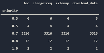
Only two URLs have “1.0” priority while 3316 of the URLs have “0.7” priority. To be honest, this is not a surprise, even if Google doesn’t care about this metric in the Sitemap.xml Files, they still can be optimized for other Search Engines. You may see the visualization via subplots below.
from plotly.subplots import make_subplots
fig = make_subplots(rows=1, cols=2)
fig.add_trace(
    go.Bar(x=priority.index, y=priority['loc'], name='Loc'),
    row=1,col=1)
fig.add_trace(
    go.Bar(x=priority.index, y=priority['changefreq'], name='Changefreq'),
    row=1, col=2)
fig.layout.title = 'Priority and Changefreq Distrubition for Sigortam.net'
fig.layout.yaxis.title = 'Number of URLs'
fig.layout.paper_bgcolor = '#E5ECF6'
fig.show()- At first line, we have imported “make_subplots” function for creating multiple plots in one figure.
- We have created our columns and rows for plots.
- At the third line of code, we have added our first plot for “loc” column into the first row and first column of the figure.
- At the fourth line of code, we have added our second trace into the first row and second column of the figure.
- We have changed the title of the figure, title of the y axis.
- We have changed the background color of the figure.
- We have called our interactive plot.
You may see the result as below.
As you may see, we have two different plots, since the “0.7” Priority has much more URL according to others, there is a disproportion in our graphic. Now, we will perform a content publishing trend analysis via Python and Sitemaps.
How to Analyze a Web Site’s Content Publishing and Updating Trend via Sitemaps and Python
To perform a trend analysis for content publishing frequency and timing, we need to use our “lastmod” column which is index at the same time. Before proceeding more, we should check whether our sitemap has a “NaN” value for the “lastmod” column or not.
sigortamdf[sigortamdf.index.isna()]You may see the output below.

It doesn’t have any “NaN” values so we may proceed.
sigortamdf.index = pd.to_datetime(sigortamdf.index)
ppyear= sigortamdf.resample('A')['loc'].count()
ppyear.to_frame()- To use the “lastmod” column as a date-time, we need to convert it into a Date Time Instance via the “pd.to_datetime” method.
- We have created a variable that is “ppmonth” which stands for “Post per Month”. We have used Pandas’ “resample” function on it with the “A” parameter which stands for “Annual”. And we have called the “loc” column based on every month.
- At the second line, we have called it in a frame thanks to the “to_frame()” function.
You may see the output below.

Isn’t it interesting? It basically says that, all of the content are updated today. So, there is only one explanation for this situation. This web entity always update its Sitemap’s “lastmod” column automatically every day without changing their content actually. Isn’t it spam? If you are trying to manipulate Search Engine based on your “lastmod” date so that Search Engine needs to increase crawl frequency for your web entity, it is called as spam. Also, Google Algorithms will stop to care about “lastmod” data for this web entity and decrease the Trust and Quality scores. We have explored a honest mistake or a spam effort while examining a sitemap via Python. Such a situation can’t be noticed easily via a manual examination.
Now, since our crawled Sitemap is not fit for our guideline anymore, we will continue our guideline one of their competitors. Koalay.com is another insurance aggregator brand from Turkey with more than 1 Millions of Sessions every month.
koalay = sitemap_to_df('https://www.koalay.com/sitemap.xml')
OUTPUT>>>
INFO:root:Getting https://www.koalay.com/sitemap.xml
We have crawled and assigned their sitemap into the “koalay” variable.
koalay.to_csv('koalay_sitemap.csv', index=False)We have exported their sitemap as CSV without the index column.
koalaydf = pd.read_csv('koalay_sitemap.csv')We have assigned the CSV output into the “koalaydf” variable.
koalaydf['lastmod'] = pd.to_datetime(koalay['lastmod'])We have changed the “lastmod” instances into the “Date Time” index instances.
koalaydf.set_index(koalay['lastmod'], inplace=True)We have determined the index column as “lastmod” permanently.
ppmonth2 = koalaydf.resample('M')['loc'].count()
ppmonth2.to_frame()
We have resampled the data frame based on monthly periods and “loc” column’s numeric values and put it into a variable by calling it as a frame.
You may see the result below.
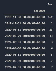
We have 257 URLs in total. Most of them are from 11 November 2019. They are still updating or publishing new content since 14 of their contents are from June and July. Now, let’s put this into a interactive plot.
fig = go.Figure()
fig.add_scatter(x=ppmonth2.index, y=ppmonth2.values, name='Koalay')
fig.layout.paper_bgcolor='#E5ECF6'
fig.layout.yaxis.title='Number of Articles per Month'
fig.layout.title='Koalay Article Publishing and Updating Trends'
fig.show()
You may see the result below:
You also can unite the Sigortam and Koalay Post Trends even if one of them is completely faulty.
fig.add_scatter(x=ppmonth2.index, y=ppmonth2.values, name='Koalay')
fig.add_scatter(x=ppmonth2.index,y=ppmonth.values, name='Sigortam (Wrong Information)')
We can call two different values from the different variables as long as they have the same “X” axis. In this examples, only the “Y” axis are different.
Since all of the data from the “Sigortam” has the same date, it has only a single dot on the timeline. Now, for a better comparison for the post trend, we need a similar competitor. Our third competitor will be “Generali.com” which has nearly 1 million sessions per month from the same industry. Before, performing deeper content analysis, creating a standard timeline comparison can be useful.
generali_sitemap = sitemap_to_df('https://www.generali.com.tr/sitemap.xml')
OUTPUT>>>
INFO:root:Getting https://www.generali.com.tr/sitemaps/sitemap-site.xml
INFO:root:Getting https://www.generali.com.tr/sitemaps/sitemap-site-bireysel.xml
INFO:root:Getting https://www.generali.com.tr/sitemaps/sitemap-site-kurumsal.xml
INFO:root:Getting https://www.generali.com.tr/sitemaps/sitemap-site-arac-sigortasi.xml
INFO:root:Getting https://www.generali.com.tr/sitemaps/sitemap-site-kasko-fiyatlar
It seems that, we have more than one sitemap.xml files in Generali.com.
generali_sitemap['sitemap'].unique()
OUTPUT>>>

array(['https://www.generali.com.tr/sitemaps/sitemap-site.xml',
       'https://www.generali.com.tr/sitemaps/sitemap-site-bireysel.xml',
       'https://www.generali.com.tr/sitemaps/sitemap-site-kurumsal.xml',
       'https://www.generali.com.tr/sitemaps/sitemap-site-arac-sigortasi.xml',
       'https://www.generali.com.tr/sitemaps/sitemap-site-kasko-fiyatlari.xml'],
      dtype=object)
And it is correct, we have 5 different sitemaps that are categorized according to the different content areas. Let’s see which sitemap has the most content.
generali_sitemap['sitemap_name'] = generali_sitemap['sitemap'].str.split('/').str[4]
generali_sitemap
We have created a new column with the names of the “sitemap files”. We have splitting them via the “/” sign and choosed the right section of splitting values. You may see the result below.
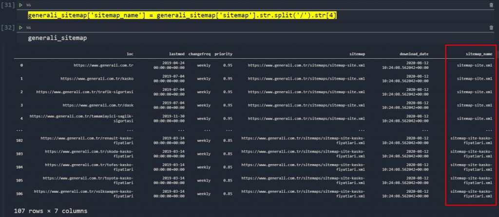
Since, our sitemap names are so long such as “sitemap-site-kasko-fiyatlari.xml”, we need to shorten them.
generali_sitemap['sitemap_name'].replace('sitemap-site-kasko-fiyatlari.xml', 'Kasko', inplace=True)
generali_sitemap
You may see the result below.

We will perform the same shortening process for all of the long sitemap names.
generali_sitemap['sitemap_name'].replace('Kasko', 'Traffic', inplace=True)
generali_sitemap['sitemap_name'].replace('sitemap-site-bireysel.xml', 'Personal', inplace=True)
generali_sitemap['sitemap_name'].replace('sitemap-site-kurumsal.xml', 'Cooperate', inplace=True)
generali_sitemap['sitemap_name'].replace('sitemap-site-arac-sigortasi.xml', 'Car', inplace=True)
generali_sitemap['sitemap_name'].replace('sitemap-site.xml', 'Others', inplace=True)
generali_sitemap['sitemap_name'].unique()
I have also translated into English all of the names of the sitemap names to make them more clear for you. You may see the output below:
OUTPUT>>>
array(['Others', 'Personal', 'Cooperate', 'Car', 'Traffic'], dtype=object)
Now, we can check our categorized Sitemap’s content amount so that we can see their content structure.
generali_sitemap['sitemap_name'].value_counts().to_frame().assign(percentage=lambda df:df['sitemap_name'].div(df['sitemap_name'].sum())).style.format(dict(sitemap_name='{:,}',percentage='{:.1%}'))- In general, we used the “value_counts ()” method to measure the division of all contents by sitemaps.
- We encapsulated each result with the “to_frame ()” method.
- We created two separate columns, one showing the total value and the other showing the percentage of the total value. For this, we used the “assign ()”, “style ()”, “format ()” methods and the “lambda” function.
You may see the result below:

It seems that most of our content is not categorized and they are in “Others” sitemap but we also have “car”, “traffic”, “personal” and “cooperate” insurance contents in different amounts. This is our first check, if you would have performed this process for a web site with more than 100.000 URLs, your time gaining and insight value would be more. We are performing those processes in small sites for speeding up the process as an example creation. Now, the visualization.
stmc = generali_sitemap.groupby('sitemap_name').count()
fig = go.Figure()
fig.add_bar(x=stmc.index, y=stmc['loc'], name='Sitemap Names')
fig.layout.title = 'Content Amount by Sitemap Categories'
fig.layout.paper_bgcolor='#E5ECF6'
fig.layout.yaxis.title = 'Article Amount'
fig.update_layout(showlegend=True)
fig.show()
We have assigned our “grouped” data based on “sitemap_name” column’s” summed values and created our interactive graph.
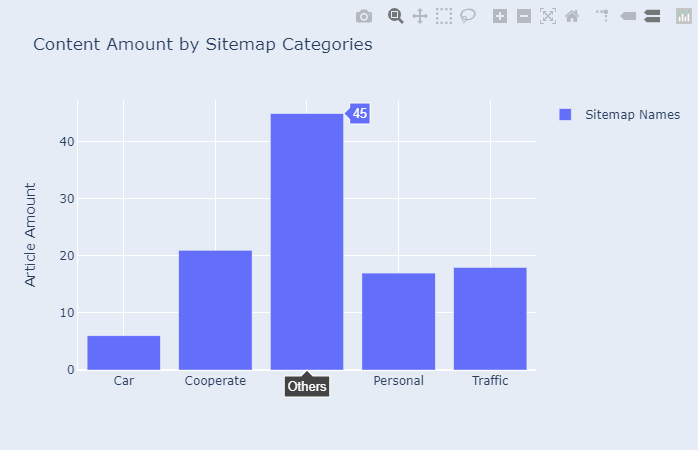
Now, before proceeding more, let’s compare our content publishing trend between these entities.
fig = go.Figure()
fig.add_bar(x=ppmonth3.index, y=ppmonth3.values, name='Generali')
fig.add_bar(x=ppmonth3.index, y=ppmonth2.values, name='Koalay')
fig.layout.title = 'Generali Content Publishing Trend'
fig.layout.xaxis.title = 'Article Amount'
fig.update_layout(showlegend=True)
fig.layout.paper_bgcolor='#E5ECF6'
fig.show()
You may see the result below.
We have compared two different web entities’ content puıblishing trends from the same industry. While comparing these types of entities, be sure that you are using the same value in the “X” axis. As you may see here, Koalay has published most of its content in one day from 2018, after a while they have stopped to publish new content (if their sitemaps are updated regularly, which in this case, they are being updated). If you don’t have efficient “date time” space in a right format, you can create it via Python’s Datetime Module also. Also, we can perform the same comparison as days or years. You may see the comparison as “days”.
Below, you will find the comparison as years.
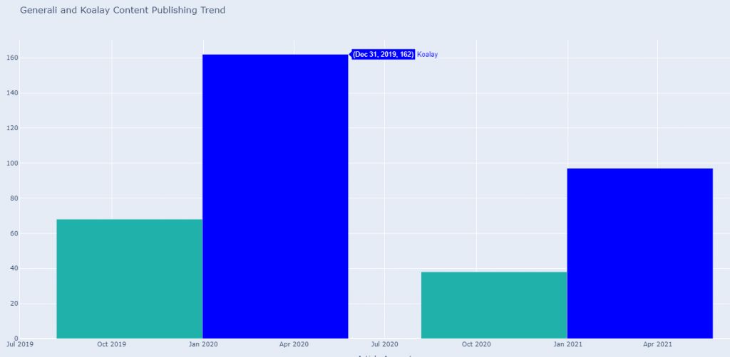
We see that every year Koalay.com is publishing more content according to Generali. But also we know from the previous graphs, Generali is more active than Koalay.com for the latest times in terms of content publishing.
We also can analyze their content publishing trends according to the days of the weeks.
generali_sitemap.groupby(generali_sitemap.index.weekday)['loc'].count().to_frame().rename(columns=dict(loc='count')).assign(day=['Mon', 'Tue', 'Wed', 'Thu', 'Fri', 'Sat']).style.bar(color='#34495e').format(dict(count='{:,}'))We have used only “six days of the week” here because coincidentally, the Generali web entity had not published any articles on the day of Sunday. You may see the result below for “Generali”.

You also can see the same result for Koalay, below.
koalaydf.groupby(koalaydf.index.weekday)['loc'].count().to_frame().rename(columns=dict(loc='count')).assign(day=['Mon', 'Tue', 'Wed', 'Thu']).style.bar(color='#34495e').format(dict(count='{:,}'))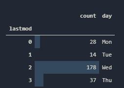
You may want to check the necessary days of the week by using “to_frame()” method without rest of the script.
Now, since we have compared their content publishing trends, we also can compare their content profiles. We already did a similar thing via “Generali’s Sitemap Categorization” but, we still don’t know that is it right or not, we also don’t know what “Others” sitemap contains. So, we will start to use “URL Structure” to analyze their content.
How to Categorize URLs via Sitemaps and Python for Analyzing Content Structure
To analyze their content profile, we should use their URLs’ structure. Since we are not concerned about their publishing timings anymore, we may use also “Sigortamdf” variable for this analysis since it is the biggest data frame among them.
categories = generali_sitemap['sitemap_name'].unique()
fig = make_subplots(rows=1, cols=len(categories), subplot_titles=categories,
                    shared_yaxes=True)
for i, cat in enumerate(categories):
    df = generali_sitemap[generali_sitemap['sitemap_name']==cat].resample('A')['loc'].count()
    fig.add_bar(x=df.index.year, y=df.values, row=1, col=i+1, showlegend=False, name=cat)
fig.layout.height = 550
fig.layout.paper_bgcolor = '#E5ECF6'
fig.layout.title = 'Buzzfeed Articles per Year - By Category'
fig.update_layout(width=1600)
fig.show()
You may see the result below:

We see that, Generali published articles from the “Other” category for the last three years while its “Car Insurance” articles are from two years ago.
Now, let’s learn how to analyze URL Structure.
sigortamdf['loc'].sample(25).tolist()Since, we have more than 3000 URLs in our “sigortamdf” variable, we have chosen 25 random URLs and put them into a list. Here is the output:
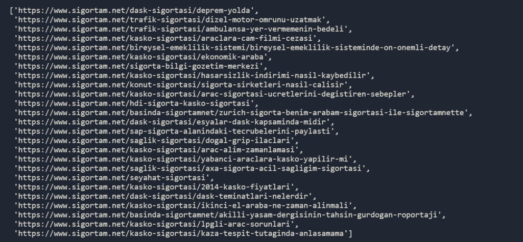
We see that we have different hierarchy levels in our URL Structure, it is a good sign for us because it will be easier to analyze all of those URLs. We will quickly go over some steps.
sigortamdf['mcat'] = sigortamdf['loc'].str.split('/').str[3]
sigortamdf['scat'] = sigortamdf['loc'].str.split('/').str[4]
We have created two different categories for URL’s sections which show us main and sub-categories in the “Sigortam”. Below, you will see them both in the frame.
sigortamdf['mcat'].value_counts(normalize=True).to_frame() * 100You may see the result below:
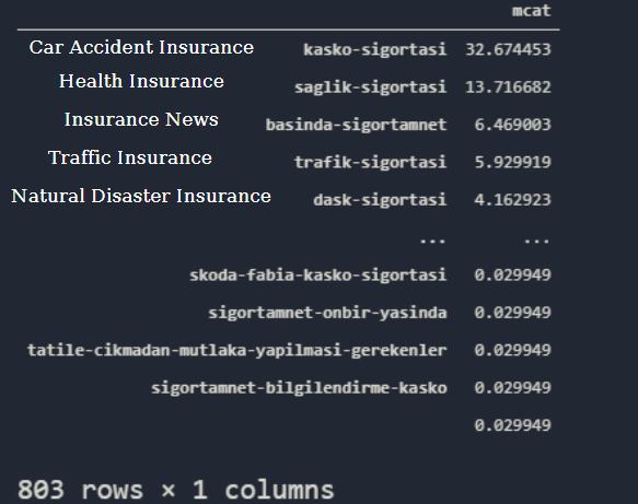
I have translated some of the URL Categories for you. 32% of our content is related to the “Car Accident Insurance” while 13% of our content is from “Health Insurance”. If you have “Google Search Console” access, you may “Categorize Your Queries with Click Performance via Python and Apriori Algorithm” to see their “organic traffic activity”. If you don’t have so much organic traffic while you have more than 1000 URLs on a topic, you may think “Content Pruning” option there. Also, you can do the same for another web entity via a Third Party Tool’s data.
We also can check our “sub-categories”.
sigortamdf['scat'].value_counts(normalize=True).to_frame() * 100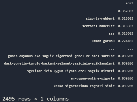
We see that our “sub-category” URLs are not so insightful, we have 2495 Rows not 895 as in the previous example. Also, most of them don’t even have a “sub-category” snippet in URL Structure, that’s why our first row in the output is empty. To create more insight, we can style our URL Structure Output.
sigortamdf['mcat'].value_counts().to_frame().assign(perc=lambda df: df['mcat'].div(df['mcat'].sum()), cum_perc=lambda df:df['perc'].cumsum())[:20].reset_index().rename(columns=dict(index='mcat', mcat='count', perc='%', cum_perc='cum. %')).style.set_caption('Top URL Categories').format({'count': '{:,}', '%': '{:.1%}', 'cum. %': '{:.1%}'}).background_gradient(cmap='twilight_shifted')- We have used the “assign()” method for creating two different columns named “perc” and “cum_perc” with different values.
- We have called only the first two “rows”.
- We have reset the indexes so that we can rename them, we have renamed the index column as “mcat” so that our indexes can have their own names. Other columns’ names are changed according to their functions.
- We have styled our data frame, we have determined a title, formatted the columns, and changed the background color via the “heatmap” effect.
You may see the output below:
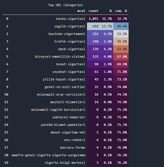
Also, we have some URL Categories such as “Automobile Guideline”, “Travel Insurance”, “Pansion System”, “House Insurance”, “Private and General Conditions” and more… We also can check the most frequently used words in the URLs.
import advertools as adv
sigortamdf['rurl'] = sigortamdf['loc'].str.split('/').str[3].str.replace('-', ' ')
words = adv.word_frequency(sigortamdf['rurl'].fillna('Missing'))
words.iloc[0:20].style.format(dict(abs_freq='{:,}')).background_gradient('Greens')- We have imported the required method from the “Advertools”.
- We have created a new column with the Main URL Category slugs without the “-” sign.
- We have filled the “NaN” values with the ‘Missing’ string.
- We have called the most used 20 single words in the URLs.
You may see the result below:

We see that “Insurance of Something” and “Insurance”, “Traffic”, “Personal”, “Press”, “Questioning” are the most used words in URLs. We have also extracted the word frequency according to the “phrase’s length”.
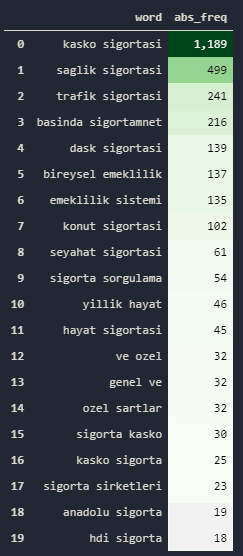
Now, let’s perform the same process for the “sub-categories” so that we can see more detail in their content profile.
sigortamdf['rurl2'] = sigortamdf['loc'].str.split('/').str[4].str.replace('-', ' ')
words = adv.word_frequency(sigortamdf['rurl2'].fillna('Missing'), phrase_len=2)
words.iloc[0:20].style.format(dict(abs_freq='{:,}')).background_gradient('Greens')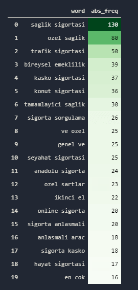
Now, we have “health insurance” at the top of our data frame for sub-categories. Also remember that if you don’t use “phrase_len” attribute, you will lose the stop words, we have some stopwords here in Turkish such as “ve(and)” or “en(most)”.
We also can compare the topical post amount between different web entities as below:
koalaydf['mcat'] = koalaydf['loc'].str.split('/').str[3].str.replace('-', ' ')
koalaydf['scat'] = koalaydf['loc'].str.split('/').str[4].str.replace('-', ' ')
koalaydf
We have performed the same process for “Koalaydf” data frame, we have also replaced the “-” sign between words in URLs with ” ” which means space. You may see the result below:

We also have performed the same process for the Generali’s sitemap data frame.
generali_sitemap['mcat'] = generali_sitemap['loc'].str.split('/').str[3].str.replace('-', ' ')
generali_sitemap['scat'] = generali_sitemap['loc'].str.split('/').str[4].str.replace('-', ' ')
generali_sitemap
Now, let’s compare their content profile via URL Structure Analyzing.
koalaydf['mcat'].value_counts().to_frame().assign(perc=lambda df: df['mcat'].div(df['mcat'].sum()), cum_perc=lambda df:df['perc'].cumsum())[:20].reset_index().rename(columns=dict(index='mcat', mcat='count', perc='%', cum_perc='cum. %')).style.set_caption('Top URL Categories').format({'count': '{:,}', '%': '{:.1%}', 'cum. %': '{:.1%}'}).background_gradient(cmap='twilight_shifted')You may see the result below:
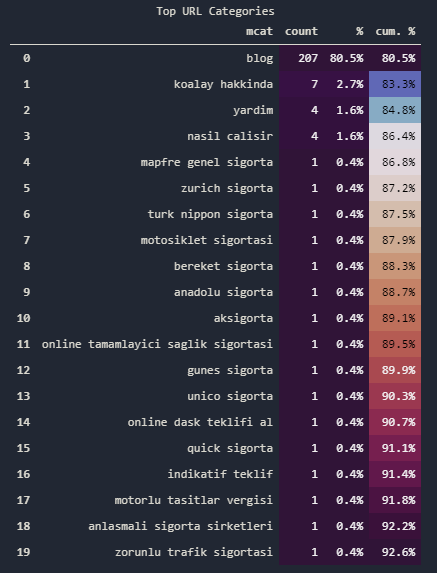
We see that Koalay has a “Blog” category and they hold their most guidelines in there, we know this because their “Brand Pages” can be seen outside of the “Blog” category. “Gunes Sigorta”, “Zurich Sigorta” and others are company introduction pages that try to create transformation partnerships. We also can check the duplicated values for sub-categories to see whether they have a smaller URL breakpoint or not.
koalaydf[koalaydf['scat'].duplicated()]
We see that they have a “detail” breakpoint, so we need to create another column to extract “blog” content’s profile.
koalaydf['scat2'] = koalaydf['loc'].str.split('/').str[5].str.replace('-', ' ')
koalaydf
You may see the deeper URLs’ content below.

Also, even from now, we can see that Koalay has written content for “Visa Applications” in the context of “Travel Insurance”. We also can compare the missing content and search intent areas via those URLs, easily. At below, you will see our blog URLs.
koalaydf['scat2'].fillna('', inplace=True)
koalaydf['scat2'].sample(45).value_counts()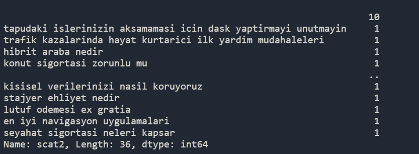
Above, you see that most of the URL Examples are being used only one time. Since we have used “fillna(”)” for the “NaN” values, we also see that 10 URLs don’t have content for this breakpoint. Using, “word_frequency()” method can help here again.
words2 = adv.word_frequency(koalaydf['scat2'], phrase_len=1)
words2.iloc[0:20].style.format(dict(abs_freq='{:,}')).background_gradient('Greens')
We have repeated the same process from “phrase_len=1” to “phrase_len=3”, we can see the Koalay’s Blog Content structure easily as below.
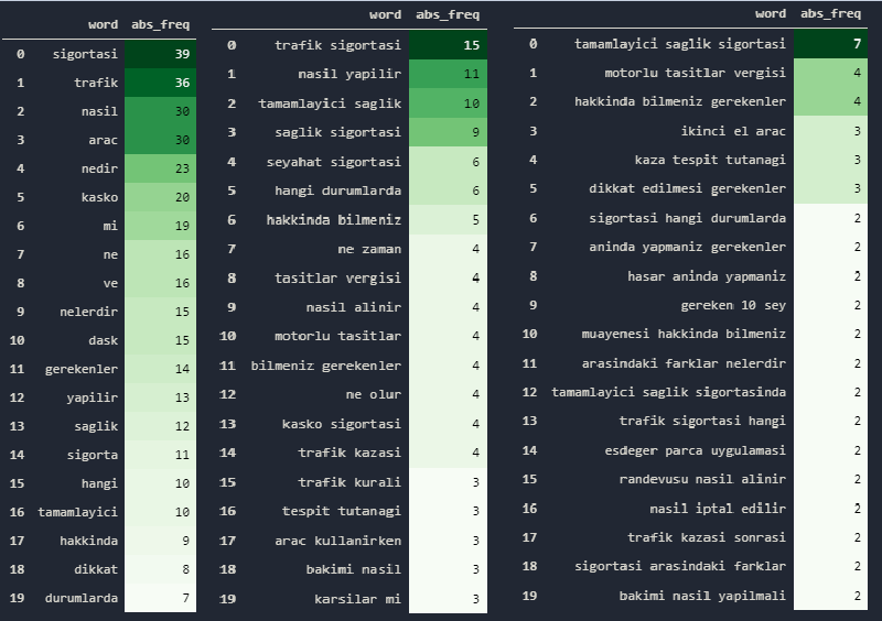
They have mainly “traffic insurance” and “health insurance” articles. An important difference here is that they have also some “Travel Insurance” and “Car Fixing” articles, unlike others. Now, after these minor examples, we also can perform a content structure comparison via visualization between these entities based on publishing trends.
fig = make_subplots(rows=2, cols=3)
fig.add_trace(
    go.Bar(
        x = ppmonth_kasko_k.index, y=ppmonth_kasko_k.values, name='Koalay Accident'
    ), row=1, col=1
)

fig.add_trace(
    go.Bar(
        x = ppmonth_kasko_k.index, y=ppmonth_traffic_k.values, name='Koalay Traffic'
    ), row=1, col=2
)
fig.add_trace(
    go.Bar(
        x = ppmonth_kasko_k.index, y=ppmonth_dask_k.values, name='Koalay Traffic'
    ), row=1, col=3
)
fig.add_trace(
    go.Bar(
        x = ppmonth_kasko_k.index, y=ppmonth_kasko_g.values, name='Generali Accident'
    ), row=2, col=1
)

fig.add_trace(
    go.Bar(
        x = ppmonth_kasko_k.index, y=ppmonth_traffic_g.values, name='Generali Traffic'
    ), row=2, col=2
)
fig.add_trace(
    go.Bar(
        x = ppmonth_kasko_k.index, y=ppmonth_dask_g.values, name='Generali Traffic'
    ), row=2, col=3
)

"""fig.add_bar(x = ppmonth_kasko_k.index, y=ppmonth_kasko_k.values, name='Accident')
fig.add_bar(x = ppmonth_kasko_k.index, y=ppmonth_traffic_k.values, name='Traffic')
fig.add_bar(x = ppmonth_kasko_k.index, y=ppmonth_dask_k.values, name='Natural Disease')
fig.add_bar(x = ppmonth_kasko_k.index, y=ppmonth_kasko_g.values, name='Accident')
fig.add_bar(x = ppmonth_kasko_k.index, y=ppmonth_traffic_g.values, name='Traffic')
fig.add_bar(x = ppmonth_kasko_k.index, y=ppmonth_dask_g.values, name='Natural Disease')"""
fig.update_layout(width=1300, height=700)
fig.layout.yaxis.title='Article Amount'
fig.layout.paper_bgcolor='#E5ECF6'
fig.layout.title='Content Categories and Publishment Trend for Koalay and Generali'
fig.show()
You may use “fig.add_bar” method or you can use the “make_subplots”, we have prefered to use multiple plots in one figure, you may see the result below:
We see both of the web entities’ content categories, their amount and their publishing trends in one figure. We may also use “Pandas Library” for creating Pie Charts.
sigortam_url_mc = sigortamdf.groupby('mcat').count().sort_values(by='loc', ascending=False)[:4]
sigortam_url_mc
Now, we may create Pie Charts for every columns with a built-in “Matplotlib function” within Pandas Library. You may see the codes below.
sigortam_url_mc = sigortamdf.groupby('mcat').count().sort_values(by='loc', ascending=False)[:4]
sigortam_url_mc
We have grouped the columns and data instances by “mcat” category which stands for Main Category.
a.plot.pie(subplots=True, figsize=(100, 500))We have created “Pie Plots” for every column, you may see the “loc” column’s Pie Chart below.

Last Thoughts on Content Profile and Strategy Analyzing via Python
In this guide article, we tried to cover many different points and the Python methods. Using the Advertools, Pandas, Plotly, and Matplotlib methods, we made conclusions by playing with data frames in a narrative way. We analyzed and compared what types of content different websites publish based on time. At the same time, we looked at what content they published differently, whether they were active or not. We discovered some spam spots by chance. We have done all of this only through Sitemaps and URLs.
Thus, you can imagine how easy a quality URL Structure and Sitemap Editing can make the work of a Search Engine. With a good URL Structure, a Search Engine can very easily analyze a website, up to the topic they are telling, and the width to handle the topic. Consider the Crawl Efficiency and Cost Reduction that this will create for the Search Engine. By scanning Sitemap files that have millions of URLs, you can compare much more data than “entities”, “author” information, or “writing language” information that can be found in the URL. You can even measure how extensively you are dealing with a topic through URLs and Natural Language Processing and Knowledge Graph Creation techniques.
At the same time, you will see that we interpret more data in our article of crawl and analyze a website with Python, which will be written in the following process, thanks to the fact that we can pull much more data.
Our guidebook “Content Profile Browsing, Interpretation and Visualization with Python and Sitemap”, which has many missing points, for now, will be developed.
- Sliding Window - August 12, 2024
- B2P Marketing: How it Works, Benefits, and Strategies - April 26, 2024
- SEO for Casino Websites: A SEO Case Study for the Bet and Gamble Industry - February 5, 2024


Hello Koray,
I have a question, when going through this article I found two separate summary content, one table of content and another content of the article.
Why is it? Is it an SEO strategy that the “Table of Content” of the article is hidden, hence a separate “Content of the Article” is written?
Even though both have the same content and link, clicking the “table of content links”, the page does not scroll.
Thanks & Regards
Madhan
Masha ALLAH Murshad Koray! Hats Off! What a multi-dimensional guide it is.
Thank you.