This article has been prepared as a tutorial to show how to Retrieve Google SERP with regular periods, animate the differences to see Google Search Engine’s preference and experiment algorithms. In this article, we will use Semantic Search Queries to understand the topical coverage and topical authority of certain domains. We will retrieve all of the related Search Engine Result Pages (SERP) for these queries, crawl landing pages, blend the crawl data with also Google Search Engine’s SERP dimensions and third-party page information to find different correlations and insights for the SEO via Data Science.
You can watch the related RankSense Webinar that has been performed with Dear Elias Dabbas (a.k.a, Professor) and Koray Tuğberk GÜBÜR. And, all of this Jupyter notebook normally was prepared in December for a planned and canceled webinar with Genius and Dear Hamlet Batista.
The webinar recording is below.

This Data Science and Visualization tutorial includes a comprehensive, complete guideline for analyzing algorithms, Search Engines’ decision trees, on-page, off-page, technical, non-technical features of landing pages along with text-analysis, SERP data insights, and topical search engine features. This mini Python and Data Science for SEO book have been written in the memory of Dear Hamlet Batista. At the end of the educational SEO Data Science article, you will see a complete tribute to him.
If you want to support his family, you can join Lily Ray’s campaign: https://www.gofundme.com/f/in-memory-of-hamlet-batista

The webinar for the Data Science, Visualization for SEO has been published with Koray Tuğberk GÜBÜR and Elias Dabbas. You can find the related webinar video below.
By examining the Data Science, Visualization for SEO Twittorial with RankSense, you can see some summative instructions and visualizations for this tutorial.
After Elias Dabbas and Koray Tuğberk Gübür performs the Data Science for SEO Webinar with RankSense and OnCrawl, the video of the webinar will be added here. If you want to wonder what RankSense is you can click the image below to support it.
I am a Star Author in OnCrawl for the last 2 years, and I thank you to OnCrawl for all their support during my SEO Journey. I also recommend you to check OnCrawl’s SEO and Data Science vision which is supported by Dear Vincent Terrasi.
You can see the content of tables for the Data Science, Visualization and SEO tutorial/guideline below.
Connecting to the Google Custom Search API (Programmable Search Engine API)
To connect the Google Custom Search API and retrieve Google Search Results with Python, you need two things.
- Google Developer Console Account
- Custom Search API Key
- Custom Search Engine ID.
Below, you will see the section where you can create and copy a Custom Search API Key from Google Developer Console.

Below, you will see how you can create and find custom Search Engine ID.
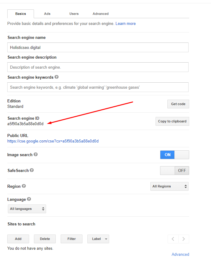
Note: I recommend you to not change any kind of settings in your Custom Search Engine, it might affect the results that we will get via Python’s Advertools Package from Google.
Using Google Custom Search API via Advertools to Retrieve the SERP Data
To use Google’s Custom Search API via Advertools, you will need to write three lines of code as below.
import advertools as adv
api_key, cse_id = "YOUR API KEY", "YOUR CSE ID"
adv.serp_goog(key=api_key, cx=cse_id, q="Example Query", gl=["example country code"])
With these three lines of code, you can connect to Google Custom Search API, use a custom search engine, and retrieve search engine results page data from Google. Below, you will see a live example:
Retrieving the Search Engine Results Pages with Regular Periods with Python
To take the Google Search Engine’s Result Pages with regular periods, you will need a timer. In Python, there are different methodologies for timing a function call. Below, you will see a representative example.
import schedule
import advertools as adv
api_key, cse_id = "YOUR API KEY", "YOUR CSE ID"
adv.serp_goog(key=api_key, cx=cse_id, q="Example Query", gl=["example country code"])

def SERPheartbeat():
    """
    Calls the function with the determined frequency, for the determined queries.
    Creates a CSV Output with the name of the actual date which the function called.
    """
    date = datetime.now()
    date = date.strftime("%d%m%Y%H_%M_%S")
    df = adv.serp_goog(
        q=['Credit Calculation', "Insurance", "Medical Coding Services", "Lawyer", "Business Services"], key=api_key, cx=cse_id, gl=["us"], start=[1,11,21,31,41,51,61,71,81,91])
    df.to_csv(f'serp_recording_{date}_' + '_' + 'scheduled_serp.csv')


schedule.every(10).minutes.do(SERPHeartbeat)
With the “schedule” package of Python, you can schedule Python function calls. And, in this example, we have created a function which is called as “SERPheartbeat()”. Below you can see the explanation of the “SERPheartbeat()” function.
- In the first line, we have created a variable which is a date, we have assigned “datetime.now” as a value to it.
- In the second line, we have changed the format of the “datetime.now” to “Day, Month, Year, Hour and Second”. We have called our “serp_goog” function for the queries of “Credit Calculation”, “Insurance”, “Medical Coding Services”, “Lawyer”, “Business Services”. These queries are the most expensive queries on Google.
- We have extracted all of the results for the “United States” with the “gl” parameter.
- We have taken the first 100 Search Results with the “start” parameter and its values.
- We have assigned the result to the variable “df”.
- We have called the “schedule.every.minutes.do” method to call our function every 10 minutes.
There is als oanother method to call a function with regular periods. You can see it below.
n=0
while n<99:
    SERPheartbeat()
    time.sleep(1)
    n += 1
A simple explanation of this code blog is below.
- Equal the “n” to the 0.
- Until “n + 1” is equal to the 99,
- Determine how many seconds or minutes to wait for another SERP Retrieving function call.
- Call the “SERPheartbeat()” function.
How to Unite All of the Outputs of SERP Retrieving Python Script?
To unite multiple CSV, XLSX files in Python, there are various ways. The first methodology for uniting multiple CSV outputs is a little bit more mechanical, you can see it in the code block below.
df_1 = pd.read_csv("first_csv_output.csv", index_col='queryTime')
df_2 = pd.read_csv("second_csv_output.csv", index_col='queryTime')
df_3 = pd.read_csv("third_csv_output.csv", index_col='queryTime')
df_4 = pd.read_csv("fourth_csv_output.csv", index_col='queryTime')

united_serp_df = df_1.append([df_2,df_3,df_4])

serp_csv.drop(columns="Unnamed: 0", inplace=True)
serp_csv.set_index("queryTime", inplace=True)
The explanation of the first methodology is below.
- We have created four different variable for four different “pd.read_csv()” command.
- We have determined the “queryTime” as the index column, it is important because it will be used while animating the result differences.
- We have united all the data frames with the “pd.append()” method with a list argument.
- We have dropped one of the unnecessary columns, we have changed the indexing column of the united data frame.
Still, this is too many lines of code, and also according to the SERP Retrieving calls, the count of the data frames to be united will vary. To prevent this situation, there is a more pratic methodology with the “glob” module. You can see it below.
serp_csvs = sorted(glob.glob(("str*.csv")))
serp_csv = pd.concat((pd.read_csv(file) for file in serp_csvs), ignore_index=True)- Two lines of code… With the “sorted(glob.glob((“str*.csv”)))” method, we have taken all of the “CSV” files that start with the “str” character, sorted them according to the “dates” that they are being recorded.
- We have contacted all of the retrieved SERP files with “pd.read_csv” method and list comprehension.
How to Animate Search Result Differences based on Periodic Search Engine Result Pages Records
To animate the Search Engine Result Page ranking differences based on different domains, dates and queries, Python’s Plotly library should be used with a sub-module which is “Express”. Below, you will see a code example and its explanation for using Plotly Express animations.
query_serp = serp_csv[serp_csv['searchTerms'].str.contains("your query", regex=True, case=False)]

query_serp['bubble_size'] = 35

fig = px.scatter(query_serp, x="displayLink", y="rank", animation_frame=query_serp.index, animation_group="rank",
            color="displayLink", hover_name="link", hover_data=["searchTerms","title","rank"],
           log_y=True,
           height=900, width=1100, range_x=[-1,11], range_y=[1,11],  size="bubble_size", text="displayLink", template="plotly_white")

#fig['layout'].pop('updatemenus')

fig.layout.updatemenus[0].buttons[0].args[1]["frame"]["duration"] = 2500
fig.layout.updatemenus[0].buttons[0].args[1]["transition"]["duration"] = 1000

fig.update_layout(
    margin=dict(l=20, r=20, t=20, b=20),
    paper_bgcolor="white",
)

fig.show(renderer='notebook')
Most of the Plotly functions have many parameters, but they are all in a semantic structure and logic. So, their documentation can be very long, but they are also human-readable. Below, you can find an explanation for this code block.
- At the first line, we have filtered a “search term” to create a ranking change animation for only that query, in this example, it is “your query” which means that whichever query you want.
- At the second line, we have created a new column for the “bubble size” for the data that we will animate.
- At the third line, we have called “px.scatter()” function, which includes the data frame which is “query_serp”, x and y axes, animation frame which is our index column, a text which will be displayed on the data and color palette of the chart.
- In the fourth and fifth lines, we have used “updatemenus” property to change the animation frame duration and transition duration between different frames.
- We have updated the layout of the chart for its paper background color and margin.
- We have called our plotly animation chart which shows the SERP Ranking Differences in an animated way in the notebook, with an inlined way.
Basiaclly, for retrieving and animating Search Engine Results Pages, we have shown all of the related steps. In the next section you will see a practical example with real-world data.
Retrieving and Animating the Search Engine Results Page Ranking Changes to See the General Situation
First, we need to import the necessary libraries.
import schedule
import advertools as adv
import pandas as pd
import plotly.express as px
import glob
import time
from datetime import datetime
Create the Custom Search API Key and Search Engine ID as below.
cse_id = "7b8760de16d1e86bc" # Custom Search Engine ID
api_key = "AIzaSyAqUXT6JCU9bnpNv6ybAmgiJ2wPC-56CLA" # API Key for Custom Search API of Google
Define the function that we need for recording the SERP.
def SERPHeartbeat():
    date = datetime.now()
    date = date.strftime("%d%m%Y%H_%M_%S")
    df = adv.serp_goog(
        q=['Calories in Pizza', "Calories in BigMac"], key=api_key, cx=cse_id)
    df.to_csv(f'serp{date}' + '_' + 'scheduled_serp.csv')
Call the related function with “schedule” and a for loop.
schedule.every(10).seconds.do(SERPHeartbeat)

#For making the Schedule work.
n = 5
while True:
    schedule.run_pending()
    time.sleep(1)
    n += 1

OUTPUT>>>

2020-12-28 21:44:27,994 | INFO | __init__.py:465 | run | Running job Every 10 seconds do SERPHeartbeat() (last run: [never], next run: 2020-12-28 21:44:27)
2020-12-28 21:44:27,998 | INFO | serp.py:698 | serp_goog | Requesting: q=Calories in Pizza, cx=7b8760de16d1e86bc, key=AIzaSyAqUXT6JCU9bnpNv6ybAmgiJ2wPC-56CLA
2020-12-28 21:44:28,640 | INFO | serp.py:698 | serp_goog | Requesting: q=Calories in BigMac, cx=7b8760de16d1e86bc, key=AIzaSyAqUXT6JCU9bnpNv6ybAmgiJ2wPC-56CLA
2020-12-28 21:44:39,451 | INFO | __init__.py:465 | run | Running job Every 10 seconds do SERPHeartbeat() (last run: 2020-12-28 21:44:29, next run: 2020-12-28 21:44:39)
2020-12-28 21:44:39,452 | INFO | serp.py:698 | serp_goog | Requesting: q=Calories in Pizza, cx=7b8760de16d1e86bc, key=AIzaSyAqUXT6JCU9bnpNv6ybAmgiJ2wPC-56CLA
2020-12-28 21:44:40,074 | INFO | serp.py:698 | serp_goog | Requesting: q=Calories in BigMac, cx=7b8760de16d1e86bc, key=AIzaSyAqUXT6JCU9bnpNv6ybAmgiJ2wPC-56CLA
2020-12-28 21:44:50,872 | INFO | __init__.py:465 | run | Running job Every 10 seconds do SERPHeartbeat() (last run: 2020-12-28 21:44:40, next run: 2020-12-28 21:44:50)
2020-12-28 21:44:50,873 | INFO | serp.py:698 | serp_goog | Requesting: q=Calories in Pizza, cx=7b8760de16d1e86bc, key=AIzaSyAqUXT6JCU9bnpNv6ybAmgiJ2wPC-56CLA
2020-12-28 21:44:51,417 | INFO | serp.py:698 | serp_goog | Requesting: q=Calories in BigMac, cx=7b8760de16d1e86bc, key=AIzaSyAqUXT6JCU9bnpNv6ybAmgiJ2wPC-56CLA
2020-12-28 21:45:02,195 | INFO | __init__.py:465 | run | Running job Every 10 seconds do SERPHeartbeat() (last run: 2020-12-28 21:44:52, next run: 2020-12-28 21:45:02)
2020-12-28 21:45:02,196 | INFO | serp.py:698 | serp_goog | Requesting: q=Calories in Pizza, cx=7b8760de16d1e86bc, key=AIzaSyAqUXT6JCU9bnpNv6ybAmgiJ2wPC-56CLA
2020-12-28 21:45:02,737 | INFO | serp.py:698 | serp_goog | Requesting: q=Calories in BigMac, cx=7b8760de16d1e86bc, key=AIzaSyAqUXT6JCU9bnpNv6ybAmgiJ2wPC-56CLA
2020-12-28 21:45:13,553 | INFO | __init__.py:465 | run | Running job Every 10 seconds do SERPHeartbeat() (last run: 2020-12-28 21:45:03, next run: 2020-12-28 21:45:13)
2020-12-28 21:45:13,553 | INFO | serp.py:698 | serp_goog | Requesting: q=Calories in Pizza, cx=7b8760de16d1e86bc, key=AIzaSyAqUXT6JCU9bnpNv6ybAmgiJ2wPC-56CLA
2020-12-28 21:45:14,205 | INFO | serp.py:698 | serp_goog | Requesting: q=Calories in BigMac, cx=7b8760de16d1e86bc, key=AIzaSyAqUXT6JCU9bnpNv6ybAmgiJ2wPC-56CLA
2020-12-28 21:45:17,915 | INFO | __init__.py:465 | run | Running job Every 1 minute at 00:00:17 do SERPHeartbeat() (last run: [never], next run: 2020-12-28 21:45:17)
2020-12-28 21:45:17,916 | INFO | serp.py:698 | serp_goog | Requesting: q=Calories in Pizza, cx=7b8760de16d1e86bc, key=AIzaSyAqUXT6JCU9bnpNv6ybAmgiJ2wPC-56CLA
2020-12-28 21:45:18,680 | INFO | serp.py:698 | serp_goog | Requesting: q=Calories in BigMac, cx=7b8760de16d1e86bc, key=AIzaSyAqUXT6JCU9bnpNv6ybAmgiJ2wPC-56CLA
2020-12-28 21:45:25,531 | INFO | __init__.py:465 | run | Running job Every 10 seconds do SERPHeartbeat() (last run: 2020-12-28 21:45:14, next run: 2020-12-28 21:45:24)
2020-12-28 21:45:25,532 | INFO | serp.py:698 | serp_goog | Requesting: q=Calories in Pizza, cx=7b8760de16d1e86bc, key=AIzaSyAqUXT6JCU9bnpNv6ybAmgiJ2wPC-56CLA
2020-12-28 21:45:26,074 | INFO | serp.py:698 | serp_goog | Requesting: q=Calories in BigMac, cx=7b8760de16d1e86bc, key=AIzaSyAqUXT6JCU9bnpNv6ybAmgiJ2wPC-56CLA
2020-12-28 21:45:36,880 | INFO | __init__.py:465 | run | Running job Every 10 seconds do SERPHeartbeat() (last run: 2020-12-28 21:45:26, next run: 2020-12-28 21:45:36)
2020-12-28 21:45:36,880 | INFO | serp.py:698 | serp_goog | Requesting: q=Calories in Pizza, cx=7b8760de16d1e86bc, key=AIzaSyAqUXT6JCU9bnpNv6ybAmgiJ2wPC-56CLA
2020-12-28 21:45:37,712 | INFO | serp.py:698 | serp_goog | Requesting: q=Calories in BigMac, cx=7b8760de16d1e86bc, key=AIzaSyAqUXT6JCU9bnpNv6ybAmgiJ2wPC-56CLA
Until this section, we have retrieved the related Search Results. Below, you will see the animation phase of SERP differences of this tutorial.
fig = px.scatter(pizza_serp, x="displayLink", y="rank", animation_frame=pizza_serp.index, animation_group="displayLink",
            color="displayLink", hover_name="link", hover_data=["searchTerms","title","rank"],
           log_y=False,
           height=900, width=1700, range_x=[-1,11], range_y=[1,11],  size="bubble_size", text="displayLink", template="plotly_white", title="Heartbeat of SERP for 'Calories in Pizza'", labels={"rank":"Rankings","displayLink":"Domain Names"})
#fig['layout'].pop('updatemenus')
fig.layout.updatemenus[0].buttons[0].args[1]["frame"]["duration"] = 500
fig.layout.updatemenus[0].buttons[0].args[1]["transition"]["duration"] = 1000

"""fig.update_layout(
    margin=dict(l=20, r=20, t=20, b=20),
    paper_bgcolor="white",
)"""

fig.update_xaxes(
        title_font = {"size": 20},
        title_standoff = 45)
fig.update_yaxes(
        title_font = {"size": 20},
        title_standoff = 45)


fig.show(renderer='notebook')
With the “fig.update_xaxes” and “fig.update_yaxes” we have changed the title style of the x and y axes. Below, you can watch the animation of SERP Ranking Changes.
As you can see certain sources (websites and domains) switches their rankings with other certain types of sites with regular bases. You can also check these changes’ correlative with their update frequency, link velocity, or Google’s own algorithm updates. Below, you will see another visualization and animation example for the query of “calories in BigMac”.
bigmac_serp = serp_csv[serp_csv['searchTerms'].str.contains("bigmac", regex=True, case=False)]
bigmac_serp['bubble_size'] = 35
bigmac_serp

fig = px.scatter(bigmac_serp, x="displayLink", y="rank", animation_frame=bigmac_serp.index, animation_group="displayLink",
            color="displayLink", hover_name="link", hover_data=["title"],
           log_y=False,
           height=900, width=1100, range_x=[-1,11], range_y=[1,11],  size="bubble_size", text="displayLink", template="plotly_dark", title="Heartbeat of SERP for 'Calories in BigMac'", labels={"rank":"Rankings","displayLink":"Domain Names"})
#fig['layout'].pop('updatemenus')
fig.layout.updatemenus[0].buttons[0].args[1]["frame"]["duration"] = 450
fig.layout.updatemenus[0].buttons[0].args[1]["transition"]["duration"] = 1500
"""fig.update_layout(
    margin=dict(l=20, r=20, t=20, b=20)
)"""
fig.update_xaxes(
        title_font = {"size": 20},
        title_standoff = 45)
fig.update_yaxes(
        title_font = {"size": 20},
        title_standoff = 45)
fig.show(renderer='notebook')
You can see the result below.
You can also plot the different SERP changes from different dates without animation as vertically. You can see an example below.
Below, you will see an example of multiple SERP Animation in one chart.
serp['bubble_size'] = 15
fig = px.scatter(filtered_serp,
           x="displayLink",
           y="rank",
           color="displayLink",
           hover_name="link",
           hover_data=["title","link","searchTerms"],
           log_y=False, size="bubble_size", size_max=15,
           height=1000,
           width=1000,range_y=[0,10],
           template="plotly_white",
           animation_group="displayLink",
           animation_frame="queryDay",
           opacity=0.60,
           facet_col="searchTerms",
           facet_col_wrap=1,facet_row_spacing=0.01,
           text="displayLink",
           title="Multiple SERP Animating for the Ranking Differences",
           labels={"rank":"Rankings", "displayLink":"Domain Names"})

#fig['layout'].pop('updatemenus')
"""
fig.update_layout(
    margin=dict(l=20, r=20, t=20, b=20)
)"""
fig.update_yaxes(categoryorder="total ascending", title_font=dict(size=25))
fig.update_xaxes(categoryorder="total ascending", title_font=dict(size=25), title_standoff=45)
fig.layout.updatemenus[0].buttons[0].args[1]["frame"]["duration"] = 1500
fig.layout.updatemenus[0].buttons[0].args[1]["transition"]["duration"] = 2000
fig.update_yaxes(categoryorder="total ascending")
fig.show(renderer='notebook')
Below, you will see an example of multiple SERP Animation at the same time. These Search Engine Results Page Changes are more intense because, they were retrieved during the 5th of December 2020 Google Broad Core Algorithm Update.
Besides these, you can also animate more than 10 SERP Ranking Changes but after a point, Plotly Graphical Interface will be broken. That’s why I recommend you animate the top 4 SERP Changes based on different dates at the same time. Below, you will see that I am animating SERP more than 20 queries at the same time, and Plotly is not handling it very well.
This tutorial is not just about taking the Search Engine Results Page with regular time differences and animating the ranking changes based on different days or hours. Also, it is about using Data Science, Data Visualization for analyzing the Google Algorithms with data blending and analytical thinking. The next section will be about more Data Science for SEO.
Extracting Semantic Entities from Wikipedia and Creating Related Search Queries based on Semantic Search Intents
To extract Semantic Queries from Web and examine their SERP with Data Science for SEO, we need to install and import the related Python Modules and Libraries as below.
#Install them if you didn't install before.

"""
!pip install advertools
!pip install spacy
!pip install nltk
!pip install plotly
!pip install pandas
!pip install termcolor
!pip install string
!pip install collections
!pip intall seaborn
!pip install matplotlib
!pip install urlparse
!pip install re
!pip install datetime
!pip install numpy
!pip install sklearn
"""


import advertools as adv
from termcolor import colored
import pandas as pd
import plotly.express as px
import matplotlib.pyplot as plt
from matplotlib.cm import tab10
from matplotlib.ticker import EngFormatter
import seaborn as sns
import numpy as np
from nltk.corpus import stopwords
import datetime
import nltk
import spacy
from spacy import displacy
from collections import Counter
import en_core_web_sm
from nltk.stem.porter import PorterStemmer
import string
from urllib.parse import urlparse
import re
from sklearn.feature_extraction.text import CountVectorizer
import time
import plotly.graph_objects as go
from plotly.subplots import make_subplots
import numpy as np
Below, you can find and learn why we do need these Python Libraries and Modules.
- “Advertools” is for extracting Google Search Results, Crawling Landing Pages, Connecting to the Google Knowledge Graph, Taking Word Frequencies.
- “Termcolor” is for coloring the printed output so that we can show the difference between different outputs.
- “Matplotlib” is for creating static plots with Data Science
- “Plotly” is for creating interactive plots and animating the frames in charts.
- “Matplotlib.cm.tab10” is for coloring the different plots and plot sections.
- “Seaborn” is for finding and visualizing the quick correlations.
- “Numpy” is for making Pandas methods more effective.
- “Pandas” is for aggregating, uniting, blending the data for different dimensions.
- “Spacy” is for Natural Language Processing.
- “NLTK” is for Natural Language Processing
- “Datetime” is for using the dates in related Python code blocks.
- “Re” is for using regex.
- “SKlearn” is for vectorizing the sentences from the landing pages’ content.
- “Displacy” is for showing the NLP Relations in the contents.
- “String” is for helping the data cleaning.
- “EngFormatter” is for changing the X-Axes format in Matplotlib Charts.
- “PorterStemmer” is for lemmatization of the targeted content blocks.
- “URLParse” is for parsing the URLs from landing pages in the retrieved SERP.
Since, this is a long and detailed tutorial, every one of these modules and libraries are being used for multiple reasons and purposes. At the second phase, you need to add the Custom Search Engine ID and Custom Search API Key.
cse_id = "a5f90a3b5a88e0d0d"
cse_id = "7b8760de16d1e86bc"
api_key = "AIzaSyD2KDp26_TBAvBQdckjWLFiw24LHOqjTdI"
api_key = "AIzaSyAqUXT6JCU9bnpNv6ybAmgiJ2wPC-56CLA"

#I have used multiple IDs and API Keys in this tutorial.
At the third phase, you need to extract the semantic queries from web. Any topic has some semantic queries. In this example, I have chosen “culinary fruits”, and I have extracted the list of culinary fruits with the help of “read_html” method of Pandas and Wikipedia.
culinary_fruits_df = pd.read_html("https://en.wikipedia.org/wiki/List_of_culinary_fruits", header=0)
culinary_fruits_merge_df = pd.concat(culinary_fruits_df)
“header=0” means that the first row is for headers. With, “pd.concat” I have concatenated all of the HTML Tables as a Pandas Data Frame with the “culinary_fruits_merge_df”. Now, we can generate some Google Queries with these fruit names.
culinary_fruits_queries = ["calories in " + i.lower() for i in culinary_fruits_merge_df['Common name']] + ["nutrition in " + i.lower() for i in culinary_fruits_merge_df['Common name']]
culinary_fruits_queries
Explanation is below.
- We have used the “list comprehension” and “string.lower()” methods for creating semantic queries.
- We have used “calories in X” and “nutrition in Y” types of queries.
Below, you can see the result.
Since, we have queries from the same topic. Now, we can extract Search Engine Results Pages for these semantic search queries.
#serp_df = adv.serp_goog(cx=cse_id, key=api_key, q=culinary_fruits_queries[0:30], gl=["us"])
serp_df.to_csv("serp_calories.csv") # Taking Output of Our SERP Data as CSV
serp_df = pd.read_csv("serp_calories.csv") # Assigning our SERP Data into a Variable
serp_df = pd.read_csv("serp_calories_full.csv")
serp_df.drop(columns={"Unnamed: 0"}, inplace=True)
Explanation of code block is below.
- We have extracted all of the Search Engine Results Pages for more than 1000 Queries in 10 seconds.
- We have assigned it to a variable.
- We have exported all of the information to the “serp_calroies.csv”.
- We have read and dropped an unnecessary column.
serp_df.shape

OUTPUT>>>

(8910, 633)
We have 8690 rows and 633 columns. All of these columns are coming from Google’s Programmable Search Engine vision, and some of these columns are not being talked about by the Search Engine Optimization Experts before, I recommend you to examine these column names and their data in the context of Holistic SEO.
serp_df.info()

OUTPUT>>>

<class 'pandas.core.frame.DataFrame'>
RangeIndex: 8910 entries, 0 to 8909
Columns: 633 entries, Unnamed: 0.1 to branch:deeplink:canonical_identifier
dtypes: float64(68), int64(5), object(560)
memory usage: 43.0+ MB
Our dataframe is more than 43 MB and most of the data types are object. Let’s print all of these columns as below.
for column20, column40, column60, column90  in zip(serp_df.columns[:90], serp_df.columns[90:180],serp_df.columns[180:360],serp_df.columns[360:438]):
    print(colored(f'{column20:<22}', "green"), colored(f'{column40:<37}', "yellow"), colored(f'{column60:<39}', "white"),colored(f'{column90:<12}', "red"))
We have used the “zip()” function for columns of our SERP data frame, and you can see all of the columns and their names with different colors and within the shape of four columns.
For instance, we have “google-signing-cookiepoliy”, “or “citation_date” columns, as a Holistic SEO, I care about everything that affects a site, every pixel, every code, byte, letter, color. And, I am happy to see such a detailed Search Engine perspective from the Custom Search API. We see that Google takes all the results and uses different types of dimensions while aggregating the data, and these dimensions can really be detailed. Let’s call a single row with every aspect to examine how it looks.
pd.set_option("display.max_colwidth", 90) #For changing the max Column Width.
serp_df.loc[35].head(50)

OUTPUT>>>

Unnamed: 0.1                                                                                                     35
gl                                                                                                               us
searchTerms                                                                                 calories in cocky apple
rank                                                                                                              6
title                                                                                         Ciders – Buskey Cider
snippet                   100% virginia apples fermented the right way. this cider is refreshing and \ndrinkable...
displayLink                                                                                     www.buskeycider.com
link                                                                       https://www.buskeycider.com/pages/ciders
queryTime                                                                          2021-01-03 19:30:09.489752+00:00
totalResults                                                                                                1370000
cacheId                                                                                                njJYPs0wr1EJ
count                                                                                                            10
cseName                                                                                         Holisticseo.digital
cx                                                                                                7b8760de16d1e86bc
fileFormat                                                                                                      NaN
formattedSearchTime                                                                                        0.350000
formattedTotalResults                                                                                     1,370,000
formattedUrl                                                               https://www.buskeycider.com/pages/ciders
htmlFormattedUrl                                                           https://www.buskeycider.com/pages/ciders
htmlSnippet               100% virginia <b>apples</b> fermented the right way. this cider is refreshing and <br>...
htmlTitle                                                                                     Ciders – Buskey Cider
inputEncoding                                                                                                  utf8
kind                                                                                            customsearch#result
mime                                                                                                            NaN
outputEncoding                                                                                                 utf8
pagemap                   {'cse_thumbnail': [{'src': 'https://encrypted-tbn2.gstatic.com/images?q=tbn:ANd9GcRF7y...
safe                                                                                                            off
searchTime                                                                                                 0.347557
startIndex                                                                                                        1
cse_thumbnail             [{'src': 'https://encrypted-tbn2.gstatic.com/images?q=tbn:ANd9GcRF7yzgNJEAqYI2d2ZBKixW...
metatags                  [{'og:image': 'https://cdn.shopify.com/s/files/1/0355/2621/3768/files/Buskey_RVA_Cider...
cse_image                 [{'src': 'https://cdn.shopify.com/s/files/1/0355/2621/3768/files/Buskey_RVA_Cider_Can_...
hcard                                                                                                           NaN
thumbnail                                                                                                       NaN
person                                                                                                          NaN
speakablespecification                                                                                          NaN
Organization                                                                                                    NaN
techarticle                                                                                                     NaN
BreadcrumbList                                                                                                  NaN
organization              [{'logo': 'https://cdn.shopify.com/s/files/1/0355/2621/3768/files/Buskey_logo_design_n...
product                                                                                                         NaN
hproduct                                                                                                        NaN
nutritioninformation                                                                                            NaN
breadcrumb                                                                                                      NaN
imageobject                                                                                                     NaN
blogposting                                                                                                     NaN
listitem                                                                                                        NaN
postaladdress                                                                                                   NaN
offer                                                                                                           NaN
videoobject                                                                                                     NaN
Name: 35, dtype: object
We have changed the column width with “pd.set_option” method.
We have called the first 50 columns of the 35th row. You can see that it doesn’t have a breadcrumb, breadcrumbList, organization data, it doesn’t include any list item, product or postal address, and person data either. But, it has “title and encoding” information. Below, you will see the general view of the united SERP output.
serp_dfWe have called our data frame.
The introduction section of the SEO with Data Science has ended in this section. At the next section, we will start to aggregate and visualize the general information that we have gathered from the Search Engine Results Pages for the semantic queries that we have created from Wikipedia’s “list of culinary fruits” pages with the help of list comprehension and string manipulation.
Calculating the Topical Coverage and Authority of Different Sources with Pandas
To aggregate a data with the chosen dimensions, there are two different methodologies in Pandas.
- Pivoting the data frame.
- Groping the data frame.
Below, you will see how to aggregate SERP data with the “pivot_table” method with Pandas for SEO. And, you will see how to learn which domain has the best topical authority and coverage for a semantic search network.
serp_df.pivot_table("rank", "displayLink", aggfunc=["count", "mean"]).sort_values([("count", "rank"), ("mean", "rank")], ascending=[False,True]).assign(coverage=lambda df:df[("count", "rank")] / len(serp_df)*10).head(10).style.format({("coverage", ""):"{:.1%}", ("mean", "rank"): '{:.2f}'})The explanation of this code block is below.
- Choose the data frame to be implemented “pivot_table” method.
- Choose which columns are pivoted. (“rank” and “displayLink)
- Choose which methods will be used. (“count” and “mean”)
- Sort the values according to their order and values.
- Create a new column with the “assign()” method.
- Use lambda function for creating new columns.
- Use data frame’s columns to aggregate data.
- Style the data of the newly created column.
We have divided the number that shows a domain’s ranked query count by the total length of our data frame which shows the total query count. Below, you will see the output.
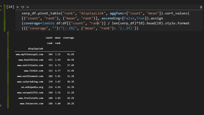
After explaining the Pivot Table method of Pandas while measuring the topical coverage of the domains (sources), we can also show the method with the “groupby”.
serp_df.groupby("displayLink")["rank"].agg(["count","mean"]).sort_values(by="count", ascending=False).assign(coverage=lambda df:df["count"]/len(serp_df)*10).style.format({"coverage":"{:.1%}","count":'{:.1f}', "mean":"{:.3f}"})Explanation of the “groupby” method is below.
- Group data frame with “displayLink” column values.
- Use “agg()” method to aggregate the data with “mean” and “count” values.
- Sort values with the “sort_values” method.
- Use assign to create a new column.
- Use the lambda function to create the value of the new column.
- Use “style.format()” for creating the format and style of the new created column. (“coverage”)
You can see the result below.
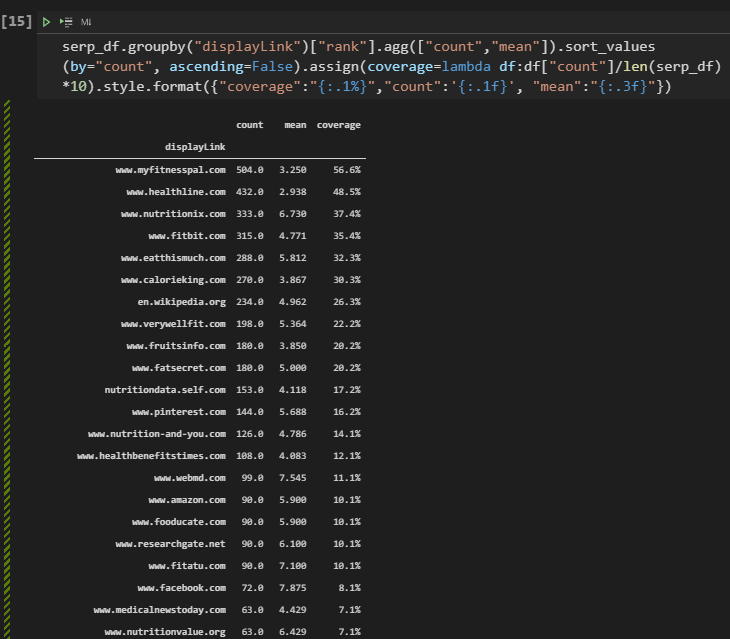
“Mean” column has “three more decimal points” after the “,” because we have used “mean:{:.3f}” And, we have more than 10 rows because we didn’t use the “head(10)” method and argument.
Conclusions from the Topical Coverage and Topical Authority measurement.
- Healthline has the best second topical coverage.
- Healthline has the best average ranking.
- Healthline has ranked 432 of the queries.
- MyFitnessPal has the best topical coverage.
- MyFitnessPal has the best second average ranking.
- MyFitnessPal 504 of the queries.
- We have “nutritionvalue”, “calorieking”, “fatsecret” as alternative competitors.
- We also see that Facebook and Wikipedia have coverage.
- We see that “WebMD” also on the competitor list.
Now, we can check which queries are being ranked by Healthline while MyFitnessPal is not ranking, or which queries exist that don’t include any of the main competitors. What are the differences between Healthline and MyFitnessPal in terms of content structure, or response size? We will examine lots of things in the context of SEO and Data Science.
How to Extract Best 10 Domain from SERP Data for Thousands of Queries?
Since we acquired a lot of information, we can start visualizing some of the important aspects. To extract the best top 10 domains from the SERP Data, you can use the code block below. The purpose of this section is below.
- Taking the first 10 Domains
- Filtering the serp_df for these domains.
top10_domains = serp_df.displayLink.value_counts()[:10].index
top10_df = serp_df[serp_df['displayLink'].isin(top10_domains)] - We have created a variable with the name of “top10_domains” and we have taken the most used values in the “displayLink” section. We have taken the first 10 indexes.
- We have filtered the “serp_df” with the “isin” method to take only the rows that include the top 10 domains in their “displayLink” column.
Below, you will see the related output.
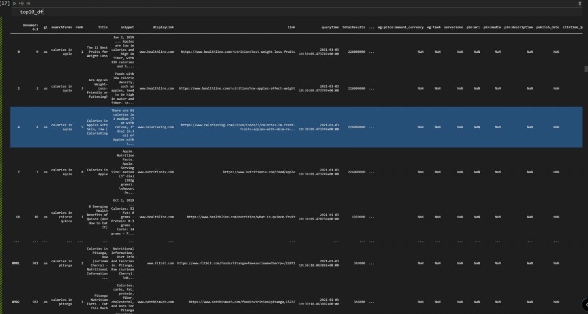
Visualization of the Top 10 Domains’ Organic Search Performance on the SERP with Matplotlib and Plotly
After extracting the top 10 domains and their organic search performance data with Pandas filtering methods, we can visualize the general situation. First, we will use Matplotlib for visualization.
fig, ax = plt.subplots(facecolor='#ebebeb')
fig.set_size_inches(18, 10)
ax.set_frame_on(False)
ax.scatter(top10_df['displayLink'].str.replace('www.', ''), top10_df['rank'], s=850, alpha=0.01, edgecolor='k', lw=2)
ax.grid(alpha=0.25)
ax.invert_yaxis()
ax.yaxis.set_ticks(range(1, 11))
ax.tick_params(labelsize=15, rotation=9, labeltop=True, labelbottom=False)
ax.set_ylabel('Search engine results page rank', fontsize=16)
ax.set_title('Top 10 Domains for Calorie and Nutrition of Culinary Fruits', pad=95, fontsize=24)
ax.text(4.5, -0.5, 'Organic Search Rankings for the All Queries',
ha='center', fontsize=15)
fig.savefig(ax.get_title() + '.png',
facecolor='#eeeeee', dpi=150, bbox_inches='tight')
plt.show()
A summary of the code block above is below.
- In the first line, we have created a subplot, determined the face color of the plot.
- We have determined the resolution of the plot.
- We have determined that the color of the frame and the color of the borders of the frame will be the same
- We have used “ax.scatter” for creating a scatter plot. Since we have used multiple columns, the number of the “ax” is being determined by the count of the “displayLink” unique value.
- We have inverted the “Y-Axis”.
- We have set the range for the y axis labels.
- We have used “tick_params” for styling.
- We have used “set_ylabel” for putting a label to the y axis.
- We have used “set_title” to create a plot title.
- We have used the “ax.text()” method for putting a custom text to the determined place.
- We have saved the figure with its name.
- We have called our result.
You can see the result below.
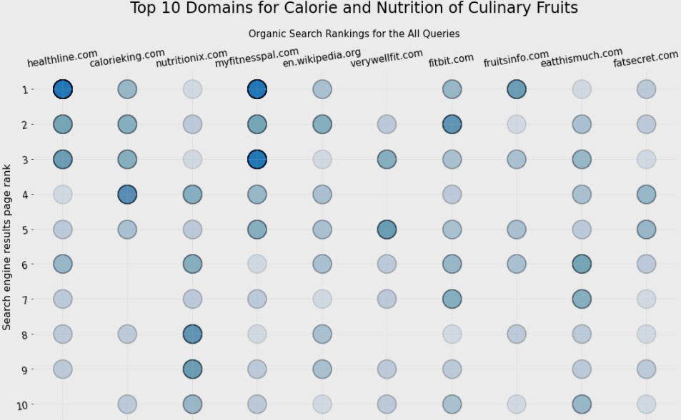
The graph above shows which domain has more results at which rank. It uses “intensity of the bubbles” as the corresponding value count. And, we can see that “Healthline” and “MyFitnesPal” are competing with each other for the first three rankings.
Visualizing the Top Domains’ SEO Performance with Plotly Express
Instead of using a static table, we can use interactive visuals in Python. Interactive visuals and graphs from Plotly can give more opportunities the examine and grasp the value of the data. It also gives an opportunity for hovering on data and examine more dimensions. Below, you will see an example.
top10_df["size_of_values"] = 35 ## Giving size to the "bubbles"

fig = px.scatter(top10_df, x='displayLink', y="rank", hover_name=top10_df['displayLink'].str.replace("www.",""), title = "Top 10 Domains Average Ranking for Culinary Fruits", width=1000, height=700, opacity=0.01, labels={"displayLink": "Ranked Domain Name", "rank":"Ranking"},template="simple_white", size="size_of_values", hover_data=["searchTerms"])
fig['layout']['yaxis']['autorange'] = "reversed"
fig.update_yaxes(showgrid=True)
fig.update_xaxes(showgrid=True)
fig.update_layout(font_family="OpenSans", font=dict(size=13, color="Green"))
fig.layout.yaxis.tickvals=[1,2,3,4,5,6,7,8,9,10]
fig.show()
Explanation of the methodology is below.
- We have created a new column with the name “size_of_values”. It is for the sizes of the values on the plot.
- We have used “px.scatter” to create a scatter plot. We have used domain names at the “x-axis”.
- We have used “rank” values in the y axis.
- We have used domains’ names as the hover name.
- We have set a title, determine the opacity, height, width values.
- We have changed the names of the labels.
- We have determined the color palette which is “simple_white”.
- We have chosen “searchTerms” as the hover data.
- We have reversed the Y-Axis.
- We have used “grids” on both axes.
- We have updated the font family, size, and color.
- We have put the “y-axis ticks”.
- We have called our graph.
This methodology includes less code and more data. It is similar to an Unique Mentor’s quote, “Do more, with less”. You can see the result below.
In the next section, we will take and compare the relevant page count of the sources.
Taking Relevant Total Result Count per Top 10 Domains and Queries
Total result count per domain is a signal for the overall relevance and prominence of the source for a specific topic or phrase. If you search for “apple” while filtering search results for only “Apple (Company)”, you will see an important amount of search results that talk about a specific entity. Thus, if we filter search results per domain with per query, and sum them all, we can see how well these sources are relevant to these semantic queries.
In other words, the total Result Count per query and domain can show how well a domain focuses on a specific topic. If the total result count is high, it means that they have more related search results and better overall relevancy for the topic.
resultperdomain = adv.serp_goog(cx=cse_id, key=api_key, q=culinary_fruits_queries[:6], siteSearch=top10_df['displayLink'][:10].tolist(), siteSearchFilter="i")We have created a new variable with the name “resultperdomain”. We have used “siteSearchFilter” to filter the results per domain, we have used the “i” value with this parameter which means “include”. We have used multiple values for the “siteSearch” parameter which is the best 10 domain. Thus, we have acquired the best 10 domains’ results only for the first 6 queries from our semantic search query network.
resultperdomain.to_csv("resultperdomain_full.csv")
resultperdomain = pd.read_csv("resultperdomain.csv")
Above, we have exported and read the document so that we can use it in the future without performing the same query.
cm = sns.light_palette("blue", as_cmap=True)
pd.set_option("display.max_colwidth",30)
resultperdomain[["displayLink","title","snippet","totalResults","searchTerms"]].head(40).sort_values("totalResults", ascending=False).style.background_gradient(cmap=cm)
We have used “sns.light_palette()” method to highlight the related column. We have changed the maximum “colwidth”, and we have taken the most important columns. Below, you can see the relevant result page count per domain.
Taking Related Result Examples for Only One Domain
We also can take related results only for one source to see how many different pages they have, and how they approach to the specific topic.
pd.set_option("display.max_colwidth",100)
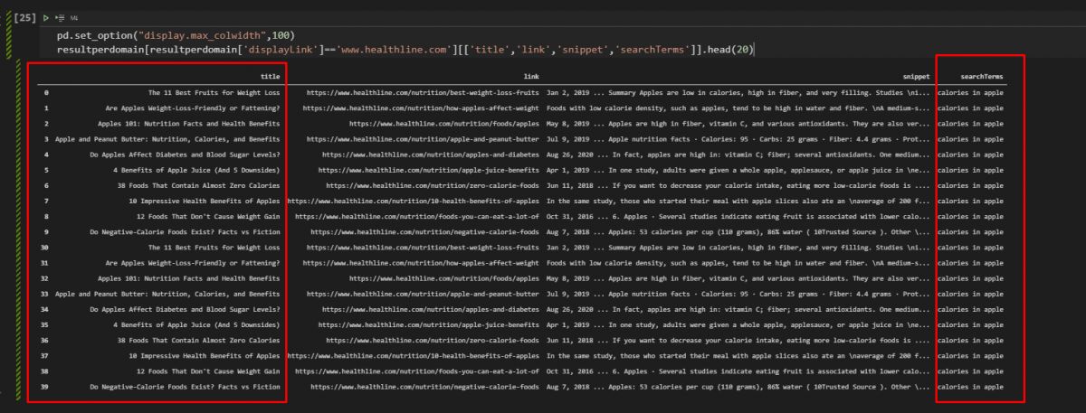
resultperdomain[resultperdomain['displayLink']=='www.healthline.com'][['title','link','snippet','searchTerms']].head(20)
We can changed the maximum “coldiwth”.
We have filtered the data frame for only “healthline.com”, and thaken only the “title”, “link”, “snippet”, and “searchTerms” data. Below, you can see the result.
How to Visualize Total Result Count per Domain for a Semantic Search Query Network?
Visualization helps to understand the data in a better way. The same data can be explained with different sentences or different visuals. SEO Data Visualization is important to extract better and descriptive insights from SEO data frames. In this example, we will use “Treemaps” and “Bar plots” to compare domains’ result count for these semantic search queries. And, at the end of this visualization section, you will see that, there are multiple and effective ways for comparing different results.
Filtering the SEO Performance Data for Visualization of Total Result Count Per Domain
To perform a successful SEO Data Visualizations, we should filter the data first. Below, you will see the relevant and necessary columns filtered.
resultperdomain[["displayLink",'link','totalResults']]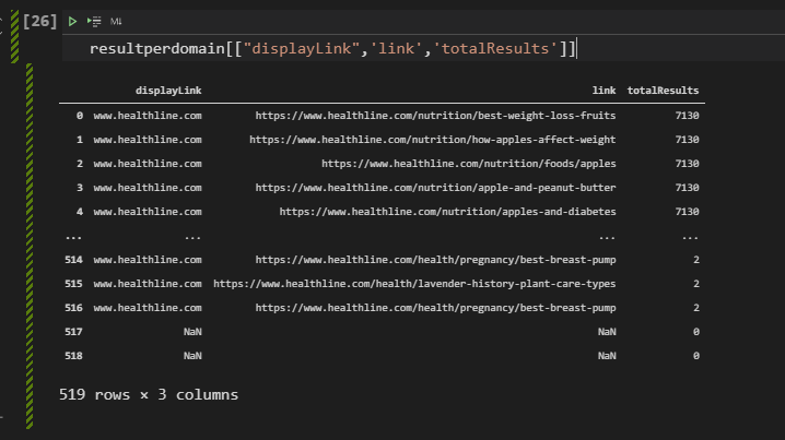
We have taken the “displayLink”, “link”, and “totalResults” columns while filtering results. Below, you will see that we are creating the necessary data frame for visualization.
top10_df[['displayLink','totalResults']].pivot_table("totalResults", "displayLink", aggfunc=np.sum).sort_values("totalResults",ascending=False)[:10]We have created a new pivot table from “totalResults” and “displayLink” columns while summing all of the total results with the “aggfunc=np.sum” parameter. We have sorted values according to the “totalResults” and sorting them in an ascending way.

Above, you will see the outcome of our code block.
Visualization of Total Result Count Per Domain with Plotly
After filtering and aggregate the data, we can use matplotlib to visualize it. You will see a function blog below to visualize total result count per domain in a horizontal bar plot.
total_results = top10_df[['displayLink','totalResults']].pivot_table("totalResults", "displayLink", aggfunc=np.sum).sort_values("totalResults",ascending=False)[:10]
plt.figure(figsize=(10,10))
plt.barh(total_results.index, total_results['totalResults'])
plt.xlabel("Domain Names")
plt.ylabel("Total Result Amount for Per Query and Per Domain")
plt.tick_params(labelsize=10)
plt.tight_layout()
plt.grid(axis="x")
plt.show()
Below, you can see all the related explanation for this matplotlib function call.
- Created a new variable, called “total_results”.
- Assigned it the first 10 results of our previously filtered data frame.
- Set figure size as “10×10”.
- Used “plt.barh” method for creating a horizontal bar plot.
- Put the x-axis label as “Domain Names”.
- Put the y-axis label as “Total Result Count for per Query and Per Domain”.
- Put the “xtick” values with “tick_params”.
- Used tight layout with “plt.tight_layout()”.
- Used grid design with “plt.grid(axis=”x”).
- Called the horizontal bar plot result.
You can see the relevant output and function call from the VSCode screenshot.
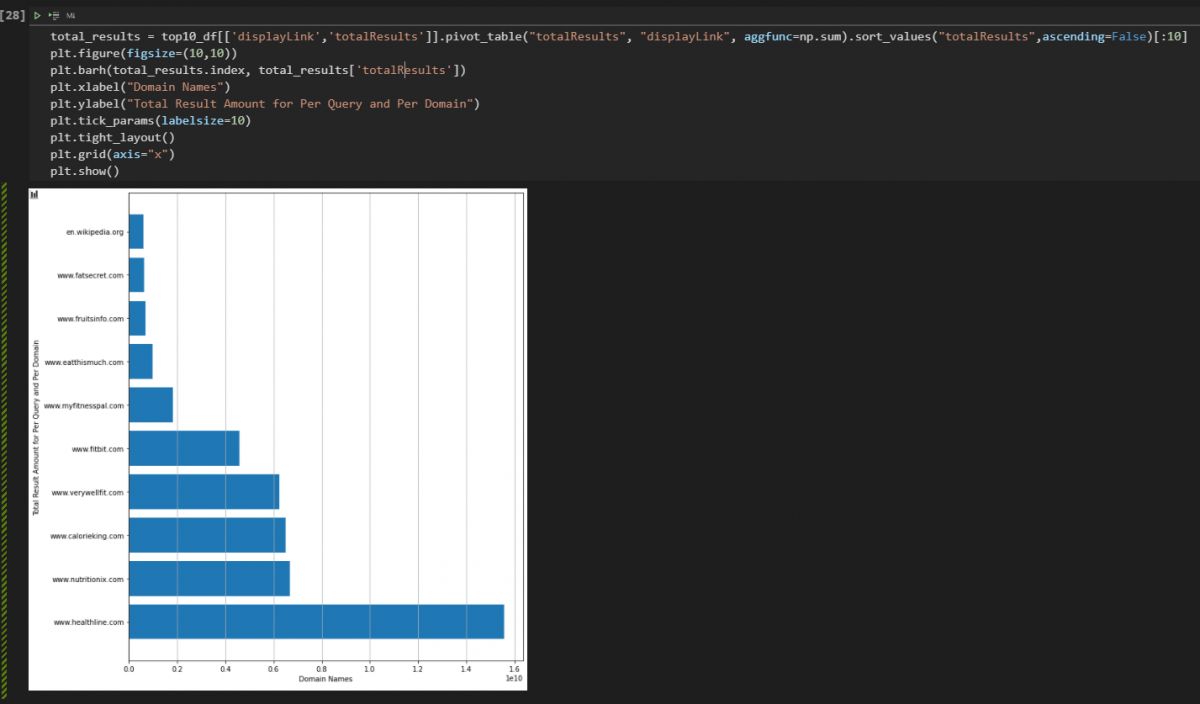
We see that the visual is consistent with the data that we have filtered and summed from our data frame.
Visualization of the Relevant Result Count for per Queries and Top 10 Domains with Plotly
Visualization of the relevant result count can be done as interactive way with Plotly. You will see that we have less code with a better descriptive SEO data visualization below.
fig = px.bar(top10_df, x="totalResults", y="displayLink", orientation='h',color="searchTerms", hover_data=["totalResults", "displayLink","link","searchTerms"], hover_name="displayLink", title="Result Count for Queries per Domain", height=500, width=1000)
fig.show()
There are only two lines of code here for doing the same task. Explanation is below.
- We have created a variable which is “fig”, assigned it to the outcome of “px.bar()” method, we have chosen our data frame, x and y-axis values, the orientation of the plot.
- We have colored the plot while categorizing every output with different queries thanks to “color=’searchTerms'”, we have chosen our data to be shown after the hover effect along with the name to be shown.
- We have put a title and called our interactive total result count per domain and query chart.
You can see the result below.
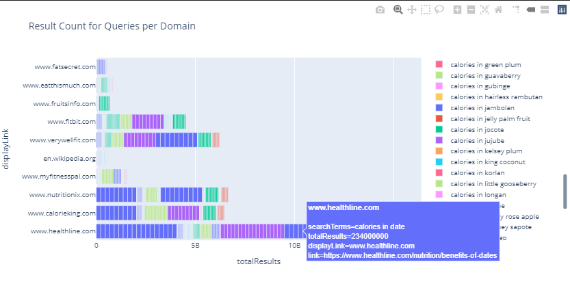
To show the outcome in a more descriptive way, we have put an image and video at the same time. As you can see we can check every query, result count for a specific URL from a domain, total result count, and search queries’ importance.
We see that the most result count belongs to the Healthline as source, and “calories in apple” as the query. Again, this shows the prominence of the source and query at the same time.
Visualization of Total Relevant Ranked Page Count per Domain
Page count is an indicator that shows how much content a source has for a specific topic. It basically shows how well different domains focus on the same topic, or how well they structure their content for these sub-topics. You can see the methodology to extract the page count for these queries per source (domain).
page_count = resultperdomain['displayLink'].value_counts().to_frame() # .style.background_gradient(cmap="viridis")
page_count
You can see the explanation of the code block below.
- We have created a variable, called “page_count”. We have assigned our “resultperdomain” dataframe’s “displayLink” columns’ values’ summed version within a data frame to it.
- We have called the data frame.
You can see the result below.

To visualize the total page count for these queries from every source, using a pie chart is the best option. Pie chart is usually used for showing the share of different sources or competitors over a market or area of industry. In this case, it will show the sources’ page count, and the page count will show the possible content granularity and sources’ size for SEOs. Below, you will see a simple pie chart creation example with Plotly Express.
fig = px.pie(page_count, values='displayLink', names=page_count.index, title='Relevant Page Count Per Domain')
fig.show()
The explanation of this code block is below.
- We have created a variable, “fig”.
- We have assigned the “px.pie()” outcome to it.
- We have chosen the data frame, “page_count” data frame.
- We have used the “displayLink” as values for the pie chart.
- We have chosen the domain names as the labels with the “page_count.index”.
- We have chosen the title of the pie chart which is “Relevant Page Count Per Domain”.
- We have called the pie chart.
Below, you can see the pie chart example that shows the page count of sources for “the culinary fruit queries”.
We see that “healthline” has more pages than its competitors. Result count, page count, topical coverage and average ranking has a correlation with each other. It doesn’t mean that the “more pages” is better. It means that more semantic pages for semantic queries is better. But, in the future sections of this SEO Data Science tutorial, you will see that “Healthline” and “MyFitnessPal” have strategic differences in their websites. Let’s continue.
Checking and Visualizing First Three Results for a Specific Domain with Pandas and Plotly
We can check which domain has how many rankings in the first three results. Below, you will see a simpledata filtering example for the necessary visualization.
serp_df[serp_df['displayLink'] == "www.healthline.com"][['rank',"link", "searchTerms"]]We have filtered the “rank”, “link”, “searchTerm” columns for only the “healthline.com”. You can see the result below.
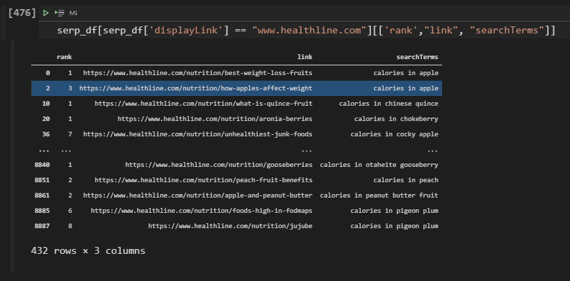
Besides filtering the results for only one domain, we can filter all the sources according to a specific Search Engine Results Page ranking range. In this example, we will create a new variable to encapsulate all the results within the first three ranks.
top_3_results = resultperdomain[resultperdomain['rank'] <= 3]
px.bar(top_3_results, x='displayLink', y='rank', hover_name="link", hover_data=["searchTerms","link","title"], color="searchTerms", title="Visualization of Rankings per Query for Competitors: Only for the First Three Ranks",labels={"rank":"Rank", "displayLink":"Domain Names","searchTerms": "Query", "totalResults":"Result Count","displayLink":"Domain Name","link":"URL", "title":"Title"})
#color is optional
You can find the explanation below.
- Created a variable, “top_3_results”.
- Assigned the rows that include a result within the first three ranks with filtering the “rank” column.
- We have called the “px.bar()” method.
- Determined the titles, labels, x, and y-axis values, hover data, and hover names.
You can see the result below in an interactive way.
We see that Healthline has more results within the first three rankings, the main reason for this is Healthline’s topical authority, topical coverage, content detail level, and content count for the related queries.
Checking and Visualizing 4-10 Results for a Specific Domain with Pandas and Plotly
We also can check the last 4-10 results for comparing the general situation of the rankings for different domains with Python and data science. And, you can indirectly calculate how much percentage of a domain’s content is in the first 3 ranks or not.
_4_10_results = resultperdomain[resultperdomain['rank'] >= 3]
px.bar(_4_10_results, x='displayLink', y='rank', hover_name="link", hover_data=["searchTerms","link","title"], color="searchTerms",title="Visualization of Rankings per Query for Competitors: Only for Last Seven",labels={"rank":"Rank", "displayLink":"Domain Names","searchTerms": "Query", "totalResults":"Result Count","displayLink":"Domain Name","link":"URL", "title":"Title"},height=600, width=1000)
Below, you can see the interactive results with Plotly Express. The only difference of this code block is the character “>” in the filtering code line.
We see that Healthline has nearly 1200 content in the 4-10 rankings. And, Calorieking.com’s content is usually in the 1-3 rankings, more than 4-10. It might worth to look at their content since their success rate is a little bit better for these queries despite their low topical coverage.
Checking and Visualizing Rankings for Only One Domain
We can check and visualize all of the rankings for only one domain with Plotly Express and Data Science. Below, you will see the all the rankings with URL and Query information for only “Healthline.com”.
healthline_results = resultperdomain[resultperdomain['displayLink'] == "www.healthline.com"]
fig = px.bar(healthline_results, x="displayLink", y="rank", facet_col="rank", template="plotly_white", height=700, width=1200,hover_name="link", hover_data=["searchTerms","link","title"],
            color="searchTerms", labels={"rank":"Rank", "displayLink":"Domain Names","searchTerms": "Query", "totalResults":"Result Count","displayLink":"Domain Name","link":"URL", "title":"Title"})
fig.update_layout(
    font_family="Open Sans",
    font_color="black",
    title_font_family="Times New Roman",
    title_font_color="red",
    legend_title_font_color="green",
    font=dict(size=10)
)
fig.show()
To visualize a domain’s ranking data, the explanation is below.
- Create a new variable.
- Assign the filtered search results to the variable.
- Create a “figure variable” and assign the “px.bar()” method’s output to that variable.
- Determine the data frame to be visualized, x-y axes values, hover data-name, color categorization, labels, and title.
- Determine font family, color, title font, legend title with “fig.update_layout()”.
- We have determined the “facet_col” as “rank” so that we can categorize the output for different rankings.
- We have used “searchTerms” for the “color” parameter so that we can compare the different SERPs’ situations.
- We have used “plotly_white” as the color theme of the entire plot.
- We have used “query”, “link” and “title” to examine the hover effect.
- We have used the “labels” parameter within a dictionary to change the value parameters’ names.
- Call the figure with “fig.show()”.
We see that Healthline actually has more content at the first three results. Instead of focusing on the height of the bar, you should check the count of the horizontal lines. In the future section, you will see a density heatmap example for a better SEO data visualization example.
Visualizing All Ranking Performance for Top 10 Domains with Colors and Bars
To visualize the all domains’ and websites’ performance, we can use the same methodology as below.
top10_df.sort_values('rank', ascending=True, inplace=True)
fig = px.bar(top10_df, x="displayLink", y="rank", color="rank", height=500, width=850, hover_name=top10_df["link"], hover_data=["searchTerms","link","title"],labels={"rank":"Rank", "displayLink":"Domain Names","searchTerms": "Query", "totalResults":"Result Count","displayLink":"Domain Name","link":"URL", "title":"Title"})
fig.update_layout(title="Top 10 Domains and their Rankings",xaxis_title="Domain Names", yaxis_title="Ranking of Results Based on Domains with Colors", height=400, width=1200)
fig.show()
#density_heatmap (Optional)
The explanation for visualizing the ranking situation of every domain on the SERP for certain queries is below with a simplified version.
- We have sorted the “top10_df” according to the “rank” column, as ascending.
- Determined the data frame, columns, colors, labels, titles, hover data and hover name.
Below you can see all rankings for the best performing top 10 domains for the culinary fruits queries in the Google Search and their performance. We see that Healthline is better but “MyFitnessPal” has a higher bar. It is because, we are using a bar chart, and for me examining the entire SERP is easier within a bar chart, despite this handicap.
Because, when I hover the mouse over a section of a bar, I can see the query, rank data, and URL of the landing page. And, in this example we have used “rank” for the “color” parameter, that’s why we have a kind of color map. The deep purple means the “1” and the clear yellow color means the 10. Thus, we also can check the rankings, but in this example, we don’t have different colors for different queries. That’s why while planning a chart, determining the purpose of the data is important.
The example above is not detailed enough because it is only for the first 6 queries. Below, you will see another example for all of the queries within our semantic search queries example.
As you can see, we have a bigger darker color for the Healthline and MyFitnessPal again, it is because their general ranking situation is between 1-3. And, we have more “horizontal lines” within their bars, which is a signal for the content count. And, it is a good example to show how data amount can affect the overall aspect of the general situation.
Using Density Map for Organic Search Performance Comparison between Different Domains
If you don’t want to use the bar chart for the general situation of the SERP. You can use a density heatmap. The density heatmap will change its color scale according to the intensity and characters of the data points. In this example, if a domain has more ranked results, it will have a clear color, if it has a fewer count, the color will be darker. You can see the related code block below.
top10_df.sort_values('rank', ascending=True, inplace=True)
fig = px.density_heatmap(top10_df, x="displayLink", y="rank", height=500, width=850, hover_name=top10_df["link"], hover_data=["searchTerms","link","title"],labels={"rank":"Rank", "displayLink":"Domain Names","searchTerms": "Query", "totalResults":"Result Count","displayLink":"Domain Name","link":"URL", "title":"Title"})
fig.update_layout(title="Top 10 Domains and their Rankings",xaxis_title="Domain Names", yaxis_title="Ranking of Results Based on Domains with Colors", height=400, width=1200)
fig.show()
To create a desnity heatmap with Python, you can use the instructions below.
- Sort the data frame according to the visualized column (“rank”).
- Create a variable (fig).
- Use “px.density_heatmap()” method.
- Determine the data frame (“top_10df”).
- Determine the x and y values (“displayLink”, “rank”)
- Determine the height and width parameter values.
- Determine the information that will be shown after the hover effect (“SearchTerms”, “link”, “title”)
- Determine the name that will be shown after the hover effect (“link”).
- Determine the labels with the “label” parameter, and title with the “fig.update_layout()” method.
- Call the figure, with the “fig.show()”.
You can see the interactive result below.
You can see that the overall results are similar to the results only for the first 6 queries. That’s why all the SERPs is semantic. Because Topical Authority can be felt from the first query to the last one.
You can see that, Healthline and MyFitnessPal has the best possible color balance in terms of organic search performance.
Visualization for All Domains via Treemap
Treemaps can show the overall situation of the SERP in a “shared aspect”. In other words, every attribute will have a different size according to the quantity that they have. In this example, we will use “Treemap Data Visualization” for visualizing the total result count and ranked query count of all domains and result count for all these domains.
average_df = serp_df.pivot_table("rank", "displayLink", aggfunc=["count", "mean"]).sort_values([("count", "rank"), ("mean", "rank")], ascending=[False,True])
average_df
“average_df” is the variable that we created for aggregating the total ranked query count and average ranking. You can see it below.

Below, you will see the same example with all the data.
ranked_query_count = pd.DataFrame(list(average_df[('count', 'rank')]), index=average_df.index)
column_name = "Ranked_Count"
ranked_query_count.columns = [column_name]
ranked_query_count
We have used the “pd.DataFrame()” method with a “list()” method for a specific column of the created data frame so that we can avoid the Data Frame Constructor error. Below, you can see the created data frame.

Below, you will see a more simple data frame for the data visualization.
ranked_query_count = pd.DataFrame(list(average_df[('count', 'rank')]), index=average_df.index)
column_name = "Ranked_Count"
ranked_query_count.columns = [column_name]
ranked_query_count
We have just the domain names and ranked query counts. We have used the index of the “average_df” data frame that we have created at the previous code block. You can see the result below.
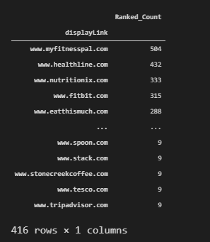
After creating the right data frame, we can visualize the total result count per domain to see their topical coverage in terms of SEO.
fig = px.treemap(ranked_query_count, path=[ranked_query_count.index], values="Ranked_Count", height=800, width=1500, title="Ranked Query Count for the Queries per Domain")
fig.show()
We have used the “px.treemap()” method from Plotly Express. To create the treemap visualization with plotly, the most important two parameters are “values” and “path”. So that Plotly can know what to show in the name section, and what to show for values. Values’ size will affect the treemap sections’ sizes. Below, you can see the result.
Visualization of Ranked Query Count for the Queries Per Domain as a Treemap
Like the visualization of the ranked query count, we can visualize the total result per domain. You can see the methodology below.
fig = px.treemap(serp_df, path=["displayLink"], values="totalResults", height=800, width=1500, title="Result Count for the Queries per Domain" )
fig.show()
To visualize the total result count per domain, we have used the “ranked_query_count.index” value for the “path” parameter. Because all of the values for the domain names were an index of the “ranked_query_count” data frame’s index. You can see the related result below.
Visualization of Total Results and Domain Coverage Side by Side
This is one of the most complicated code blocks in the Data Science and Visualization for SEO tutorial. It uses plotly graph objects and also the “make_subplots” method. If you read every code block, I am sure that you will understand. Visualizing the two different data points side by side helps an SEO to understand better the SEO-related data. Until now, we have visualized the total result count and total ranked query count one by one. Below, you will see how to visualize them side by side.
import plotly.graph_objects as go
from plotly.subplots import make_subplots
import numpy as np

# Creating two subplots
fig = make_subplots(rows=1, cols=3, shared_xaxes=True,
                    shared_yaxes=False, vertical_spacing=0.001)

fig.append_trace(go.Bar(
    x=top10_df['totalResults'],
    y=top10_df['displayLink'],
    marker=dict(
        color='rgba(50, 171, 96, 0.6)',
        line=dict(
            color='rgba(50, 171, 96, 1.0)',
            width=1),
    ),
    name='Total Relevant Result Count for the Biggest Competitors',
    orientation='h',
), 1, 1)

fig.append_trace(go.Scatter(
    x=ranked_query_count['Ranked_Count'], y=ranked_query_count.index[:11],
    mode='lines+markers',
    line_color='rgb(128, 0, 128)',
    name='Best Domain Coverage with Ranked Query Count',), 1, 2)


fig.update_layout(
    title='Domains with Most Relevant Result Count and Domains with Better Coverage',
    yaxis=dict(
        showgrid=False,
        showline=False,
        showticklabels=True,
        domain=[0, 0.85],
    ),
    yaxis2=dict(
        showgrid=False,
        showline=True,
        showticklabels=False,
        linecolor='rgba(102, 102, 102, 0.8)',
        linewidth=2,
        domain=[0, 0.85],
    ),
    xaxis=dict(
        zeroline=False,
        showline=False,
        showticklabels=True,
        showgrid=True,
        domain=[0, 0.42],
    ),
    xaxis2=dict(
        zeroline=False,
        showline=False,
        showticklabels=True,
        showgrid=True,
        domain=[0.47, 1],
        side='top',
        dtick=200,
    ),
    legend=dict(x=0.029, y=1.038, font_size=10),
    margin=dict(l=100, r=20, t=70, b=70),
    paper_bgcolor='rgb(248, 248, 255)',
    plot_bgcolor='rgb(248, 248, 255)',
)


fig.show()
A brief and simple explanation for this code block is below.
- We have created a subplot with two rows.
- We have used “append_trace” to append the different graphs to the same subplot.
- We have used “go.Bar()” for creating a different data frame with a bar plot.
- We have used “go.Scatter()” for creating a line plot.
- We have determined the positions of two different plots.
- We haev used “fig.update_layout()” to determine the layout changes.
- We have called the visualization.
You can see the result below.
In the next section, we will try to understand the correlation of the words in the title tags and their rankings.
Analysing the SERP Dimensions with Data Science in a Deeper Level
Search Engine Results Pages data can be gathered from Google and can be used with Data Science to understand the On-Page SEO Elements. For instance, we can check which words are being more used in title tags, descriptions, URLs. You will find a list of things to be examined in this section below.
- Most used anchor texts
- Most used words in title, front-title, and end-title.
- Most used words in descriptions, snippets.
- First used words in the content.
- Entity count within the landing pages’ content.
- Entity types within the landing pages’ content.
There will be more things to cover during this section, you will see them too.
Analyzing Title Tags on the SERP for Understanding Word and Ranking Correlations
Title tags have different types, characters according to the their industry differences, or purposes. They can have dates, numbers, currencies, exact answers, power words within them. They can be eye-catching or they can be descriptive or they can include questions. Below, you will see the most used words within the title tags for all of these queries and domains.
serp_df[['rank','title']]We have filtered our data frame to check the titles and row count generally.
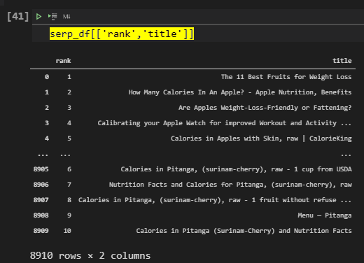
Below, you will see how to calculate the most used words and their ranks.
serp_df['title'].str.split(' ').to_frame().assign(rank=serp_df['rank'], count=1).explode('title').groupby(['rank', 'title']).count().reset_index().rename(columns={'title':'word'}).sort_values(['rank', 'count'], ascending=[True,False]).reset_index(drop=True).query('rank==1')[:40].style.background_gradient(subset=['count'], cmap='viridis')Explanation of this code block is below.
- Chose a column.
- Use the “str” method with the “split” method.
- Put it into a frame so that we can create a new column with “assign”.
- Create another column to calculate the “counts”.
- Create a new column and use the explode method to explode every word with their indexes.
- Use “groupby()” and “count()” methods to group the data frame based on “rank” data and the used words within titles.
- Change the column names and drop the index, sort the values again.
- Use the “query” methods for taking only the first rank results.
- Style the background of the data frame.
You can see the result below.
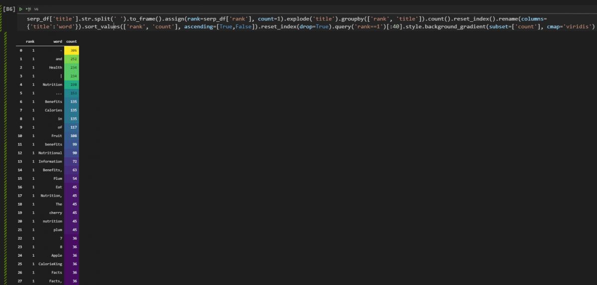
As you can see we have stop words and punctuations here, we will need to clean them. But, before cleaning them you can see that at the first rank for all of these queries, the word “Health, Nutrition, Benefits, Fruit” were the most used words.
Extracting the Most Used Words in Titles with Counts and Rankings for the Top 10 Results
Below, you will see how to extract the most used words within the title tags of landing pages with Pandas for the top 10 search results.
rank1 = serp_df['title'].str.split(' ').to_frame().assign(rank=serp_df['rank'], count=1).explode('title').groupby(['rank', 'title']).count().reset_index().rename(columns={'title':'word'}).sort_values(['rank', 'count'], ascending=[True,False]).reset_index(drop=True).query('rank==1')[:15] #.style.background_gradient(subset=['count'], cmap='viridis')
rank2 = serp_df['title'].str.split(' ').to_frame().assign(rank=serp_df['rank'], count=1).explode('title').groupby(['rank', 'title']).count().reset_index().rename(columns={'title':'word'}).sort_values(['rank', 'count'], ascending=[True,False]).reset_index(drop=True).query('rank==2')[:15]
rank3 = serp_df['title'].str.split(' ').to_frame().assign(rank=serp_df['rank'], count=1).explode('title').groupby(['rank', 'title']).count().reset_index().rename(columns={'title':'word'}).sort_values(['rank', 'count'], ascending=[True,False]).reset_index(drop=True).query('rank==3')[:15]
rank4 = serp_df['title'].str.split(' ').to_frame().assign(rank=serp_df['rank'], count=1).explode('title').groupby(['rank', 'title']).count().reset_index().rename(columns={'title':'word'}).sort_values(['rank', 'count'], ascending=[True,False]).reset_index(drop=True).query('rank==4')[:15]
rank5 = serp_df['title'].str.split(' ').to_frame().assign(rank=serp_df['rank'], count=1).explode('title').groupby(['rank', 'title']).count().reset_index().rename(columns={'title':'word'}).sort_values(['rank', 'count'], ascending=[True,False]).reset_index(drop=True).query('rank==5')[:15]
rank6 = serp_df['title'].str.split(' ').to_frame().assign(rank=serp_df['rank'], count=1).explode('title').groupby(['rank', 'title']).count().reset_index().rename(columns={'title':'word'}).sort_values(['rank', 'count'], ascending=[True,False]).reset_index(drop=True).query('rank==6')[:15]
rank7 = serp_df['title'].str.split(' ').to_frame().assign(rank=serp_df['rank'], count=1).explode('title').groupby(['rank', 'title']).count().reset_index().rename(columns={'title':'word'}).sort_values(['rank', 'count'], ascending=[True,False]).reset_index(drop=True).query('rank==7')[:15]
rank8 = serp_df['title'].str.split(' ').to_frame().assign(rank=serp_df['rank'], count=1).explode('title').groupby(['rank', 'title']).count().reset_index().rename(columns={'title':'word'}).sort_values(['rank', 'count'], ascending=[True,False]).reset_index(drop=True).query('rank==8')[:15]
rank9 = serp_df['title'].str.split(' ').to_frame().assign(rank=serp_df['rank'], count=1).explode('title').groupby(['rank', 'title']).count().reset_index().rename(columns={'title':'word'}).sort_values(['rank', 'count'], ascending=[True,False]).reset_index(drop=True).query('rank==9')[:15]
rank10 = serp_df['title'].str.split(' ').to_frame().assign(rank=serp_df['rank'], count=1).explode('title').groupby(['rank', 'title']).count().reset_index().rename(columns={'title':'word'}).sort_values(['rank', 'count'], ascending=[True,False]).reset_index(drop=True).query('rank==10')[:15]

united_rank = [rank1,rank2,rank3,rank4,rank5,rank6,rank7,rank8,rank9,rank10]
united_rank_df = pd.concat(united_rank, axis=0, ignore_index=False, join="inner")
united_rank_df
We have extracted the most used words within the titles for the first 10 results of the SERP. United all the results for every ranking with the “pd.concat()” method and called the data frame as below.
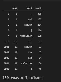
In the next section we will see how to visualize this data.
Visualization of the Most Used Words in the Titles for the first 10 Results
Below, you will see how to visualize the most used words within the title tags for the top 10 results with Plotly Express.
fig = px.bar(united_rank_df, united_rank_df['count'], united_rank_df['word'], orientation="h", width=1100,height=2000, color="rank", template="plotly_white", facet_row="rank", labels={"word":"Words", "count":"Count for the Words in the Title"}, title="Words and Their Count per Ranking")
fig.update_layout(coloraxis_showscale=False)
fig.update_yaxes(matches=None, categoryorder="total ascending")
We have created a bar chart with “px.bar()” method, used “orientation=”h”” method for horizontal bar creation. Determined the color scheme, weight height, and “faceol_row” as the “rank” so that we can visualize every data for different ranking separately. We have used “update_layout”
We see that the most important and general words are being used in the titles in the first three ranks more and in the last 7 ranks, the stop words and some separators are used more. And, to see this change in a more characteristic way, we can check the position of the words within the title tags.
First 4 Words in the Title Tags according to Their Rankings
The beginning section of a title and the end section of a title can be different from each other. Thus, we can use the same method for different ranking results and create ten different variables to encapsulate these data within them. Below, you will see that we take all the most used words within the titles and extract the first 4 of them.
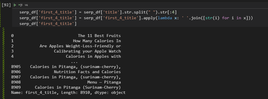
serp_df['first_4_title'] = serp_df['title'].str.split(" ").str[:4]
serp_df['first_4_title'] = serp_df['first_4_title'].apply(lambda x: ' '.join([str(i) for i in x]))
serp_df['first_4_title']
We have taken the titles of every landing page on the SERP, used the “str” and “split” method to chose the first four words of the titles. We have used a lambda function with the “join()” method and list comprehension so that we can create a new column with the last four words of the titles. You can see the result below.
Taking Frequencies of the Most Used Words in Titles with Their Rankings
After taking all of the last 4 words of the title tags of the landing pages, we can check the frequency of these words according to the ranking of their landing pages as below.
serp_df['first_4_title'].str.split(' ').to_frame().assign(rank=serp_df['rank'], count=1).explode('first_4_title').groupby(['rank', 'first_4_title']).count().reset_index().rename(columns={'first_4_title':'word'}).sort_values(['rank', 'count'], ascending=[True,False]).reset_index(drop=True).query('rank==1')[:15]The methodology here is actually the same as the one before. Basically, we are taking all of the last 4 words of our title tags and put them into another data frame with the “to_frame()” option, we create a new column that shows the count values and their rankings with the “assign()” method. Then, we group by the data frame according to the “rank” and “first_4_tityle” values, count all of the values, and then we are changing the column names, resetting the index, and sorting the values.
Below, you can see the result.
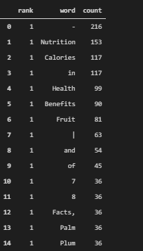
As we see that the most used words in the title tag’s beginning section and the most used words in the title tags in the first three results are correlative with each other. Because these words have better relevance for these semantic queries. As below, we can visualize the first four words of the title tags, as below.
Visualization of the First Four Words in the Titles with their Rankings
Visualization of the First Four Words in the title tags can be done as before. We will create “rank1_first_4” variables for every rank on the SERP. Then, we will use all these variables for the visualization by concatenating them within a data frame.
rank1_first_4 = serp_df['first_4_title'].str.split(' ').to_frame().assign(rank=serp_df['rank'], count=1).explode('first_4_title').groupby(['rank', 'first_4_title']).count().reset_index().rename(columns={'first_4_title':'word'}).sort_values(['rank', 'count'], ascending=[True,False]).reset_index(drop=True).query('rank==1')[:15]
rank2_first_4 = serp_df['first_4_title'].str.split(' ').to_frame().assign(rank=serp_df['rank'], count=1).explode('first_4_title').groupby(['rank', 'first_4_title']).count().reset_index().rename(columns={'first_4_title':'word'}).sort_values(['rank', 'count'], ascending=[True,False]).reset_index(drop=True).query('rank==2')[:15]
rank3_first_4 = serp_df['first_4_title'].str.split(' ').to_frame().assign(rank=serp_df['rank'], count=1).explode('first_4_title').groupby(['rank', 'first_4_title']).count().reset_index().rename(columns={'first_4_title':'word'}).sort_values(['rank', 'count'], ascending=[True,False]).reset_index(drop=True).query('rank==3')[:15]
rank4_first_4 = serp_df['first_4_title'].str.split(' ').to_frame().assign(rank=serp_df['rank'], count=1).explode('first_4_title').groupby(['rank', 'first_4_title']).count().reset_index().rename(columns={'first_4_title':'word'}).sort_values(['rank', 'count'], ascending=[True,False]).reset_index(drop=True).query('rank==4')[:15]
rank5_first_4 = serp_df['first_4_title'].str.split(' ').to_frame().assign(rank=serp_df['rank'], count=1).explode('first_4_title').groupby(['rank', 'first_4_title']).count().reset_index().rename(columns={'first_4_title':'word'}).sort_values(['rank', 'count'], ascending=[True,False]).reset_index(drop=True).query('rank==5')[:15]
rank6_first_4 = serp_df['first_4_title'].str.split(' ').to_frame().assign(rank=serp_df['rank'], count=1).explode('first_4_title').groupby(['rank', 'first_4_title']).count().reset_index().rename(columns={'first_4_title':'word'}).sort_values(['rank', 'count'], ascending=[True,False]).reset_index(drop=True).query('rank==6')[:15]
rank7_first_4 = serp_df['first_4_title'].str.split(' ').to_frame().assign(rank=serp_df['rank'], count=1).explode('first_4_title').groupby(['rank', 'first_4_title']).count().reset_index().rename(columns={'first_4_title':'word'}).sort_values(['rank', 'count'], ascending=[True,False]).reset_index(drop=True).query('rank==7')[:15]
rank8_first_4 = serp_df['first_4_title'].str.split(' ').to_frame().assign(rank=serp_df['rank'], count=1).explode('first_4_title').groupby(['rank', 'first_4_title']).count().reset_index().rename(columns={'first_4_title':'word'}).sort_values(['rank', 'count'], ascending=[True,False]).reset_index(drop=True).query('rank==8')[:15]
rank9_first_4 = serp_df['first_4_title'].str.split(' ').to_frame().assign(rank=serp_df['rank'], count=1).explode('first_4_title').groupby(['rank', 'first_4_title']).count().reset_index().rename(columns={'first_4_title':'word'}).sort_values(['rank', 'count'], ascending=[True,False]).reset_index(drop=True).query('rank==9')[:15]
rank10_first_4 = serp_df['first_4_title'].str.split(' ').to_frame().assign(rank=serp_df['rank'], count=1).explode('first_4_title').groupby(['rank', 'first_4_title']).count().reset_index().rename(columns={'first_4_title':'word'}).sort_values(['rank', 'count'], ascending=[True,False]).reset_index(drop=True).query('rank==10')[:15]

united_rank_first_4 = [rank1_first_4, rank2_first_4, rank3_first_4, rank4_first_4, rank5_first_4, rank6_first_4, rank7_first_4,rank8_first_4,rank9_first_4,rank10_first_4]
united_rank_first_4 = pd.concat(united_rank_first_4, axis=0, ignore_index=False, join="inner")

fig = px.bar(united_rank_first_4, 'count', 'word', orientation="h", width=1100,height=2000, color="rank", template="plotly_white", facet_row="rank",labels={"word":"Words", "count":"Count for the Words in the Titles"},  title="First Four Words in the Title Tags and Their Count per Ranking" )
fig.update_layout(coloraxis_showscale=False)
fig.update_xaxes(title_font=dict(size=25))
fig.update_yaxes(matches=None, categoryorder="total ascending",title_font=dict(size=25))
Below, you can see the most used words in the title tags’ first section or in the first 4 words of them according the ranking data.
In the visualization, we see that the most relevant and important queries are in the first section, and again the last ranking results have also stop words and more light terms in their titles according to the first ranking results. To prove this correlation, you can check the future section, basically, it will filter, aggregate, and visualize the last 4 words of the title tags.
Extracting the Last Four Words in Titles and Their Rankings
We will use the same methodology for the last four words in the title tags. We will check whether they include more stop words or not. We also will check the whether they include the important terms or not.
serp_df['last_4_title'] = serp_df['title'].str.split(" ").str[4:]
serp_df['last_4_title'] = serp_df['last_4_title'].apply(lambda x: ' '.join([str(i) for i in x]))
serp_df['last_4_title']
We have created a new column for the last 4 words in the title tags, we have used list comprehension, lambda function, and “join” method together to take the last 4 words. Below, you can see the result.
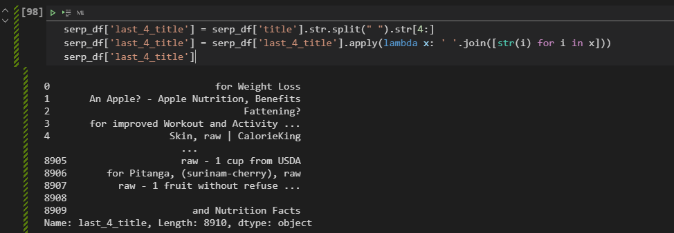
This time, before the aggregation, we will visualize the outcome, but if you want you can use the same methodology to visualize the difference.
Visualization of Last Four Words in Titles and Ranking Correlations
To visualize the last four words of the titles according to their ranking data, we can use the same methodology as below. We will create “rank1_last_4” variables ten times for every rank with the “query” method from Pandas.
rank1_last_4 = serp_df['last_4_title'].str.split(' ').to_frame().assign(rank=serp_df['rank'], count=1).explode('last_4_title').groupby(['rank', 'last_4_title']).count().reset_index().rename(columns={'last_4_title':'word'}).sort_values(['rank', 'count'], ascending=[True,False]).reset_index(drop=True).query('rank==1')[:15]
rank2_last_4 = serp_df['last_4_title'].str.split(' ').to_frame().assign(rank=serp_df['rank'], count=1).explode('last_4_title').groupby(['rank', 'last_4_title']).count().reset_index().rename(columns={'last_4_title':'word'}).sort_values(['rank', 'count'], ascending=[True,False]).reset_index(drop=True).query('rank==2')[:15]
rank3_last_4 = serp_df['last_4_title'].str.split(' ').to_frame().assign(rank=serp_df['rank'], count=1).explode('last_4_title').groupby(['rank', 'last_4_title']).count().reset_index().rename(columns={'last_4_title':'word'}).sort_values(['rank', 'count'], ascending=[True,False]).reset_index(drop=True).query('rank==3')[:15]
rank4_last_4 = serp_df['last_4_title'].str.split(' ').to_frame().assign(rank=serp_df['rank'], count=1).explode('last_4_title').groupby(['rank', 'last_4_title']).count().reset_index().rename(columns={'last_4_title':'word'}).sort_values(['rank', 'count'], ascending=[True,False]).reset_index(drop=True).query('rank==4')[:15]
rank5_last_4 = serp_df['last_4_title'].str.split(' ').to_frame().assign(rank=serp_df['rank'], count=1).explode('last_4_title').groupby(['rank', 'last_4_title']).count().reset_index().rename(columns={'last_4_title':'word'}).sort_values(['rank', 'count'], ascending=[True,False]).reset_index(drop=True).query('rank==5')[:15]
rank6_last_4 = serp_df['last_4_title'].str.split(' ').to_frame().assign(rank=serp_df['rank'], count=1).explode('last_4_title').groupby(['rank', 'last_4_title']).count().reset_index().rename(columns={'last_4_title':'word'}).sort_values(['rank', 'count'], ascending=[True,False]).reset_index(drop=True).query('rank==6')[:15]
rank7_last_4 = serp_df['last_4_title'].str.split(' ').to_frame().assign(rank=serp_df['rank'], count=1).explode('last_4_title').groupby(['rank', 'last_4_title']).count().reset_index().rename(columns={'last_4_title':'word'}).sort_values(['rank', 'count'], ascending=[True,False]).reset_index(drop=True).query('rank==7')[:15]
rank8_last_4 = serp_df['last_4_title'].str.split(' ').to_frame().assign(rank=serp_df['rank'], count=1).explode('last_4_title').groupby(['rank', 'last_4_title']).count().reset_index().rename(columns={'last_4_title':'word'}).sort_values(['rank', 'count'], ascending=[True,False]).reset_index(drop=True).query('rank==8')[:15]
rank9_last_4 = serp_df['last_4_title'].str.split(' ').to_frame().assign(rank=serp_df['rank'], count=1).explode('last_4_title').groupby(['rank', 'last_4_title']).count().reset_index().rename(columns={'last_4_title':'word'}).sort_values(['rank', 'count'], ascending=[True,False]).reset_index(drop=True).query('rank==9')[:15]
rank10_last_4 = serp_df['last_4_title'].str.split(' ').to_frame().assign(rank=serp_df['rank'], count=1).explode('last_4_title').groupby(['rank', 'last_4_title']).count().reset_index().rename(columns={'last_4_title':'word'}).sort_values(['rank', 'count'], ascending=[True,False]).reset_index(drop=True).query('rank==10')[:15]

united_rank_last_4 = [rank1_last_4, rank2_last_4, rank3_last_4, rank4_last_4, rank5_last_4, rank6_last_4, rank7_last_4,rank8_last_4,rank9_last_4,rank10_last_4]
united_rank_last_4 = pd.concat(united_rank_last_4, axis=0, ignore_index=False, join="inner")

fig = px.bar(united_rank_last_4, 'count', 'word', orientation="h", width=1100,height=2000, color="rank", template="plotly_white", facet_row="rank")
fig.update_layout(coloraxis_showscale=False)
fig.update_yaxes(matches=None, categoryorder="total ascending")
You can see the outcome below.
As you can see, we have more stop words, and less relevant words and more branded and helper words in the last section of the titles. This shows us that we should include the most important terms and terms that show the relevance and search intent in the first section of the title tags. In the next section, we will check the word patterns for every source and query without the stop words.
Used Words within Snippets without Stop Words and Ranking Relation
Advertools has a useful function called “word_frequency”. It can be used for taken the word pattern frequencies from any document. In this example, we will use this for the “snippets”. “Snippet” column from the “serp_goog()” function’s output include all of the snippet information from the SERP. And, I have chosen the “phrase_len=4”, it means that we will check the word patterns with 4 words.
adv.word_frequency(serp_df['snippet'], phrase_len=4)You can see the result below.
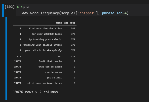
This type of perspective can be used to understand the most used word patterns for a specific topic. It might help an SEO to have a quick perspective for the general situation of the SERP and general structure of the content. For instance “your caloric intake”, “find nutrition fact for”, “by tracking your calorie” word patterns are the most used word patterns and you might want to include these and some synonyms and different versions of these sentences with the relevant information. Below, you will see the first 50 results.
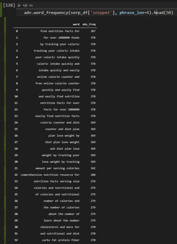
“Number of calories”, “plan lose weight”, “free online calorie counter”, “nutrional and diet”, “carbs fat protein fiber”… There are lots of different word patterns to be used in the content. And, with Python, you can check whether a specific domain has these phrases in its content or not, and you can check its performance for these types of queries. In this tutorial, we might add these things in the future.
Note: If you use “phrase_len” parameter for a value which is bigger than 1, Advertools won’t remove the stop words.
Taking Word Counts and Rankings from Snippets
Taking the word count and rankings from the snippets from SERP can help to understand which words are being most at which rank within the snippets. Thus, for On-Page SEO these terms, sentences, and phrases can be used in a natural and useful way for the users. Below, you will see the related code block.
rank_snippet = serp_df['snippet'].str.split(' ').to_frame().assign(rank=serp_df['rank'], count=1).explode('snippet').groupby(['rank', 'snippet']).count().reset_index().rename(columns={'snippet':'word'}).sort_values(['rank', 'count'], ascending=[True,False]).reset_index(drop=True).query('rank==1')[:40] #.style.background_gradient(subset=['count'], cmap='viridis')We have created a new data frame while taking the “snippet” column and using the “str”, “split”, and “to_frame” methods along with the “assign”, “explode”, “groupby”, “count”, “reset_index”, “rename”, “sort_values”, “reset_index”, “query” methods. Before reading all of the code blocks at once, you might want to check all of these methods from Pandas documentation so that you can understand what we are doing in a better way. But, also we previously explained these methods and their usage purposes in this SEO and Data Science tutorial.
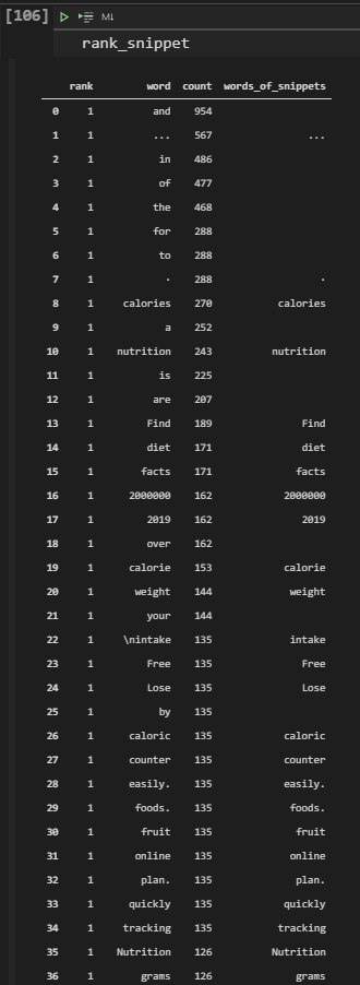
In the example above, we have created two different columns also, and one of them doesn’t include any of the stop words. We see that the “food”, “diet”, weight”, “nutrition”, “lose”, “calorie”, “counter”, “plan”, “quickly”, “grams” words are important for these semantic queries. And the answers should include these things.
Word Counts and Rankings Without Stop Words
In this example, we will show how to remove stop words while calculating the word frequencies in the snippets from the SERP. To do that we will use “nltk.stopwords.words(“english”)” method.
stop = stopwords.words('english')
rank_snippet['words_of_snippets'] = rank_snippet['word'].apply(lambda x: ' '.join([word for word in x.split() if word not in (stop)]))

rank_snippet.drop(rank_snippet[rank_snippet['words_of_snippets'] == ""].index, inplace=True)

rank_snippet.style.background_gradient(subset=['count'], cmap='viridis')
The explanation is below.
- We have created a variable which is “stop”..
- We have assigned the English stop words to the variable that we have created.
- We have created a new column which is “words_of_snippets”.
- We have used a lambda function for the “word” column which includes the frequencies of all words in the snippets.
- In the lambda function, we have united all of the words with the “join” method if they are not in the “stop” variable which is the English stop words.
- We have used a conditional drop command which says if the value is equal to nothing, drop it from the index permanently.
- We have styled our new data frame with the “style.background_gradient” and called it.
You can see the result below.
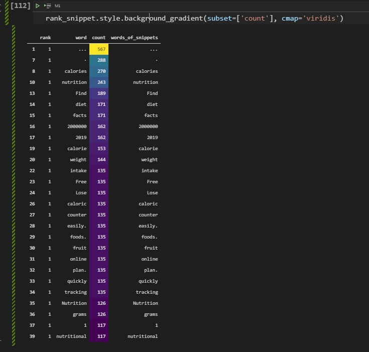
Extracting Numbers, Questions, Dates and Patterns from SERP
Extracting numbers, questions, dates, and patterns can be done via string manipulation methods and Pandas methods easily. Below ,you will see that how we extract numbers from the snippets. In this example, we care about the numbers because most of the successful landing pages have calorie, gram, or nutritional values in a numeric data type, thus having these types of numbers in the content and snippet is important. Thus, we will check which snippets have numbers and how well they perform in the SERP.
serp_df['numbers_in_description'] = serp_df['snippet'].str.extract("(\d+)")
(serp_df['numbers_in_description'].notna()).value_counts().to_frame().transpose()
We have created a new column named “numbers_in_description” and used the regex to extract the numbers from snippets. We have checked how many of the snippets have numbers in the description and how many of them don’t have. To create a better-looking data frame we have used the “transpose()” method from Pandas. You will see the result below.

We have “6102” snippets that include at least one number within the snippets while 2808 of them don’t include a number. It means that including a number or numeric data within the snippets is the industry normal, and it directly satisfies the dominant search intent for these semantic queries. Below, you will see that we filter these snippets include number within them.
serp_df[serp_df['numbers_in_description'].isnull() == False]We filtered all of the descriptions and titles that include at least one number with the “isnull()” method. You can see the character of these numbers as below.
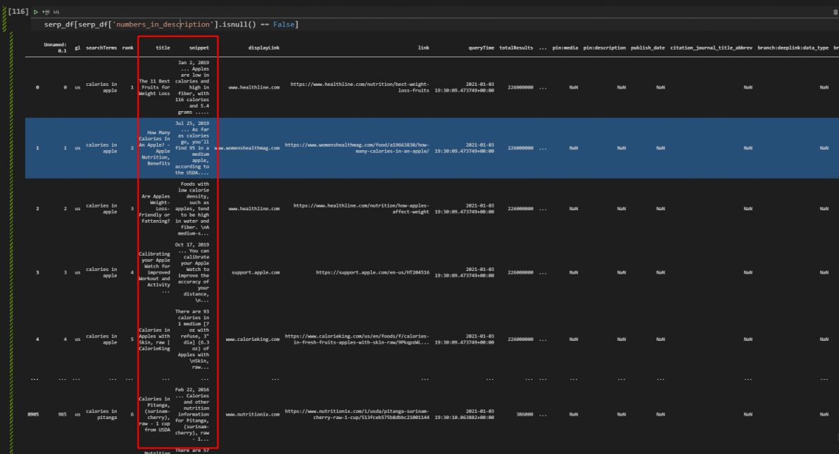
Most of these numbers are coming from numeric data for the calories, grams, nutritions, also some of those numbers include dates. In other words, having numeric data and showing the dates in snippets and in the document might be an industry normal for the Search Engine’s algorithms and content publishers. In this context, we will check the document publishing dates, their freshness, and the exact answers within the snippets to see the correlation of them with the ranks of the landing pages.
Taking Dates from the Documents
Query Deserves Freshness is a term from Google’s algorithm. It means that some queries deserve more fresh results, articles, and landing pages that are updated more frequently and include the latest information from the web and the real world. In other words, if a document is new, it might have a kind of ranking boost in Google Search, but this happens for some sources and queries, for specific times. Below, you will see a code block for extracting the dates from the snippets.
serp_df['document_age'] = serp_df['snippet'].str.extract("(\w+\s\d+,\s\d+)")
serp_df[['document_age',"snippet"]].head(50)
Google records the dates with a certain order and format with a certain position. Every date information for every document has been position to the starting point of the snippets. With the “str.extract” method and a regex formula, we eextracted all of the dates of the landing pages on the Google SERP and assigned it to a new column which is “document_age” to see whether there is a correlation between rankings and the freshness of these documents.
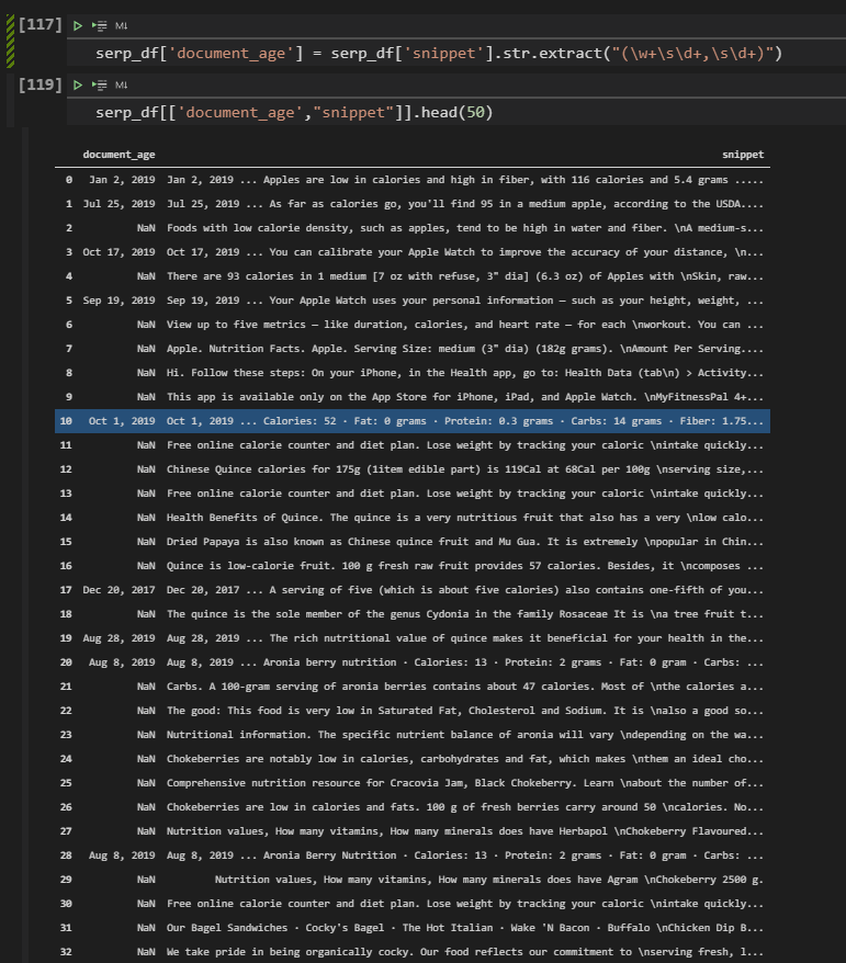
Document Age Visualization with SeaBorn Heatmap
In this section, we will see how to visualize the document age and ranking correlation along with the document date usage frequency. Below, there is a Seaborn Heatmap example that shows the which documents have date and which documents don’t.
Note: Elias Dabbas has likened the visualization below to a barcode. I think, he is right.
fig, ax = plt.subplots(figsize=(10,10))
sns.heatmap(serp_df[['document_age',"snippet"]].isna()==False);
The methodology explanation will be below.
- We have created two variables which are “fig” and “ax”. We have used “figsize” parameter to determine the height and width values of the plot.
- We have used “sns.heatmap()” method with the data frame’s related columns and “isna()” method, for visualizing the “not none” values.
You can see the result below.
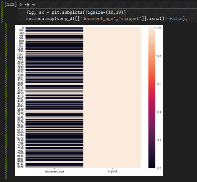
We can see that in the document age section, most of the rows are black, which means that the documents have age data or date data within the SERP and their snippets.
Changing the Document Age’s Format with Pandas
To visualize and check the document ages for understanding the ranking correlations on the SERP, you need to change the date format. Changing date format can be done with the “datetime” module and its “strptime” and “strftime” methods. Below, you will see an example.
#date = datetime.datetime.strptime("Mar 2, 2013", '%b %d, %Y')
serp_df['document_age'] = pd.to_datetime(serp_df['document_age'], format="%b %d, %Y")
serp_df[["document_age", "displayLink", "title", "snippet"]]
Below, you will see how to change the landing pages’ publising dates’ formats.
- We have chosen the related column which is “document age”.
- We have used the “pd.to_datetime” method with the related column and with the “format” method we have changed the format of our date data.
- We have filtered some of the columns and called them.
Below, you will see the result.
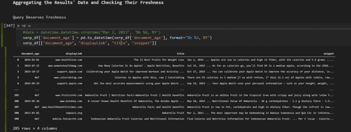
Aggregating the Results’ Date and Checking Their Freshness Performance Correlation
After changing the document ages’ time format, we can use it in the index of the data frame so that we can aggregate the data according to the dates. Below, you will see the example.
serp_df['document_age'] = pd.to_datetime(serp_df['document_age'])
serp_df.set_index("document_age", inplace=True)
result_per_year = serp_df.resample("A")['displayLink'].count()
result_per_year.to_frame().assign(Percentage=lambda df: df['displayLink'].div(df['displayLink'].sum())*100).sort_values("Percentage", ascending=False)[:10]
You can see the explanation of the code block below.
- In the first line, we have changed the date format of the document.
- In the second line, we have changed the index of the document permanently.
- In the third line, we have used the “resample()” method with the value “A” which aggregates the documents annually. At the end of the line, we have used the “count” value.
- In the last line, we have used the “to_frame()” method and “assign()” method to create a new column, we have used the “div” method for calculating the percentage of every year for the content count.
Below, you can see the result.

In the data frame, we see that most of the content is from 2019, and 23% of them are from 2020. This means that the documents for these queries are actually usually fresh and from the last 2 years. After taking certain counts, now we will need to check the rankings of these documents.
Uniting the Document Count and Average Ranking based on Dates
We can check the document count and their average rankings together so that we can see whether the fresher content ranks better or not for these search terms. Thus, an SEO can understand what should be done in terms of updating a content.
result_per_year = serp_df.resample("A")['rank'].mean()
result_per_year.to_frame().assign(Document_Count=lambda df: serp_df.resample("A")['rank'].count()).sort_values("document_age", ascending=False)[:40]
Below, you will see the average rank and document count for every year. To correlate the rankings and document count according to the document ages, we have created a new variable which is “result_per_year”, we have assigned the “resample()” methods’ output with the “rank” column’s average value thanks to “mean()” method. We have created a new column for the ranking count, sorted the values and called the result.
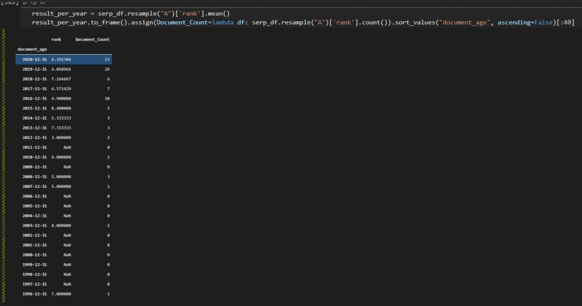
We see that the documents from 2019 have 4.86 average rankings, and documents from 2016 also rank well. So, we can say that some of these documents are younger and rank better, but also average ranking is also high for some of the old documents. In this case, the freshness is not a key signal or factor for these queries, but still having fresher content is the industry normal and has slightly better results.
Visualization of Snippet Count based on Dates on the Search Engine Results Page
In this section, we will use data visualization for SEO to show the document ages’ and their count per year. To show the share of certain types of elements, using a pie chart is the best option.
#pie_chart = result_per_year.to_frame().assign(Percentage=lambda df: df['displayLink'].div(df['displayLink'].sum())*100).sort_values("Percentage", ascending=False)[:10]
pie_chart = result_per_year.to_frame().assign(Document_Count=lambda df: serp_df.resample("A")['rank'].count()).sort_values("document_age", ascending=False)[:40]
fig = px.pie(pie_chart, values="Document_Count", names=pie_chart.index, hover_data=["rank"])
fig.update_layout(margin=dict(t=0, b=0, l=0, r=0))
fig.show()
The explanation of this pie chart visualization with Python Plotly code block is below.
- We have created a variable.
- We have assigned the “px.pie()” method’s outcome to the variable.
- We have used “pie_chart” variable, “Document_Count” column for the values, and “pie_chart.index” for the names.
- For “hover_data”, we have used the “rank” column.
- We have used update_layout for determining the layout of the pie chart of the SEO data.
- We have called the plot.
Below, you will see the outcome.
We can see that 2019 and 2020 are the most popular years for the document publishing years.
Visualization of Document Ages as Bar Chart with Plotly
Visuailzation of the document ages can be done with bar chart. Thus, we can see the same data with a different perspective. To create a bar chart, we will use “px.bar()” method.
fig = px.bar(result_per_year, height=600, width=1000, title="Result Count per Year",labels={
                     "value": "Result Count",
                     "document_age": "Document's Publication Year"
                 })
fig.show()
Explanation of the bar chart code block is below.
- We have created a variable.
- Assigned the “px.bar()” method’s value to it.
- We have determined the data frame, title, height, width.
- We have called the plot.
You can see the document ages in a bar chart.
We see that most of the documents are from 2021, 2020, and 2019. But, if we visualize the ages of the only first three results, probably we will be able to see the better ranking documents’ and landing pages’ dates. This can give a more clear insight.
Visualization of the Dates of only First Three Results on the SERP
To visualize the only the best performing web pages’ publishing dates, we will use Pandas’ filtering methods. You will see an example below.
dates_first_3 = serp_df[serp_df['rank'] <= 3].resample("A")['rank'].count().to_frame()
dates_last_7 = serp_df[serp_df['rank'] >= 4].resample("A")['rank'].count().to_frame()

fig = px.bar(dates_first_3, x=dates_first_3.index, y="rank", width=1200,title="First 3 Ranking Results' Dates",labels={
                     "value": "Result Count",
                     "document_age": "Document's Publication Year"})
fig.show()
Below, you can read the explanation of the filtering method and visualization method together.
- We have created two different variables, one of them is for filtering the first three results, another one is for filtering the last 7 ones.
- To filter the data we have used “=>” and “<=” methods, it means that “equal or greater” and “equal and smaller”.
- We have used the “resample()” and the “count()” methods along with the “to_frame()” method so that we can visualize them easier.
- We have used the “px.bar()” method with the necessary labels, data frames, height, width, x, and y axes values.
- We have called the visualization example, for the first three ranking results’ ages.
You can see the publishing date trends of the first three ranking results for these semantic queries.
You can see that most of the documents and landing pages from the first three results are from 2020 and 2021. It means that they are usually fresher. Below, you will see that we will visualize the dates of the last 7 documents.
Visualization of the Last Three Results as Bar Chart
Visualization of the last seven results will show us the general trend of the publication dates for the less-successfull web pages on the SERP.
fig = px.bar(dates_last_7, x=dates_last_7.index, y="rank", width=1200,title="Last 7 Ranking Results' Dates", labels={
                     "value": "Result Count",
                     "document_age": "Document's Publication Year"})
fig.show()
Visualization of the last seven results methodology can be found below.
- We have used the “px.bar()” method with the “dates_last_7” variable which we have created in the previous section for encapsulating the last seven ranking results dates and counts.
- We have called the bar plot.
Below, you can see the result.
We see that the documents from 2019, 2018, 2017, 2016, and 2015 along with 2005,2004 and 2006 have a broader share in the last seven ranking results.
Comparing Freshness of Content for Competitors on the SERP with Data Aggregation (Healthline & WebMD)
We can choose two competitors from the Google SERP and compare their documents’ and landing pages’ published dates. Healthline and WebMD are among the most successful SEO competitors for the semantic search queries that we use in this SEO Data Science tutorial. We can choose those SEO Competitors and check their rankings based on the document publishment dates.
result_healthline = serp_df[serp_df['displayLink'] == "www.healthline.com"].resample("A")['rank'].count().to_frame()
result_webmd = serp_df[serp_df['displayLink'] == "www.webmd.com"].resample("A")['rank'].count().to_frame()
result_healthline
The methodology for filtering the search results per domain and taking their average document count per year is below.
- We haev created two different variable, “result_healthline” and “result_webmd”. We have filtered the “Healthline” and “WebMD” search results while using “resample()”, “count()” and “to_frame()” methods for aggregating the web page publication dates per year.
- We have called the results first only for “Healthline”.
You can see the result below.

We see that most of the content of the Healthline is from 2019. And some section is from 2017 and 2018.
Note: Since, during the core algorithm updates of 2019, Healthline showed its success, I could also check their competitors’ situation for these updates and their content publication frequency and trend.
WebMD document count based on different years can be found below.
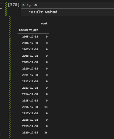
We see that WebMD doesn’t have fresher content like the Healthline. Most of their content is still from 2020, but they also have content from 2016, or 2015. Below, you will see the visualization of certain domains’ document ages and count of documents from specific years.
Visualization of the Competitors’ Content Count Based on Date with Plotly (Healthline & WebMD)
Visualization of a certain domains’ content age and content publication years can be useful to understand their content publication trend. This data can be used to understand their general situation, reflexes against Google algorithm updates, and also how well they focus on a specific topic. Also, checking a domains’ contents’ ages and rankings together is useful to see whether there is a difference between the old and new content in terms of the rankings for only a specific domain. Especially if the source is authoritative and successful, the importance of the Query Deserves Freshness can be understood in a better way.
fig = px.bar(result_healthline, x=result_healthline.index, y=result_healthline['rank'], color=result_healthline['rank'],
                 labels={
                     "rank": "Result Count",
                     "document_age": "Year of the Publication"
                 },
                title="Healthline's Results' Distribution Per Year")
fig.show()
The methodology for visualizing a domains’ content publication trend for a specific topic can be found below.
- We have used the “px.bar()” method with the data frame that we have created in the previous section for encapsulating the result count per year from a specific domain.
- We have used the “result_healthline.index” for the x-axis so that we can see the dates on the x-axis.
- We have used the “result_healthline[“rank”] for the y axis so that we can show the result count in a vertical way. We have used the “rank” column also for the color map.
- We have used the “labels” parameter for determining the x and y axes’ names.
- We have used the title parameter for determining the title of the plot.
Below, you can see the Healthline’s document publication date for the queries that we use for this research.
Below, you will see the same methodology for the WebMD.
fig = px.bar(result_webmd, x=result_webmd.index, y=result_webmd['rank'], color=result_webmd['rank'],
                 labels={
                     "rank": "Result Count",
                     "document_age": "Year of the Publication"
                 },
                title="WebMD's Results' Distribution Per Year")
fig.show()- We have only changed the “data frame” that we use for the visualization, we have changed the “result_healthline” variable with the “result_webmd” so that we can see the WebMD’s content publication dates.
- We also changed the “title of the plot”.
You can see the result below.
We see that most of the content from WebMD and also Healthline is between 2021 and 2019. And, most of the results in the first three rank are coming from the same date range. And, Healthline has the second-best topical coverage and best average ranking for these queries, thus we can say that fresher is better, and having fresh content or updated information are useful for having better results on the search engine result pages.
In the next section, we will use regex to extract direct answers from the snippets and we will compare the rankings according to these results.
Does the Snippet Have the Exact and Clear Answer?
There are different perspectives for writing title tags and meta descriptions or URLs. Some SEOs believe that a title and description should give the answer, or ask the question. Some perspectives for title tag writing defend the idea of including strong power words, unlike others. In this case, we can differentiate title tags or meta descriptions from each other and categorize them. In this example, we will categorize them according to their stance in terms of “questions” and “answers”.
For the “culinary fruit” queries, we will check how frequently the snippets on the SERP have a direct answer or not. Then, we will check their average ranking and success situation for organic search. To extract the answers from the snippets, we will use a simple regex pattern.
serp_df['info_in_description'] = serp_df['snippet'].str.extract("(\d+\s+\w+\s+\w+\s+\w+)")
serp_df[['rank','info_in_description','displayLink','searchTerms']].sort_values("rank", ascending=True).head(50)
You can find the code explanation for extracting exact answers from the snippets below.
- We have created a new column to extract all of the exact answers from the snippets.
- We have used the “digit, space, word, space, word, space, word” pattern to have the direct answers for our queries because all of the queries that we have included “calories” or “nutrition” within them. This means that the answer will have a digit and two words like “X grams carb” or “X calories per” etc.
- After creating the column that includes all of the exact answers, we have filtered the results, sorted the values according to their rank column values, and called the first 50 rows.
Below, you can see the result.
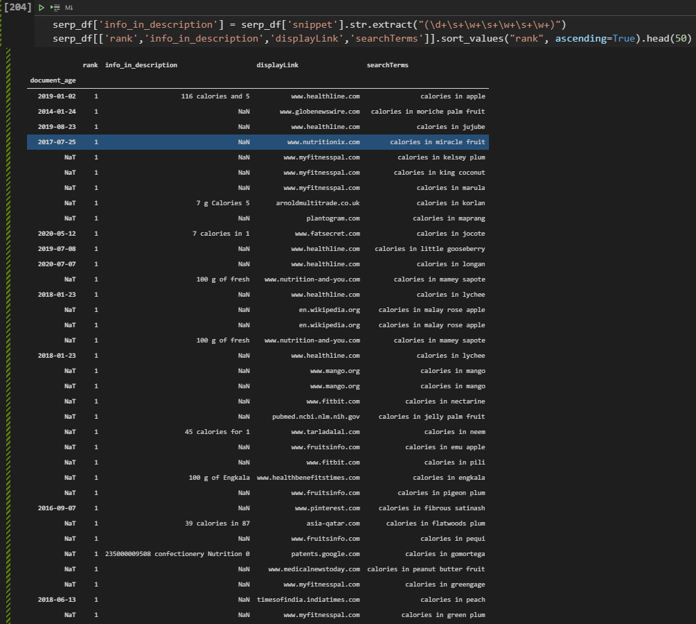
We see that some of the documents have an exact answer in the snippets such as “39 calories in 87” or “45 calories for” and “100 g of fresh” etc. In the future, even for creating new content briefs, an SEO can extract all these answers and their sentence structure, word patterns, and annotation texts for the authors. Because, certain types of word patterns, information, and question orders will rank higher according to the user satisfaction possibilities.
In the next section, we will compare the results of the snippets that include an exact, direct answer for the query of the user and not include direct information for the search term of the user.
Comparing Rankings of the Results with Exact Answer in the Snippet and Answers without Exact Answer
To compare the ranking of the snippets according to their character, we will need to filter them for certain conditions. Below, you will see that we will filter the snippets that have the exact answer and also include the word “calories” within them. In other words, we only try to calculate the ranking difference between the snippets that include an answer and not for the queries that include the “calorie” word within it.
serp_df[(serp_df['info_in_description'].isna() == False) & (serp_df['searchTerms'].str.contains("calories")) == True ]['rank'].mean()In the code example above, we have filtered the “info_in_description” column and its rows if they are not empty, and we have taken all the rows that include the word “calorie”. We have chosen the “rank” column and checked the average ranking. Below, you will see the result.

We have 5.41 average ranking for the title tags, descriptions and snippets on the SERP that include a exact, direct and informational answer within them. Below, you will see the average ranking for the rankings of snippets without a direct answer.
serp_df[(serp_df['info_in_description'].isna() == True) & (serp_df['searchTerms'].str.contains("calories")) == True ]['rank'].mean()We have only changed the “False” value to the “True” so that we can filter only the rows that not include a direct answer. Below, you can see the result.

The average ranking of the snippets without a direct answer is 5.52. It means that snippets with direct answers have a better ranking with a difference of 0.11 average position. But, in this case, an SEO should evaluate whether he/she has enough data or not or the outcome might be biased or not because of some authoritative domains and their content guidelines. Thus, data science and its principles are important while doing SEO, and also still this type of information can affect an SEO’s decision for the Google SERP snippet strategy.
Extracting Questions on the SERP and Visualizing Their Rankings
Like extracting the answers, we also can extract the questions easily from the SERP for taking the average rankings. In this example, we will take the first 100 results for the “calories in pizza” query as below.
questions = adv.serp_goog("calories in pizza", cx=cse_id, key=api_key, gl=["us"], start=[1,11,21,31,41,51,61,71,81,91])We have taken the results for the “calories in pizza” query and now we will extract the questions from them.
questions.to_csv('serp_questions.csv')
questions = pd.read_csv('serp_questions.csv')
question_title=adv.extract_questions(questions['title'])
serp_question_title = pd.DataFrame.from_dict(question_title['question_text']).rename(columns={0:"Question_Title"})
question_snippet = adv.extract_questions(questions['snippet'])
serp_question_snippet = pd.DataFrame.from_dict(question_snippet['question_text']).rename(columns={0:"Question_Snippet"})
The explanation of the code block above is below.
- We have exported the SERP to the “serp_questions.csv” file.
- We have read the CSV file with the “pd.read_csv()” command.
- We have used “adv.extract_questions” function to extract the questions from titles.
- We have used “pd.DataFrame.from_dict” so that we can create another data frame with the related information.
- We have extracted the questions from the descriptions.
- We have created another data frame for the questions in the descriptions.
In the next section, we will unite these two data frames.
united_serp = [serp_question_snippet, serp_question_title]
serp_questions = pd.concat(united_serp, axis=1) #for a better Plotting
serp_questions.head(50)
We have united the two different data frames that include title tags (meta titles) and meta descriptions. We have used the “pd.concat” method for doing it. We have called the first 50 rows as below.
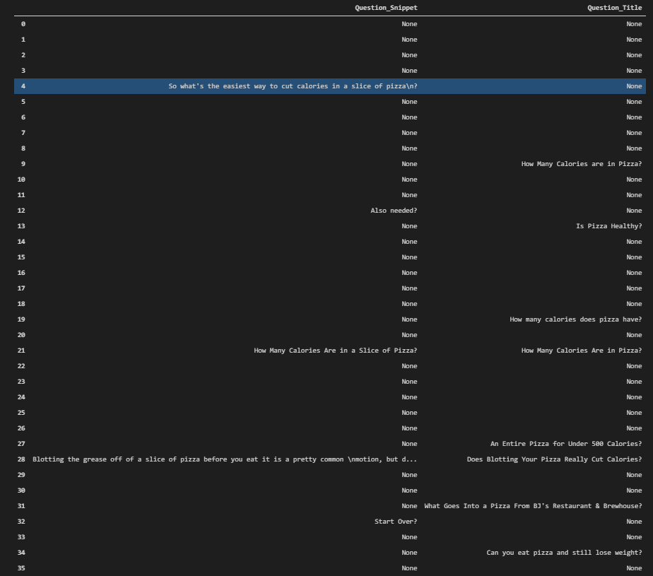
We have the ranking data, questions on the titles, and descriptions for the “calories in pizza” query. We see that most of the questions are related to “weight loss”, or making a pizza with a “lower calorie” value. In the next section, we will visualize the SERP according to the questions’ positions on it.
Visualization of the Questions on the Snippets with Heatmap
To visualize the SERP according to the positions of the questions, we will use the “sns.heatmap”. Below, you will see an example.
plt.subplots(figsize=(12,5))
sns.heatmap(serp_questions.isna()==False, cmap="cividis");
We have used “plt.subplots()” method the create a plot example. We have called the “sns.heatmap()” method with the data frame that we have created. We have marked every question on the search engine results page with the “cividis” color scale.
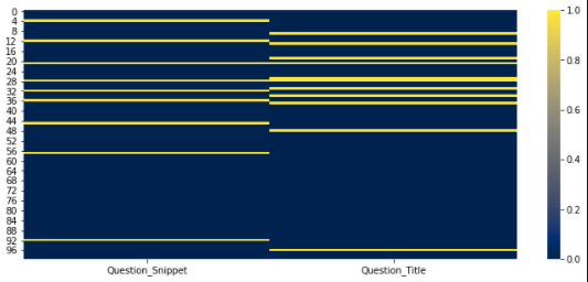
We see that questions on the SERP didn’t rank very well. In the first 10 results, we only have one question in the title and one in the descriptions. Most of the questions are stacked between the 20-35 rankings. This doesn’t mean that questions don’t work, it means that for these type of a query, having an exact answer work betters.
Checking the Document Extensions in the SERP
Before crawling the landing pages from the SERP, the last section that we will focus on the “document extensions” on the Search Engine Results Page. We will group the result URLs according to their extensions, and check their rankings.
serp_df['link'].str.rsplit(".").str[-1].value_counts().to_frame()[:30]With the code example below, we have used the “rsplit”. “rsplit” splits the string according to the given separator from starting the right. We have taken the last value of the split URL with the “.str[-1]” method. We have counted the values and taken everything to the frame, called the first 30 rows. Now, we can check the result below.
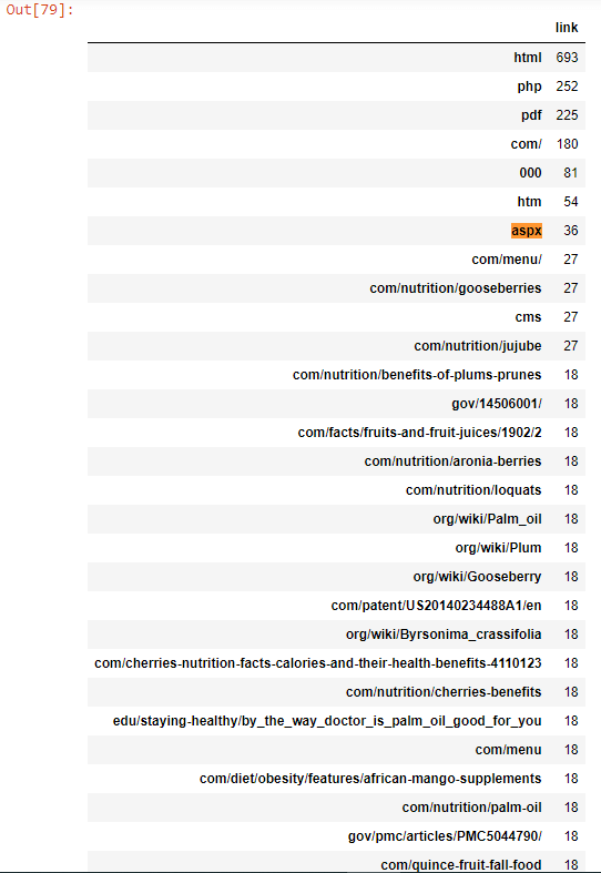
We see that the most used extension is “HTML”, then “PHP”, then “pdf”. We know that most of these documents are HTML Document and “HTM” is the same with also “HTML”. But, an SEO can check whether having an “HTML, PHP, aspx” type of extension on a URL can have a direct or indirect SEO. URL Extensions can affect the user experience, server response time, source code parsing time, and more with a small or minor effect but if the extension is “CSV”, “PDF” or “word” then it will affect the Search Results directly. To prove this, we will use “PDF” documents in the next sections.
Comparing the Rankings of Documents Based on Extensions
Checking a certain type of document extension’s situation on the SERP, an SEO can filter the SERP for this extension and check the ranking results. In the next section, to demonstrate an example we will filter the URLs with “aspx” extension and “HTML” extension to compare their rankings for the queries that we determined at the beginning of the SEO Data Tutorial.
serp_df[serp_df["link"].str.contains("aspx", regex=True)]["rank"].mean() - serp_df[serp_df["link"].str.contains("html", regex=True)]["rank"].mean()We have chosen the “link” column of your data frame, checked the rows that include the “aspx” with regex, have chosen the “rank” column for those filtered rows, then we have checked the “mean” average value for these rows. In the second section, we have chosen the “html” documents with “html” extension at the end of their URLs and extracted their “mean” values for the rankings. In the last section, we have used the “-” operator for understanding the ranking differences between these two types of landing pages. Below, you can see the result.

We see that URLs with “aspx” have a higher average ranking and position with “0.27” points. It means that “aspx” URLs have a better search performance but to understand the reason for this difference, SEO Data Scientists should look at the character of the queries. Because probably “aspx” URLs have a higher average ranking for the queries that don’t have enough information on their SERP. This assumption will be proven via the PDF documents in the next sections.
Visualization of the Document Extension Count in the SERP
To visualize the document extensions count on the SERP, we can use the “pie chart”. In this section, an SEO Data Scientist can see the coding infrastructure of the competitors, and try to understand the industry normals. Below, you will see a pie chart code block.
pie_chart_document_extension = serp_df['link'].str.rsplit(".").str[-1].value_counts().to_frame()[:30]
fig = px.pie(pie_chart_document_extension[:10], labels=pie_chart_document_extension.index[:10], values="link", names=pie_chart_document_extension.index[:10])
fig.update_layout(margin=dict(t=0, b=3, l=0, r=0))
fig.show()
We have created a new variable called “pie_chart_document_extension”, we have chosen the “serp_df[“link]” column and used the “rsplit” method like before. We have taken the first 30 rows with “value_counts()” output. We have created another variable for the visualization, we have used “px.pie()” command with the data frame variable, labels, and values. We have updated the layout so that the pie chart can be seen in a bigger frame. We have called the pie chart for the SERP Landing Pages’ extension share and count with “fig.show()”.
You can see the result above. 51.5% of the landing URLs have “html” extension within them. And, 11.8% of them has the “php” extension.
Checking the Sources, Queries and Rankings for Only PDF Files
In this section, we will check the query characters for the specific URL extensions and file types. In Google search, a user can use the “filetype” search operator to filter the SERP for only a specific file type. With a similar method, we will filter only the PDF files and their rankings, queries as below.
serp_df[serp_df['link'].str.contains(".pdf") == True][['displayLink',"title","rank","searchTerms","snippet"]].sort_values(by="rank")We have taken all of the “PDF” files with “str.contains()” method from the “serp_df” data frame. We have chosen the “displayLink”, “title”, “rank”, “searchTerms”, “snippet” variables while sorting their values. You can see the results below.

When we filter the PDF files on the SERP, we see three comon features.
- Most of the PDF files belong to the “edu”, “goverment” or “NGO” organizations
- Most of the queries for the PDF files are not popular or well-known.
- Most of the PDF files rank for the queries that the actual authoritative sources don’t rank.
This information can help to cover a topic with every detail to an SEO. Below you will see the how to check the how many of the pages are actually PDF.
#serp_df.reset_index(inplace=True)
serp_df = pd.read_csv("serp_calories.csv")
serp_df.drop(columns={"Unnamed: 0"}, inplace=True)
serp_df['link'].str.contains(".pdf").value_counts()

OUTPUT>>>

False    285
True      15
Name: link, dtype: int64
In the example above, we can see that only 15 of the landing ages are actually PDF files. This example is for only for the first 6 queries.
Crawling the Landing Pages on the SERP
Until now, we only used the data that we have gathered from the SERP. With this section, we will crawl all of the landing pages and check their content, schema type, response time, response size, entities, entity types, n-grams, anchor texts, internal links, first words on the pages, and more to understand the different sources and their strategies for these types of queries. First, we need to exclude the PDF files because Advertools can’t crawl the PDF files at the moment.
#serp_df.reset_index(inplace=True)
serp_df = pd.read_csv("serp_calories.csv")
serp_df.drop(columns={"Unnamed: 0"}, inplace=True)
serp_df['link'].str.contains(".pdf").value_counts()
Since we have PDF files and Advertools’ SEO Crawler can’t crawl the PDF Files, we have checked the PDF File count again. There are two different crawl methodology. You can use “for loop” for crawling the URLs or you can use “adv.crawl()” as it is. Both of the methodologies work at the moment.
adv.crawl(url_list=serp_df['link'], output_file="crawled_serp.jl")
#Might not crawl all of the URLs.


#Second method

"""for url in serp_df['link']:
    try:
        adv.crawl(url, 'output_file_full.jl')
    except Exception as e:
        print(str(e))
        continue"""
#Big thanks to the Dear Professor, Elias Dabbas.
At the second method, we are crawling and appending the outcome to the “output_file_full.jl” document. If the document can’t be crawled, we print that URL and continue to crawl the rest.
How to Unify SERP Data and Landing Page Data After Crawling the Pages on the SERP
After crawling all of the landing pages on the SERP, we will assign the “output_file_full_2.jl” file to the “crawled_serp” variable. We will also print the crawled URL count, unique URL count and crawled URL count.
crawled_serp = pd.read_json("output_file_full_2.jl", lines=True)
print(f"URL Count: {len(serp_df['link'].to_list())}, Unique URL Count: {len(serp_df['link'].unique())}, Crawled URL Count: {len(crawled_serp['url'])}")

OUTPUT>>>
URL Count: 285, Unique URL Count: 279, Crawled URL Count: 5096
We have printed the URL counts according to their types with the help of the “f string”. Now, we will unite the “SERP Data” and “Crawl Output Data” so that we can have a broader aspect of Google’s Decision Tree and Domains’ strategies, differences between each other.
crawled_serp.rename(columns={"url_redirected_to":"link"}, inplace=True)
crawl_serp_df = serp_df.merge(crawled_serp, on="link", how="inner") #Inner is the key.
We have changed the name of the “url_redirected_to” to the “link” so that we can merge two different data frames based on landing page URLs. We have used “on=”link”” and “how=”inner”” values and parameters to merge the two data frames. Below, you will see the “serp_df” and “crawled_serp” df columns.
serp_df.columns

OUTPUT>>>
Index(['gl', 'searchTerms', 'rank', 'title', 'snippet', 'displayLink', 'link',
       'queryTime', 'totalResults', 'cacheId',
       ...
       'archived', 'numberofitems', 'itemlistorder', 'updated',
       'citation_article_type', 'ia:markup_url', 'sourcemodified', 'company',
       'fb:page_id', 'dc.date.issued'],
      dtype='object', length=422)
“serp_df.columns” can be seen above. We have only 422 columns and most of these columns are not being talked over the main stream SEO media yet, unfortunately. Below, you will see the united data frame’s column data.
crawled_serp.columns

OUTPUT>>>
Index(['url', 'link', 'title', 'meta_desc', 'canonical', 'og:title',
       'og:description', 'og:type', 'og:url', 'og:site_name',
       ...
       'jsonld_variableMeasured.@type', 'jsonld_variableMeasured.name',
       'jsonld_variableMeasured.valueReference',
       'jsonld_creator.contactPoint.@type',
       'jsonld_creator.contactPoint.contactType',
       'jsonld_creator.contactPoint.telephone',
       'jsonld_creator.contactPoint.email', 'jsonld_1_openingHours',
       'resp_headers_x-nananana', 'resp_headers_x-ta-cdn-provider'],
      dtype='object', length=995)
We see that we have 955 different types of columns. It means that we have doubled the data dimension, aspect and feature count of the data. Below, you will see the “crawl_serp_df.shape” data.
crawl_serp_df.shape

OUTPUT>>>
(1421, 1416)
We have 1421 Landing Pages and 1416 different data dimensions. Below, you will see the names of these columns in a styled and categorized way.
for column20, column40, column60 in zip(crawl_serp_df.columns[:340], crawl_serp_df.columns[340:680],crawl_serp_df.columns[680:955]):
    print(colored(f'{column20:<33}', "green"), colored(f'{column40:<37}', "yellow"), colored(f'{column60:>13}', "white"))
We have divided the column data with “zip” and “for loop”. Then, we have printed them with the “colored” function as below.
You can see that we have lots of different data dimensions here such as “jsonld_1_mainEntity”, “jsonld_review.name” or “resp_meta_download_timeout” and “analytics-s-bucket-1” and more. Below, we will filter the “link”, “rank”,” searchTerms”, “body_text”, “size”, “resp_meta_download_latency”, “h1”, “h2”, “title_x”, “meta_desc”, “canonical_y” columns.
crawl_serp_df[['link',"rank", "searchTerms", "body_text", "size", "resp_meta_download_latency","h1","h2","title_x","meta_desc","canonical_y"]]This is an example showcase for showing that we have all the aspects for these URLs. We have filtered and extracted their content, rankings, URLs, queries, HTML size, response latency, h1, and h2 tags, titles, descriptions, and canonicals. We have more than 1400 features to understand the SERP. In this SEO Data Science and Google Algorithm Analyze example with the semantic search queries for the culinary fruits, we will examine the intersections of these columns and features in the next sections. You can see the filtered columns below.
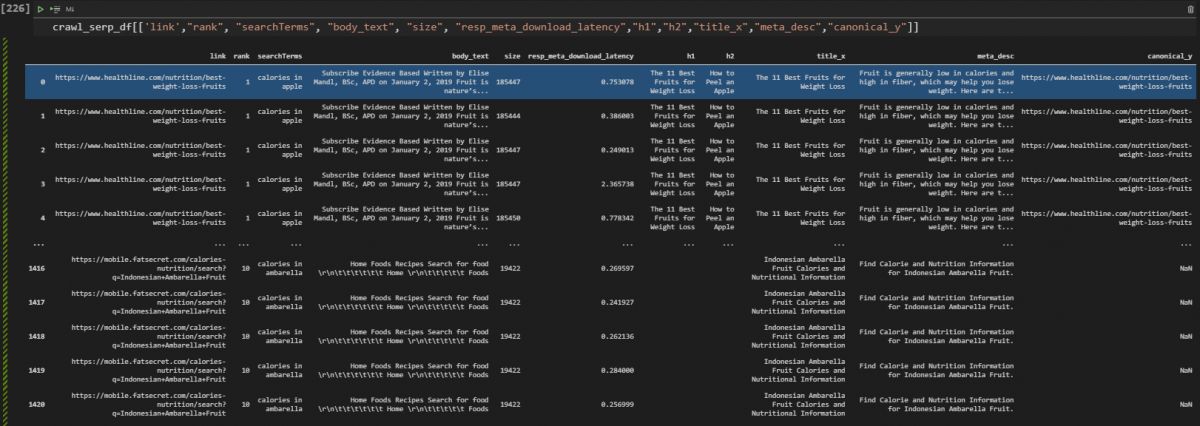
The “_x” and “_y” is an indicator in the Pandas to show the data column’s original data frame, if it is “_x” it means that the column is coming from the data frame on the left during the merging process of the data frame if it is “_y” it means that it comes from the right data frame.
Examining the On-page Elements with SERP Data via Data Science for SEO
In this section, we will examine the on-page SEO elements with the Search Engine Results Pages’ data and crawled landing pages’ data via Data Science to understand the competitors’ strategies and their situation on the SERP. First, we will check the word count for all of the SERP and Landing Pages for all of the queries. Before entering the “entity-based” Search Engine Features, we can focus on the “phrase-based” Search Engine features as below.
Word Count for All Landing Pages on the SERP
Understanding the most used terms on the SERP can help to understand the overall word patterns on the SERP. Because Search Engines also use “Word2Vec” algorithms to calculate the words’ relevance to each other. And, extracting all of the word popularity might help for these types of semantic search queries.
word_count = crawl_serp_df['body_text'].str.split(expand=True).stack().value_counts().rename_axis('vals').reset_index(name='count')
word_count
In this example, we didn’t clean the text or take stop words out of the equation. We have chosen the “body_text” of the URLs, used “str” and “split” with the “expand=True” parameter and value. Then we have used the “stack” method while counting the words. We have renamed the “axis” and reset the index while changing its name. You can see the data frame below.
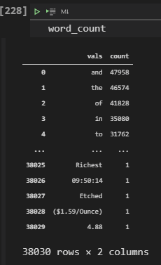
In the example above, we see that stop words are the most used words, and the word “Richest” used only once. We also see some date information and pricing as rare examples. If you want, you can check the same data only for specific sources. Before that, you will see the first 50 columns of the same data frame, below.

Comparing Words on the Documents based on Competitors (Healthline & WebMD)
Before cleaning the text, we also can extract the most used words within the content of the URLs for only specific sources. For instance, in this example, we will compare the content of the Healthline and WebMD with data aggregation.
crawl_serp_df[crawl_serp_df["displayLink"]=="www.webmd.com"]['body_text'].str.split(expand=True).stack().value_counts().rename_axis('vals').reset_index(name='count')We have filtered all of the search results based on the source domain with the “displayLink” column and “==” operator. We have taken the body text and used “str.split()” method combination along with “stack, value_counts, rename_axis and reset_index” methods. You can see the result below.
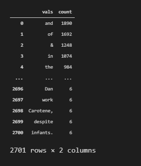
We see that 2701 unique words exist in WebMD’s content and since we didn’t clean the stop words, still we can’t see the most used “non-stop words” within their content. But, we see that they used “infants” and “work” words only 6 times. Below, you will see the same example for Healthline.
crawl_serp_df[crawl_serp_df["displayLink"]=="www.healthline.com"]['body_text'].str.split(expand=True).stack().value_counts().rename_axis('vals').reset_index(name='count')We only changed the source name to be filtered with the “displayLink” value. Then, we have extracted the related information as below.
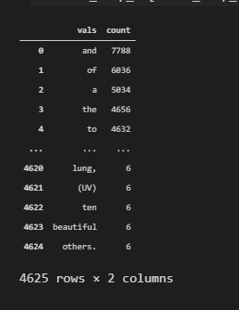
We see that Healthline uses 4625 unique words within its content, and it has more stop words in its content. This means that their content is longer and has more synonyms and perspective or detail level with granularity. But also, sometimes these types of data can be acquired because of the “gibberish content and score”. To learn what gibberish scores in Google Algorithm and Terminology, you can read the related article. But to understand whether a site’s content is gibberish or not, we can extract the entities and also clean the text from stop words as we will do in the next sections.
Removing Stop Words for Calculating the Count of Words and Frequencies of Words based on Competitors on the SERP
In this example, we will remove the stop words from the content of the Healthline and WebMD to understand their content structure in scale. To understand a website and SEO Competitor’s content structure, text analysis with data science can be used. Text analysis can be done by looking at word frequencies, characters, content structure, length, or the entities within the content. At this stage, we are still analyzing the phrase-based examples.
list_of_words_healthline = crawl_serp_df[crawl_serp_df["displayLink"]=="www.healthline.com"]['body_text'].str.split(" ").explode().to_list()
list_of_words_webmd = crawl_serp_df[crawl_serp_df["displayLink"]=="www.webmd.com"]['body_text'].str.split(" ").explode().to_list()
In the example above, we have created two variables which are “list_of_words_healthline” and “list_of_words_webmd”. We have extracted their content and put into a list with the help of “to_list()” method. In the next section, we will focus on text analysis methodologies.
Some Notes for Optional Text Analysing Methodologies
To analyze text and document, there are multiple methodologies such as “tokenizin”, “lemmetization”, “removing punctuations”, “stemning” and more. To understand the most used characters and words within a content, we will remove the stop words and then we will use “FreqDist” from “nltk” library.
The options below can be used for text analysis.
- Tokenizing the Words Before Counting (Optional)
- tokenized_words = nltk.tokenize.word_tokenize(str(crawl_serp_dfcrawl_serp_df[“displayLink”]==”www.healthline.com”))
- porter = PorterStemmer()
- porter.stem(x.lower()) if you want to Stemmning (Optional)
- x.lower().translate(table) => If you want to remove Punctuation
- porter.stem(x.lower(x.lower().translate(table))) => If you want to remove Punctuation and Stemned Version
- For the Grammar Error Checking and Comparison => https://www.holisticseo.digital/python-seo/check-fix-grammar-errors/
Below, you will see a text analysis example while removing the stop words for SEO.
#porter = PorterStemmer()
#table = str.maketrans('', '', string.punctuation)
stop_words = set(stopwords.words('english'))
words_without_stop_healthline = [x.lower() for x in list_of_words_healthline if not x in stop_words]
word_count = nltk.FreqDist(words_without_stop_healthline)
print(word_count.most_common(50))

OUTPUT>>>
[('', 10938), ('(', 3354), (').', 3162), (',', 2262), ('may', 2256), ('more', 1398), ('read', 1308), ('written', 1266), ('health', 1158), ('oil', 930), ('heart', 864), ('research', 840), ('studies', 840), ('vitamin', 810), ('rd', 810), ('in', 804), ('palm', 804), ('fruit', 798), ('ms,', 786), ('help', 774), ('this', 738), ('also', 696), ('grams', 684), ('fruits', 678), ('study', 678), ('—', 672), ('high', 660), ('blood', 642), ('berries', 636), ('the', 618), ('one', 588), ('you', 564), ('people', 558), ('many', 558), ('a', 546), ('article', 546), ('used', 540), ('.', 534), ('benefits', 528), ('quince', 528), ('loquats', 528), ('found', 510), ('like', 510), ('including', 504), ('however,', 498), ('weight', 492), ('2', 492), ('aronia', 492), ('medically', 486), ('reviewed', 486)]
Explanation of the text analysis code block example below.
- In the first line, we have created a variable called “stop_words”, we have assigned the English stop words to it with the format of “set”.
- We have used list comprehension for lovering the case-letters of every word within Healthline content, and we checked whether these words in the “stop_words” variable or not.
- We have used “nltk.FreqDist” for calculating the word frequency.
- We have used the “most_commony()” method to print the most common 50 words and characters.
You can see the result below.

We see that we also have “punctuations” in our result, if you want to remove the punctuation, you can use the “translate(table)” method as being shown in the text analysis methodologies. To turn this dictionary output into a data frame, we can use the Advertools’ “word_frequency” method as below.
adv.word_frequency(words_without_stop_healthline).head(20)We have used “word_frequency” method as below. You can see the results.
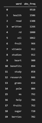
These are the absolute frequencies of the words within the Healthline’s content, we see that “vitamin”, “oil”, “studies”, “heart”, “research”, “palm”, “read”, “written”, “sugar” and more are the most used words within the Healthline’s content. And, “health” word has been used more than 1500 times for the queries that we have chosen, this shows the “Healthline’s perspective” better. Because some of the competitors focus on “weight loss” more. Maybe, an SEO should focus on both of these concepts at the same time.
Below, you will see the same result for only WebMD’s content.
words_without_stop_webmd = [x.lower() for x in list_of_words_webmd if not x in stop_words]
word_count = nltk.FreqDist(words_without_stop_webmd)
print(word_count.most_common(50))

OUTPUT>>>
[('', 176520), ('\r\n', 20616), ('&', 1248), ('view', 822), ('webmd', 708), ('abstract.', 672), ('weight', 666), ('palm', 636), ('health', 618), ('\n', 570), ('oil', 492), ('healthy', 456), ('loss', 396), ('j', 354), ('your', 342), ('news', 324), ('slideshow', 318), ('all', 306), ('article', 300), ('a', 288), ('nutr', 288), ('supplements', 282), ('vitamin', 270), ('topics', 264), ('policy', 258), ('diet', 252), ('what', 252), ('find', 246), ('drugs', 234), ('you', 234), ('red', 234), ('care', 228), ('m.', 228), ('j.', 228), ('food', 216), ('cholesterol', 216), ('effects', 216), ('the', 216), ('ig', 216), ('experts', 204), ('clin', 198), ('a-z', 192), ('disease', 192), ('my', 192), ('pregnancy', 186), ('blood', 186), ('featured', 180), ('lipids', 180), ('a.', 174), ('management', 168)]
We see that WebMD used similar words to Healthline’s content. But, it also has more variations and different types of words such as “drugs”, “pregnancy”, “healthy”, “diet” and “disease”. These word occurrences show the different perspectives of two different competitors. We will use the “word_frequency” method from Advertools as below.
adv.word_frequency(words_without_stop_webmd).head(20)After using “word_frequency” method, we have called the first 20 rows of the examples.
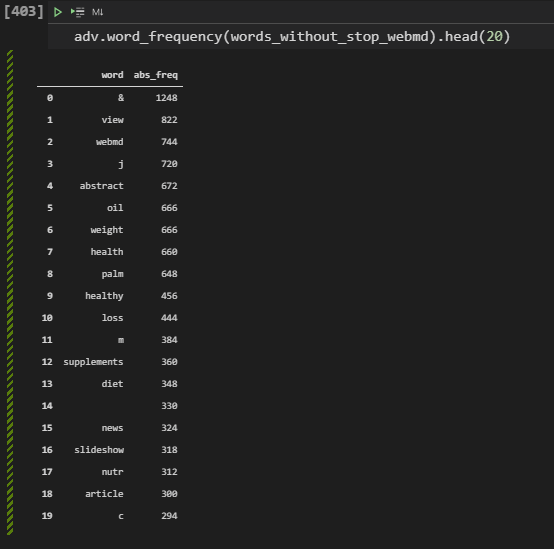
We see that WebMD uses its own brand name on the content more than Healthline, also they have “supplements” and “drugs” along with “slideshow” words that show the different angles a little bit more according to the Healthline. In the next section, we will focus on entities.
Beyond Word Count or Word Frequency: Taking Entity Count, Entity Type, and Entity Profiles on the Content of Competitors on the SERP
Entities are different than keywords or phrases. Entities have meanings and attributes, connections, real-world existence. Google stores all of the entities its own Knowledge Graph. Extracting entities from documents with the facts help Google to understand a content’s relevance, context and quality. Thus, SEO for Data Science also should focus on extracting entities during a text analysis. Below, you will see a methodology for extracting all of the entities from the content of SEO competitors to understand their position on the SERP in a better way.
How to Take All Entities, Entity Type, Entity Count and Word Count for a Website from SERP?
To take all of the entities from a content, we will use the “en_core_web_sm” from Spacy. Spacy is a Natural Language Processsing library from Python with improved features. Below, you will see an example for taking the Entity Types and Counts from the content of the Healthline.
nlp = en_core_web_sm.load()
article = nlp(str(crawl_serp_df[crawl_serp_df["displayLink"]=="www.healthline.com"]['body_text']))
labels = [x.label_ for x in article.ents]
Counter(labels)

OUTPUT>>>

Counter({'DATE': 14, 'CARDINAL': 5, 'PERSON': 5})
You can find the relevant code block’s explanation below.
- We have created a variable which is “nlp”. We have assigned the “en_core_web_sm.load()” method to it.
- We have created another variable which is the article. We have used “nlp” method on it while turning all of the content into a united string with the method of “str”.
- We have used the list comprehension with the “label” and “ents” properties.
- We have counted the labels.
We see that we have 14 entities as Date, 5 entities as numbers and 5 entities as persons.
Below, you will see how to calculate the total entity count.
len(article.ents)

OUTPUT>>>

24
We see that “len(article.ents)” method is being used for calculating the entity count. And, we have 24 total entities for the Healthline’s content.
How to Print Entities of a Web Site’s Content
To print entities of a website to understand its content, we can use the “print” method with a list comprehension. Below , you will see an example.
print([(X, X.ent_iob_, X.ent_type_) for X in article])

OUTPUT>>>

[(0, 'O', ''), (      , 'O', ''), (Subscribe, 'O', ''), (Evidence, 'O', ''), (Based, 'O', ''), (Written, 'O', ''), (by, 'O', ''), ( , 'O', ''), (Elise, 'O', ''), (Mandl, 'O', ''), (,, 'O', ''), (BSc, 'O', ''), (,, 'O', ''), (APD, 'O', ''), ( , 'O', ''), (on, 'O', ''), (January, 'B', 'DATE'), (2, 'I', 'DATE'), (,, 'I', 'DATE'), (2019, 'I', 'DATE'), (Fruit, 'O', ''), (is, 'O', ''), (nature, 'O', ''), (’s, 'O', ''), (..., 'O', ''), (
, 'O', ''), (1, 'B', 'CARDINAL'), (      , 'O', ''), (Subscribe, 'O', ''), (Evidence, 'O', ''), (Based, 'O', ''), (Written, 'O', ''), (by, 'O', ''), ( , 'O', ''), (Elise, 'O', ''), (Mandl, 'O', ''), (,, 'O', ''), (BSc, 'O', ''), (,, 'O', ''), (APD, 'O', ''), ( , 'O', ''), (on, 'O', ''), (January, 'B', 'DATE'), (2, 'I', 'DATE'), (,, 'I', 'DATE'), (2019, 'I', 'DATE'), (Fruit, 'O', ''), (is, 'O', ''), (nature, 'O', ''), (’s, 'O', ''), (..., 'O', ''), (
, 'O', ''), (2, 'B', 'CARDINAL'), (      , 'O', ''), (Subscribe, 'O', ''), (Evidence, 'O', ''), (Based, 'O', ''), (Written, 'O', ''), (by, 'O', ''), ( , 'O', ''), (Elise, 'O', ''), (Mandl, 'O', ''), (,, 'O', ''), (BSc, 'O', ''), (,, 'O', ''), (APD, 'O', ''), ( , 'O', ''), (on, 'O', ''), (January, 'B', 'DATE'), (2, 'I', 'DATE'), (,, 'I', 'DATE'), (2019, 'I', 'DATE'), (Fruit, 'O', ''), (is, 'O', ''), (nature, 'O', ''), (’s, 'O', ''), (..., 'O', ''), (
, 'O', ''), (3, 'B', 'CARDINAL'), (      , 'O', ''), (Subscribe, 'O', ''), (Evidence, 'O', ''), (Based, 'O', ''), (Written, 'O', ''), (by, 'O', ''), ( , 'O', ''), (Elise, 'O', ''), (Mandl, 'O', ''), (,, 'O', ''), (BSc, 'O', ''), (,, 'O', ''), (APD, 'O', ''), ( , 'O', ''), (on, 'O', ''), (January, 'B', 'DATE'), (2, 'I', 'DATE'), (,, 'I', 'DATE'), (2019, 'I', 'DATE'), (Fruit, 'O', ''), (is, 'O', ''), (nature, 'O', ''), (’s, 'O', ''), (..., 'O', ''), (
, 'O', ''), (4, 'B', 'CARDINAL'), (      , 'O', ''), (Subscribe, 'O', ''), (Evidence, 'O', ''), (Based, 'O', ''), (Written, 'O', ''), (by, 'O', ''), ( , 'O', ''), (Elise, 'O', ''), (Mandl, 'O', ''), (,, 'O', ''), (BSc, 'O', ''), (,, 'O', ''), (APD, 'O', ''), ( , 'O', ''), (on, 'O', ''), (January, 'B', 'DATE'), (2, 'I', 'DATE'), (,, 'I', 'DATE'), (2019, 'I', 'DATE'), (Fruit, 'O', ''), (is, 'O', ''), (nature, 'O', ''), (’s, 'O', ''), (..., 'O', ''), (
                                                       , 'O', ''), (..., 'O', ''), (
, 'O', ''), (1285, 'B', 'DATE'), (   , 'O', ''), (Subscribe, 'O', ''), (Evidence, 'O', ''), (Based, 'O', ''), (Written, 'O', ''), (by, 'O', ''), ( , 'O', ''), (Franziska, 'O', ''), (Spritzler, 'B', 'PERSON'), ( , 'O', ''), (on, 'O', ''), (January, 'B', 'DATE'), (13, 'I', 'DATE'), (,, 'I', 'DATE'), (2017, 'I', 'DATE'), (All, 'O', ''), (around, 'O', ''), (the, 'O', ''), (wor, 'O', ''), (..., 'O', ''), (
, 'O', ''), (1286, 'B', 'DATE'), (   , 'O', ''), (Subscribe, 'O', ''), (Evidence, 'O', ''), (Based, 'O', ''), (Written, 'O', ''), (by, 'O', ''), ( , 'O', ''), (Franziska, 'O', ''), (Spritzler, 'B', 'PERSON'), ( , 'O', ''), (on, 'O', ''), (January, 'B', 'DATE'), (13, 'I', 'DATE'), (,, 'I', 'DATE'), (2017, 'I', 'DATE'), (All, 'O', ''), (around, 'O', ''), (the, 'O', ''), (wor, 'O', ''), (..., 'O', ''), (
, 'O', ''), (1287, 'B', 'DATE'), (   , 'O', ''), (Subscribe, 'O', ''), (Evidence, 'O', ''), (Based, 'O', ''), (Written, 'O', ''), (by, 'O', ''), ( , 'O', ''), (Franziska, 'O', ''), (Spritzler, 'B', 'PERSON'), ( , 'O', ''), (on, 'O', ''), (January, 'B', 'DATE'), (13, 'I', 'DATE'), (,, 'I', 'DATE'), (2017, 'I', 'DATE'), (All, 'O', ''), (around, 'O', ''), (the, 'O', ''), (wor, 'O', ''), (..., 'O', ''), (
, 'O', ''), (1288, 'O', ''), (   , 'O', ''), (Subscribe, 'O', ''), (Evidence, 'O', ''), (Based, 'O', ''), (Written, 'O', ''), (by, 'O', ''), ( , 'O', ''), (Franziska, 'O', ''), (Spritzler, 'B', 'PERSON'), ( , 'O', ''), (on, 'O', ''), (January, 'B', 'DATE'), (13, 'I', 'DATE'), (,, 'I', 'DATE'), (2017, 'I', 'DATE'), (All, 'O', ''), (around, 'O', ''), (the, 'O', ''), (wor, 'O', ''), (..., 'O', ''), (
, 'O', ''), (1289, 'B', 'DATE'), (   , 'O', ''), (Subscribe, 'O', ''), (Evidence, 'O', ''), (Based, 'O', ''), (Written, 'O', ''), (by, 'O', ''), ( , 'O', ''), (Franziska, 'O', ''), (Spritzler, 'B', 'PERSON'), ( , 'O', ''), (on, 'O', ''), (January, 'B', 'DATE'), (13, 'I', 'DATE'), (,, 'I', 'DATE'), (2017, 'I', 'DATE'), (All, 'O', ''), (around, 'O', ''), (the, 'O', ''), (wor, 'O', ''), (..., 'O', ''), (
, 'O', ''), (Name, 'O', ''), (:, 'O', ''), (body_text, 'O', ''), (,, 'O', ''), (Length, 'O', ''), (:, 'O', ''), (132, 'B', 'CARDINAL'), (,, 'O', ''), (dtype, 'O', ''), (:, 'O', ''), (object, 'O', '')]
In the example above, we have printed the entities of the Healthline. We see that they have Person Names, Dates, Studies and some other types of entities. Below, you can see the image version of the output for a better understanding.

How to Compare Entity Types and Counts of SEO Competitors with Data Science
Below, you will see the same process for only MyFitnessPal. We will extract the entities of the MyFitnessPal and then we will compare it against the Healthline’s entities along with their most used words. First, we will look at the most used phrases of the Healthline.
list_of_words_myfitnesspal = crawl_serp_df[crawl_serp_df["displayLink"].str.contains("myfitnesspal", regex=True)]['body_text'].str.split(" ").explode().to_list()To calculate the word frequencies within the MyFitnessPal content, we have used the “list_of_words_myfitnesspal” variable with the data filtering, manipulation and aggregation. Below, you will see that we will clean the text for analysing.
stop_words = set(stopwords.words('english'))
list_of_words_myfitnesspal = [x for x in list_of_words_myfitnesspal if not x in stop_words]
word_count = nltk.FreqDist(list_of_words_myfitnesspal)
print(word_count.most_common(50))

OUTPUT>>>

[('', 2568), ('g', 726), ('0', 474), ('%', 378), ('--', 282), ('•', 270), ('left', 216), ('Terms', 198), ('Privacy', 198), ('mg', 162), ('Minutes', 162), ('control', 132), ('Conditions', 132), ('Use', 132), ('Calorie', 120), ('Fat', 108), ('calories', 108), ('1', 72), ('Counter', 66), ('Blog', 66), ('Contact', 66), ('Us', 66), ('API', 66), ('Jobs', 66), ('Feedback', 66), ('Community', 66), ('Guidelines', 66), ('AdChoices', 66), ("You're", 66), ('taking', 66), ('fitness', 66), ('wellness', 66), ('journey,', 66), ('take', 66), ('data,', 66), ('too.', 66), ('Learn', 66), ('rights', 66), ('options.', 66), ('Our', 66), ('Policy', 66), ('updated.', 66), ('By', 66), ('continuing', 66), ('use', 66), ('MyFitnessPal,', 66), ('acknowledging', 66), ('agreeing', 66), ('updated', 66), ('MyFitnessPal', 66)]
We ave removed the stop words from the content of the MyFitnessPal with the help of “nltk” and list comprehension. We have used the “FreqDist” method for extracting the most used words counts.

In the example above, you will see the most used words within MyFitnessPal’s content. And, most of the most used or common words of MyFitnessPal are quite different than the Healthline and WebMD. They have only 245 unique words within their content, most of these unique words include the character of “g” or a “%”. It means that they only answer the query without any additional information.
adv.word_frequency(list_of_words_myfitnesspal).head(20)With the help of “adv.word_frequency” method, you can see the most used 20 words within the MyFitnessPal’s content.
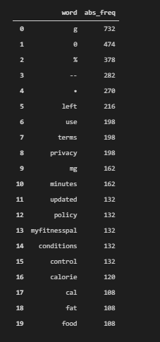
We see that they focus on “calorie” and “g”, “fat”, “food” types of answers. Also, the most used words include boiler plate content words such as “terms” and “privacy”. It shows that they don’t have enough content on their pages, but also they directly answer the query. Below, you will see that they have only 245 unique words.
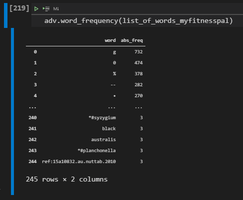
You can see that they also have some special types of mineral names and also ingredient names. In the next section, we will extract the entities of MyFitnessPal.
Extracting Entities of SEO Competitors for Organic Search Performance Comparison
To extract the entities of MyFitnessPal and compare it against the Healthline, we will use a similar methodology. We will use “spacy” and list comprehension along with the Counters module of Python.
article = nlp(str(crawl_serp_df[crawl_serp_df["displayLink"].str.contains("myfitnesspal", regex=True)]['body_text']))
labels = [x.label_ for x in article.ents]
Counter(labels)

OUTPUT>>>

Counter({'CARDINAL': 18, 'PERCENT': 30, 'DATE': 1})
We have extracted the entities of the MyFitnessPal, and checked their types and counts. We have 30 different “percent” entity, 18 numeric entity and only one date. It means that they give the numeric answers to the queries directly. Also, in this section, remember the direct answers on the SERP. MyFitnessPal might have the direct answers within their snippets too, an SEO Data Scientist should understand these methodology differences with data manipulation.
We will calculate the total entity count of MyFitnessPal.
len(article.ents)

OUTPUT>>>

49
We have 49 different entities within the content of the MyFitnessPal. Now, we will print these entities to see them. Printing the entities from the articles of MyFitnessPal output can be found below along with the necessary code block.
print([(X, X.ent_iob_, X.ent_type_) for X in article])To print the entities of the MyFitnessPal, we have used the same methodology with before, we have used “print” command with the list comprehension for the “ent_iob_” and “ent_type” properties from Spacy. Below, you can see the MyFitnessPal entities as written.

We see that their entities are numeric or nutrition focused terms. Their content is short but precise for answering the query. In the Healthline we see lots of unique words and evidences, researches and persons within the articles, also in WebMD we see that they focus on the medical information more. Now, to grasp these facts with more information, we will analyse their content strategy with Data Science.
Taking the First Words of Landing Pages to Understand Competitors’ Content Strategy
The words that are used in the beginning section of the content have a bigger prominence in terms of the ranking and context calculation. Thus, using the most important terms at the beginning section of the content is important. Instead of looking all sections of the content, we can focus on the beginning section to understand their priorities.
crawl_serp_df[crawl_serp_df["displayLink"].str.contains("myfitnesspal", regex=True)]['body_text'].str.split(" ", expand=True).loc[:, :30]In the example code block above, we have taken the “displayLink” values from the “crawl_serp_df”. e have used “str.contains” for extracting the rows only for MyFitnessPal. We have used the “str.split” method with the ” ” space character and used the “expand=True” parameter and values. We have extracted the first 30 columns for the most used words at the beginning section of these contents from MyFitnessPal. You can see the result below.
We see that most of the content from MyFitnessPal has a semantic order for satisfying the queries of users. They directly give the calorie info, then they distribute this calorie value between the “carbs”, “proteins” or other ingredients of the foods. They also tell the daily intake need. In the next section, we will take Healthline’s first words from their content.
crawl_serp_df[crawl_serp_df["displayLink"].str.contains("healthline", regex=True)]['body_text'].str.split(" ", expand=True).loc[:, :30]We only changed the filtering value after “displayLink” for filtering the content of Healthline. You can see the most used words at the beginning section of Healthline’s content as below.

We see that Healthline has a more detailed approach for these queries. They show the author’s name, evidence, and researches on their content. They also include “vitamins”, “fibers”, “and other ingredients from the food. They also give information related to health at the beginning phase. In the next section, we will focus on the internal links of these two competitors with Data Science.
Internal Link Comparison of Competitors (Healthline & MyFitnessPal)
Internal Link Comparison of Competitors can be done thanks to the data that we extracted by crawling the landing pages from SERP for the queries that we selected at the beginning section of the Data Science for SEO guideline. To extract the internal links from the beginning section of the contents of competitors, we will use the same methodology, but we will focus on the “links_text” or other “link” related columns. In the next example, you will see a comparison for the anchor texts.
crawl_serp_df[crawl_serp_df["displayLink"].str.contains("healthline", regex=True)]['links_text'].str.split("@@",expand=True).loc[:, :30]To extract the first internal links and anchor texts from the contents of the Healthline, we have used the same methodology with Pandas data filtering and string manipulation. We have used the “@@” character as the seperator since it was used as seperator by Advertools as default. Below, you will see the first internal links and anchor texts from Healthline.

We see that Healthline uses internal links for user retention, author introduction and also generic terms such as “vitamins”, “low-Gı diet”, “peanut butter”, “trans fats”, “Berries” and also links for social share. Since, we already see the MyFitnessPal’s content strucutre, we don’t have to look at their internal links in terms of “beginning section of a content”. Because, their content is too thin already, and they only link the relevant food types and legal-cooperate pages.
Most Used Anchor Texts of Competitors on the SERP within Their Content
Instead of just looking at the anchor texts at the beginning section, we also can extract all of the most used anchor texts easily. In the example below, you will see that we have extracted the most used anchor texts from Heathline.
crawl_serp_df[crawl_serp_df["displayLink"].str.contains("healthline", regex=True)]['links_text'].str.split("@@",expand=True).stack().value_counts().to_frame().rename(columns={0:"Anchor Texts"}).head(30)We have chosen the Healthline’s content with data filtering, we have extracted all of the link texts or anchor texts, we have used “stack()” and “value_counts()” to calculate the word frequencies within the anchor texts. Below, you can see the most used anchor texts of Healthline.
Healthline has numbers within their content as anchor texts because they use the “references section” with reference numbers within their content. Also, they have generic and cooperate anchor texts within their content. We also see that they help people to find doctors, they have a newsletter and careers section within their content. In the next section, we will do the same for MyFitnessPal.
crawl_serp_df[crawl_serp_df["displayLink"].str.contains("myfitnesspal", regex=True)]['links_text'].str.split("@@",expand=True).loc[:, :30] #.stack().value_counts().to_frame().rename(columns={0:"Anchor Texts"}).head(30)We see that MyFitnessPal’s first anchor texts in their content as below. And, as we said before, they have lots of boilerplate anchor texts within their content since they don’t have enough content. Most of these internal links are not related to the topic of the queries, they only have “food” and “exercises” as relevant examples.

MyFitnessPal doesn’t have enough content on their pages, and most of their initial words and also links, anchor texts are not related to the topic that they try to tell to the users. Below, you will see their most used anchor texts.
crawl_serp_df[crawl_serp_df["displayLink"].str.contains("myfitnesspal", regex=True)]['links_text'].str.split("@@",expand=True).loc[:, :30].stack().value_counts().to_frame().rename(columns={0:"Anchor Texts"}).head(30)To extract the most used internal anchor texts for MyFitnessPal, we have used the same methodology with Pandas data filtering and data frame configuration methodologies such as “str”, “split”, “stack”, “value_counts”, “to_frame”, “to_frame()” and more. Below, you will see the result.
We see that MyFitnessPal’s most used anchor texts within their content include some food names such as “Asparagus Raw”, “Dried Mango”, “Rosehip Tea”, but also they mainly use “Blog”, “Log in”, ” Privacy” and other types of anchor texts. A website should use the relevant anchor texts and the links more frequently within the most important positions of the web pages. In this context, they can also variate their anchor texts such as “Calories of X”, “Calories in X”, “Nutrition of X” instead of always using the food name. It provides more context and relevance for the Search Engine. In the next section, we will focus on the total word count of the sources.
Taking the Word Count per Result as “Total_Words” for Data Maniuplation
To understand the SEO Competitors’ content granularity and detail level along with their content strategy, we can focus on the word count. Word count can help having more queries on the SERP, and also it can help Search Engines to understand the context in a better way as long as the words help users to give more information. Below, you will see that we will create a new column on our data frame.
crawl_serp_df['total_words'] = crawl_serp_df['body_text'].str.split().str.len()
crawl_serp_df['total_words'] = crawl_serp_df['total_words'].fillna(0)
crawl_serp_df['total_words'].astype(int)

OUTPUT>>>


0       2405
1       2405
2       2405
3       2405
4       2405
        ...
1416       8
1417       8
1418       8
1419       8
1420       8
Name: total_words, Length: 1421, dtype: int32
You can see the methodology’s explanation below.
- We have created a new column called “total_words”, we have assigned the length of the words within the “body_text” of the landing pages.
- We have used “fillna(0)” method for filling the “non” values as 0.
- We have used “astype(int)” for using them in data aggregation better.
Visualization of Total Word Count and Rankings per Domain, URL and Query
After taking the word counts for every content piece on the Search Engine Results Page, we also can visualize their word count. In the future, you also can visualize the entity types, counts per sources too. In this example, we will do this for word count.
crawl_serp_df[crawl_serp_df['displayLink'].isna()]
crawl_serp_df.dropna(subset=["displayLink"], inplace=True)
fig = px.bar(crawl_serp_df, x='rank', y='total_words', hover_name="displayLink",color="displayLink", labels={"rank":"Ranking", "total_words":"Total Word Count"}, title="Total Word Count, Ranks, Domain Names", hover_data=["link","searchTerms","title_x"],width=1500,height=760)
fig.show()
We have taken the “non” values for the source column which is “displayLink”. We have seen that there are some “non” values for the domain names because we couldn’t crawl all of the domains due to the “PDF crawling” capacity of Advertools. And, we have dropped these rows from our data frame so that we can have a better visualization. In other examples, you can also drop the PDF rows or URLs before the crawling process. We have created the bar plot with Plotly Express by choosing the “crawl_serp_df” data frame. We have used the “rank” column on the “x” axis, and “total_words” for the y-axis so that we can group the rankings and words that are being used on these rankings. We have grouped the domains according to the colors with the help of the “color=displaylİnk” parameter. We have used labels, width, and height, title parameters for the design elements of the bar chart.
You can see the result below.
We see that most of the content on the first rank is longer than the content on the other ranks. But also we see that some certain sources (domains) have longer content than other domains. For instance, in this example, MyFitnessPal has the shortest content, while Fs.fed.us and Healthline have longer content than others. Also, we see that certain sources are positioned on certain rankings.
This means that every source is being positioned according to their content strategy’s result on the SERP.
Filtering Top 10 Domains and Their Rankings with Word Counts per Query
We can filter this visualization for only the first 10 Domains and their word counts per ranking on the SERP. Also, in other examples, you can check the “queries” and “word counts”. Because some queries might deserve a longer content like deserving a fresher content also. In the example below, you will see that we have filtered the best-performing top 10 content.
crawl_serp_top10_df = crawl_serp_df[crawl_serp_df['displayLink'].isin(top10_domains)]
fig = px.bar(crawl_serp_top10_df, x='rank', y='total_words', hover_name="displayLink",color="displayLink", labels={"rank":"Ranking", "total_words":"Total Word Count"}, title="Total Word Count, Ranks, Top Domain Names", hover_data=["link","searchTerms","title_x"],width=1500,height=760)
fig.show()
We have created a new variable for the top 10 domains on the SERP, we have used the “isin” method and the “top10_domains” list variable that we have created before in the Data Science SEO tutorial. In the rest of the code block, we have used the same methodology. You can see the result below.
We see that Fs.fed.us is being lost from the visualization because it was not in the Top 10 Domains. Now, we have a clearer information tree for the data that we have. We see that Healthline’s content on the first rank is nearly 200.000 words. And, we see that MyFitnessPal also shares the first rank with Healthline with way much lesser content. In his example, we should ask which one is performing better?
MyFitnessPal has better topical coverage and it is close to the Healthline in terms of Organic Search performance, let’s continue to compare them.
Comparing Competitors’ Total Word Count from SERP based on Their Rankings (Healthline & MyFitnessPal)
In this section, we will create two different data frames that include only the MyFitnessPal and Healthline content. We will compare their performance and their content strategies, also their schema types, and more.
crawl_serp_myfitnesspal = crawl_serp_top10_df[crawl_serp_top10_df['displayLink']=="www.myfitnesspal.com"]
crawl_serp_healthline = crawl_serp_top10_df[crawl_serp_top10_df['displayLink']=="www.healthline.com"]
We have created the “crawl_serp_myfitnesspal” and crawl_serp_healthline” variables. These variables include all the necessary and related results and data for these two domains in terms of SERP data and Crawl Data. In the next sections, we will also include the “Off-Page SEO Data” in our SEO Data Science Tutorial.
fig = px.bar(crawl_serp_myfitnesspal, x='rank', y='total_words', hover_name="displayLink",color="displayLink", labels={"rank":"Ranking", "total_words":"Total Word Count"}, title="MyFitnesPal Total Word Count, Ranks, Top Domain Names", hover_data=["link","searchTerms","title_x"],width=1500,height=760)
fig.show()
In the code example above, we have created a “bar chart for word counts” of MyFitnessPal for every ranking. So that we can see MyFitnessPal general situation in the SERP in terms of word count.
We see that MyFitnessPal has a consistent word count and content length for every ranking. Usually only one Healthline content is equal to the 12 MyFitnessPal content in terms of length. Also, we know that Healthline uses more relevant anchor texts, internal links, and it has more entities within its content. In the next section, we will visualize the word count for only Healthline.
Healthline Ranking URLs and Total Word Count Based on Their Rankings
We have created anothe rbar chart for only Healthline so that we can see only its general situation in a more clear way.
fig = px.bar(crawl_serp_healthline, x='rank', y='total_words', hover_name="displayLink",color="displayLink", labels={"rank":"Ranking", "total_words":"Total Word Count"}, title="Healthline Total Words, Ranks, Top Domain Names", hover_data=["link","searchTerms","title_x"],width=1500,height=760)
fig.show()
If you have an interactive visualization example, in normal conditions you can just click the names of the labels on the legend of the charts, so that you can include and exclude the related data from the visualization. Plotly has including and excluding features as built-in. But for showing a clearer SEO Data Visualization example, we have created another example.
Healthline’s Total Word Count can be found for every ranking result as below. It is interesting to see that it has no content or landing pages for the 2, 4, 5 rankings on the SERP. Also, it has nearly 200.000 words for the first rank, MyFitnessPal has only 4.00.
To understand which domain’s SEO performance is better, we can check their content gap and also mutual queries for a better comparison.
Extracting Content Gap Between Competitors and Taking the Mutual Queries for Comparison
To compare two domains’ organic performance for mutual and unique queries, we will use “set” and “difference”, “intersection” methods.
healthline_queries = set(crawl_serp_top10_df[crawl_serp_top10_df['displayLink']=="www.healthline.com"]['searchTerms'])
myfitnesspal_queries = set(crawl_serp_top10_df[crawl_serp_top10_df['displayLink']=="www.myfitnesspal.com"]['searchTerms'])
In the example above, we have created two variables, one for the queries that Healthline is ranking which is “healthline_queries”. The other one is for the queries that MyFitnessPal is ranking. We have turned these data series into sets and assigned them to the variables which are “healthline_queries” and “myfitnesspal_queries”.
healthline_queries.difference(myfitnesspal_queries)

OUTPUT>>>

{'calories in african mangosteen',
 'calories in african oil palm fruit',
 'calories in apple',
 'calories in açaí',
 'calories in chokeberry',
 'calories in loquat',
 'calories in pear',
 'calories in quince',
 'calories in southern crabapple'}
In the example above, we have used “difference” method so that we can have only the queries that Healthline is ranking and MyFitnessPal is not ranking.
myfitnesspal_queries.difference(healthline_queries)

OUTPUT>>>

{'calories in ambarella',
 'calories in jagua',
 'calories in sapodilla',
 'calories in serviceberry'}
In the example above, we have taken only the MyFitnessPal is ranking and Healthline is not ranking. We see that Healthline has more unique queries against MyFitnessPal. In the next section, we will take the mutual queries for checking their performance.
Mutual Queries and Performance Comparison Between Healthline & MyFitnessPal
To take the mutual queries of two different domains, you can use the “intersection” method for the “set” data types. Below you can see an example.
mutual_queries = myfitnesspal_queries.intersection(healthline_queries)
mutual_queries_df = crawl_serp_df[crawl_serp_df['searchTerms'].isin(mutual_queries)]
We have created a variable which is “mutual_queries”. It includes all of the queries for both of the domains. Then, we have filtered the “crawl_serp_df” with the “isin” method for these mutual queries. Now, we can compare their average rankings for these mutual queries.
mutual_queries_df[mutual_queries_df['displayLink']=="www.healthline.com"]['rank'].mean()

OUTPUT>>>

4.222222222222222
Healthline has 4.22 average position for the mutual queries with MyFitnessPal.
mutual_queries_df[mutual_queries_df['displayLink']=="www.myfitnesspal.com"]['rank'].mean()

OUTPUT>>>

2.6666666666666665
We see that MyFitnessPal has 2.66 average positions. MyFitnessPal has used 4.000 words against Healthline’s 200.000 words of content, it has used fewer internal links, anchor texts, and entities. But still, it has a way much better average ranking. Also, checking their performance for the unique queries is a nice option to see the effect of not having the main competitor on that SERP.
But also, we should remember that Healthline has way much more pages than MyFitnessPal. And also, we have checked the occurences of domains for every ranking, it was higher for Healthline. Thus, we will use the summary below for the outcomes.
The outcomes until now from our Data Science Tutorial’s word count and SEO competitor comparison can be found below.
- MyFitnessPal has a better AP but, this is because Healthline has more pages.
- We can tell that Healthline’s Long-form Content has better Results along with the Coverage
In the next section, we will visualize every domains and main competitors’ SEO performance for the mutual queries of Healthline and MyFitnessPal.
Checking the Average Rank for the Two Domains for Mutual Queries
To visualize the SEO performance of domains for the mutual queries of the Healthline and MyFitnessPal, we will use the cod eblock below.
fig = px.bar(mutual_queries_df, x='rank', y='total_words', hover_name="displayLink",color="displayLink", labels={"rank":"Ranking", "total_words":"Total Word Count"}, title="MyFitnessPal, Healthline and Other's Comparison for Mutual Queries of Healthline and MyFitnessPal", hover_data=["link","searchTerms","title_x"],width=1500,height=760)
fig.show()
In the example of the code block above, we have used the “px.bar” from Plotly Express. We have used the “mutual_queries_df” and rank data for the x-axis, total word count for the y axis. We also can see the “displayLink” when hovering the graph. And, we have the “query, title” information on the hover effect. You can see the result below.
In this example, we see that besides MyFitnessPal and Healthline, there are lots of different and competitive players for certain types of queries. Such as “Nutirionix” and “Fitbit”. Having and analyzing these sites’ data can be useful to rivet the outcomes that we had thanks to SEO data Science.
In the next section, we will perform a batch analysis from Ahrefs to take Healthline and MyFitnessPal’s organic search performance for only the URLs that they have for the “culinary fruits” queries that we have used before in the SEO Data Science guideline.
A Quick Check for Organic Query Count for these URLs based on Total Word Count
To perform a batch analysis in Ahrefs, we will need to print all of the landing pages of Healthline and MyFitnessPal’s URLs from the data frame that we have. And, we will only print the URLs of these two domains for the mutual queries that they have.
for url in mutual_queries_df[mutual_queries_df['link'].str.contains("healthline|myfitnesspal",regex=True)]['link'].explode().to_list():
    print(url)

OUTPUT>>>

https://www.healthline.com/nutrition/what-is-quince-fruit
https://www.healthline.com/nutrition/what-is-quince-fruit
https://www.healthline.com/nutrition/what-is-quince-fruit
https://www.healthline.com/nutrition/what-is-quince-fruit
https://www.healthline.com/nutrition/what-is-quince-fruit
https://www.healthline.com/nutrition/what-is-quince-fruit
https://www.healthline.com/nutrition/what-is-quince-fruit
https://www.healthline.com/nutrition/what-is-quince-fruit
https://www.healthline.com/nutrition/what-is-quince-fruit
https://www.healthline.com/nutrition/what-is-quince-fruit
https://www.healthline.com/nutrition/what-is-quince-fruit
https://www.healthline.com/nutrition/what-is-quince-fruit
https://www.myfitnesspal.com/food/calories/chinese-quince-tea-with-honey-608239300
https://www.myfitnesspal.com/food/calories/chinese-quince-tea-with-honey-608239300
https://www.myfitnesspal.com/food/calories/chinese-quince-tea-with-honey-608239300
To print all the URLs, we have used a for loop, and we have used regex to take all of the related domains and their results. We have used “explode” and “to_list()” method so that we can print URLs of MyFitnessPal and Healthline for the queries that we used before. Below, you can see the result.
If you want to print all of the URLs for a broader Off-Page Data integration, you can use the result below.
for url in mutual_queries_df['link']:
    print(url)
Extracting the Domain Names for Aggregating the Query (Keyword) Count
After performing the batch analysis from Ahrefs for the landing page URLs of Healthline and MyFitnessPal for the SERP instances that we have created via “adv.serp_goog()” function for the culinary fruit calories and nutrition queries, we can start to data aggregation and blending for understanding the effect of long and short contents in terms of Search Engine Optimization.
def domain_name_extract(url):
    domain_name = urlparse(url).netloc
    return domain_name
domain_name_extract("https://www.getwordly.com/")

OUTPUT>>>

'www.getwordly.com'
If you need to extract only the domain names for source based data aggregation, you can use the function block above, it basiaclly takes the domain name from the URL and print it. In the example below, we will use the batch analysis CSV output wih Python for Data Science Search Engine Optimization.
query_count_df = pd.read_csv("batch_analysis_export-all.utf-16.csv", encoding="UTF-16", delimiter="\t")
query_count_df['Target'].to_list()[:5]

OUTPUT>>>

['www.healthline.com/nutrition/what-is-quince-fruit',
 'www.myfitnesspal.com/food/calories/chinese-quince-tea-with-honey-608239300',
 'slism.com/calorie/107053/',
 'www.pritikin.com/quince-fruit-fall-food',
 'www.vitaherbalnutrition.com/product/dried-papaya/']
We have created a new cariable which is “query_count_df”. We have assigned the “batch analysis output” to it while reading it. “encoding” and “delimiter” parameters are for reading the CSV properly. We have printed the “Target” column’s first 5 lines. “Target” means the domain name in Ahrefs’ terminology.
Query Count and Average Total Words per URL Comparison for Healthline and MyFitnessPal
Query Count and Average Total Words are the two essential metrics to understand the main difference of the outcome of the content strategies of Healthline and MyFitnessPal. In the example below, we will create a data frame that shows the average total query count per URL and total query count per source.
query_count_df["Domain Name"] = adv.url_to_df(query_count_df['Target'])['dir_1']
query_count_df[query_count_df["Domain Name"].str.contains("healthline.com|myfitnesspal.com",regex=True)].pivot_table("Total Keywords", "Domain Name", aggfunc=["sum","mean"]).sort_values(("mean","Total Keywords"), ascending=False).style.background_gradient(cmap="cividis")
We have created a new column for the “Domain Name” with the help of the “adv.url_to_df” function. We have extracted the Domain Names so that we can aggregate the data based on source names. We have taken only the rows that contain “Healthline” or “MyFitnessPal” from our data frame. We have created a new pivot table with the help of “Keywords” and “Domain Name” columns with “sum” and “mean” methods. We have sorted the values, styled the data frame, and called it. You can see the result below.
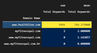
We see that Healthline has 749 queries per URL and 5995 total keywords for all the URLs of the culinary fruit queries’ SERP examples. Thus, we clearly can say that, having longer and more granular content help in acquiring more related queries and a topical authority for the related search activities. Also, we see multiple MyFitnessPal domains, because some of them are being redirected to the new properties with time.
Query Count and Total Average Total Words Count Per URL Comparison for All Sources
In this section, we will take all of the total keyword and average keyword count per URL from every source into a data frame.
query_count_df.rename(columns={"Domain Name":"displayLink"}, inplace=True)
query_count_df.pivot_table("Total Keywords", "displayLink", aggfunc=["sum","mean"]).sort_values(("sum","Total Keywords"), ascending=False).style.background_gradient(cmap="cividis")
We have used the same methodology, we just didn’t use the regex filter option, since we didn’t want to filter anything in this section. Below, you will see total keyword count and average keyword count per URL for the sources.
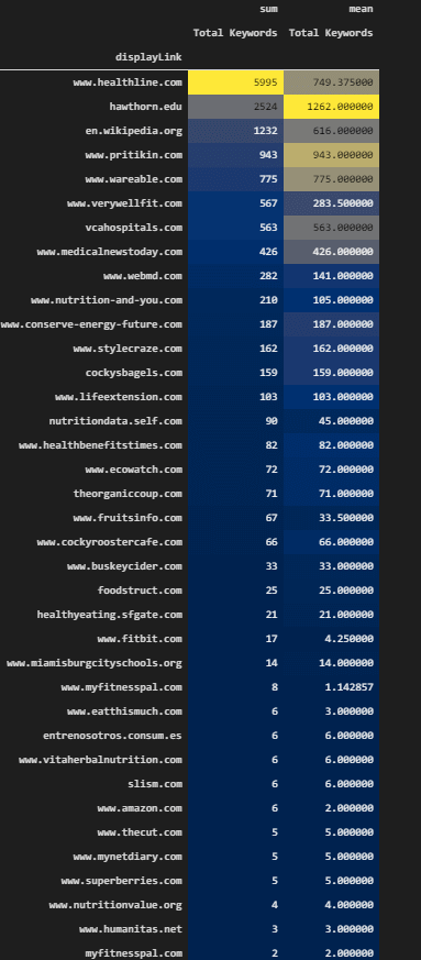
We see that there is a correlation between query count and content length or word count. Of course, having a unique word set and useful information are the two main factors here. In the result above, we see that Healthline, Wikipedia, Verywelllift are advantageous in terms of total keyword count.
Merging the Query Count DF and Crawl DF and SERP DF for a Better Comprehensive Look
For a better comprehensive look and data analysis for Search Engine Optimization, we will merge the Query and Off-Page Data, Crawl Data of Landing Pages and SERP Data of the sources for these queries. In the example below, ou will see that we merge the “mutual_queries_df” and “query_count_df”.
query_count_crawl_serp_df = pd.merge(mutual_queries_df,query_count_df, on="displayLink", how="inner" ) #totalResults => InnerWe have used the “displayLink” and “inner” options for the data frame merging. In the next example, you will see that we will output the total keyword count of the Healthline.
query_count_crawl_serp_df[query_count_crawl_serp_df['displayLink']=="www.healthline.com"]['Total Keywords'].sum()

OUTPUT>>>

323730
Healthline has 323730 total keywords that it ranks with these URLs from our query and SERP examples… In the next section, you will see the same data for MyFitnessPal.
query_count_crawl_serp_df[query_count_crawl_serp_df['displayLink'].str.contains("myfitnesspal") == True]['Total Keywords'].sum()

OUTPUT>>>

288
In this example, we see that “query_count_crawl_serp_df” has been used with only MyFitnessPal’s landing pages. We have chosen the “Total Keywords” column and checked its total keyword count for only the URLs for the queries that we used for. It appears that MyFitnessPal has 288 queries. It is a distinct difference between MyFitnessPal and Healthline. MyFitnessPal might perform better with fewer pages and only the queries that we used for, but when we include all the queries for these URLs, we see that detailed content creates better organic search performance and topical authority for the related query network.
Visual Comparison of Total Query Count for Mutual Queries based on Healthline, MyFitnessPal by Including Other Competitors
Search Engine Data Visualization can be performed for total query count for the sources’ landing pages in the mutual queries. Thus, we can see the organic performance of these URLs for a b roader aspect.
fig = px.bar(query_count_crawl_serp_df, x='displayLink', y='Total Keywords', hover_name="displayLink", color="rank", labels={"rank":"Ranking", "total_words":"Total Word Count"}, title="MyFitnessPal, Healthline and Other's Comparison for Mutual Queries of Healthline and MyFitnessPal", hover_data=["link","searchTerms","title_x","Total Keywords"],width=1300,height=760) #facet_col="rank", #facet_col_wrap=6)
fig.update_xaxes(matches=None, categoryorder="total ascending")
fig.show()
The explanation of the code block above can be found below.
We have used “px.bar()” and assigned its result to the “fig” variable. We have used “query_count_crawl_serp_df” data frame. We have determined the “hover_data”, title, height, width, color groups, and x, y axes values. We have used “update_xaxes” method for changing the order of the bars in the chart. We have called the figure.
You can see the total keyword count for the URLs of domains for the queries that we have used for as grouped according to the their domain names. We also colored the keywords according to the their ranking data, and when you hover them, you will be able to see the query, URL and title.
We see that Healthline, Wikipedia, Hawthorn have the most queries. And, also they have the longest and detailed content. MyFitnessPal has better topical coverage and performance for the queries that we have used for with fewer pages, but it has a less effective organic search performance in a general perspective.
In the next sections, we will focus on Schema Types, response times, response latency, domain rating, and backlink count with more for SEO Data Analysis and Visualization.
Which Schema Type is being Used by which Source at which Rank on the SERP?
Schema type affects the web pages’ character and function in the eyes of a search engine. Structured Data can give more information to the search engine via the properties and dimensions that it includes. Below, we will check the how many pf these landing pages use structured data or not.
crawl_serp_df['jsonld_@type'].isna().value_counts()

OUTPUT>>>

True     953
False    468
Name: jsonld_@type, dtype: int64
We have taken the “jsonld_@type” and checked the “isna” values. We see that most of the documents don’t use structured data. Now, we will check their types to understand the Search Engine Optimization and Schema relation on the SERP.
schema_type_rank = crawl_serp_df.dropna(subset=["jsonld_@type"])We have dropped the rows that include a structured data example. And assigned it into the “schema_type_rank” data frame variable.
schema_type_rank['jsonld_@type'].isna().value_counts()

OUTPUT>>>


False    468
Name: jsonld_@type, dtype: int64
We have checked the “jsonld_@type” column again, and we see that we successfully dropped the columns that don’t include structured data.
Top 10 Domain’s Schema Usage Comparison based on Ranks and Schema Type
Top 10 Domain’s Schema Usage comparison can show the different strategies and also the Search Engine’s perspective for the structured data on the SERP.
fig = px.bar(schema_type_rank, x='jsonld_@type', y='rank', hover_name="displayLink",color="displayLink", labels={"rank":"Ranking", "jsonld_@type":"Schema Type"}, title="Schema Types and Rankings", hover_data=["link","searchTerms","title_x"],width=1700,height=700,facet_col="rank")
fig.show()
In the example above, you can see that we have used the “schema_type_rank” variable, we have used “jsonld_@type” in the x-axis and “rank” in the y axis. We have grouped the domains with different colors. We also have search terms, links, and titles in the hover data effect. You can see the result below.
We see that Healthline is using “Medical Web Page” structured data, and other domains are using BreadcrumbList, NewsArticle, BlogPost structured data in different rankings. We can do the same visualization for the domains from only the top 10 domain lists.
fig = px.bar(crawl_serp_top10_df, x='jsonld_@type', y='rank', hover_name="displayLink",color="displayLink", labels={"rank":"Ranking", "jsonld_@type":"Schema Type"}, title="Schema Types and Rankings for 10 Domains", hover_data=["link","searchTerms","title_x"],width=1700,height=700,facet_col="rank")
fig.show()
We have used the same methodology for only the top 10 domains via the “crawl_serp_top10_df” data frame which includes only the best performing 10 domains within it.
We see that FatSecret, FitBit use BreaCrumbList and Organization structured data, Also, Nutritionix is using organization structured data. And, Healthline is the only example that uses “MedicalWebPage” structured data.
Examining the Response Latency and Ranking Relation on the SERP
Response latency means that the time between the response to the user-agent and the first-byte downloading time. A healthy server and fast response times are crucial for SEO performance. Thus, we will examine the response times for different domains and rankings with SEO data science.
crawl_serp_df['resp_meta_download_latency']

OUTPUT>>>

0       0.753078
1       0.386003
2       0.249013
3       2.365738
4       0.778342
          ...
1416    0.269597
1417    0.241927
1418    0.262136
1419    0.284000
1420    0.256999
Name: resp_meta_download_latency, Length: 1421, dtype: float64
We have chosen and printed some of the response latencies as above. Some of them are above 2 seconds, and some of them are above 200 milliseconds.
crawl_serp_df.pivot_table("resp_meta_download_latency", "displayLink", aggfunc=["mean"]).sort_values(("mean","resp_meta_download_latency"), ascending=False).style.background_gradient(cmap="cividis")
#crawl_serp_top10_df
We have pivoted the “resp_meta_download_latency” data according to the domains, sorted the values, and styled the data frame, you can see the worst domains in terms of response times.
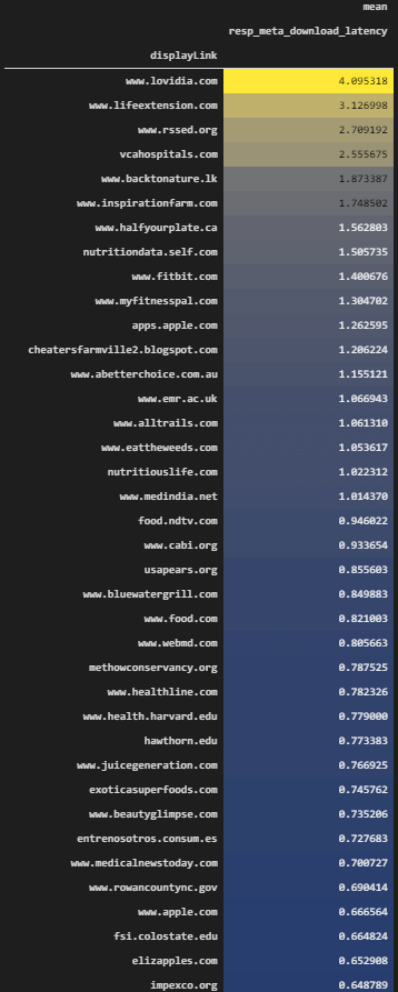
We see that all of the Top 10 Domains are better than the domains above in terms of response latency generally, and you can find the interactive video for the rest of the data frame.
SEO Data Visualization and Science can be used for server health and connectivity. A partial data example also exist in Google’s Search Console’s crawl data section.
Averaging the Response Latency Based on Top 10 Sources on the SERP
In this section, we will take the top 10 domains’ average response latency.
crawl_serp_top10_df.pivot_table("resp_meta_download_latency", "displayLink", aggfunc=["mean"]).sort_values(("mean","resp_meta_download_latency"), ascending=False).style.background_gradient(cmap="cividis")We have used the same methodology with “crawl_serp_top10_df” data frame which includes only the top 10 domains. We have chosen the “resp_meta_download_latency” as the aggregation data, we have chosen “displayLink” to be aggregated point. You can see the results below.
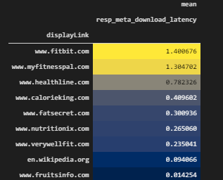
We see that “wikipedia” has a great server response time, “fruitsinfo” and “fatsecret”, “nutritionix” are also other best sites in terms of response times. Fitbit, myfitnesspal and Healthline iare not perfect but they are still managing to stay as functional. We also see that bad response time is not a definitive factor if the content and the source iare quality and authoritative. But having a better server response time is always better and helper for the SEO performance.
Visualization of Response Latency and SERP Situation for Top 10 Sources
We will use data visualization for the SEO performance in terms of response latency. We will check which domain has which response latency at which rank. We will use the top 10 domains as below.
fig = px.scatter(crawl_serp_top10_df, x='rank', y='resp_meta_download_latency',opacity=0.6, hover_name="displayLink",color="displayLink", labels={"rank":"Ranking", "resp_meta_download_latency":"Response Latency"}, title="Response Latency and SERP Situation", hover_data=["link","searchTerms","title_x","resp_meta_download_latency"],width=1200,height=700)
fig.show()
# color is the source.
We see that most of the top 10 domains have close response latency times. And also, there is a certain range between the top and lowest values in terms of response latency. We can say that most of the domains from the top 10 domain list have a response latency between 0.2 and 1 seconds, and they are all close to each other.
An SEO can look at this data visualization example and calculate the server health necessity for these queries, having a better response time will help agains these main competitors.
Visualization of Response Latency and SERP Situation for Top All Sources
After having the Top 10 domains in our data visualization example, we can check the all of the domains in terms of Response Latency within the SERP according to their rankings.
fig = px.scatter(crawl_serp_df, x='rank', y='resp_meta_download_latency', hover_name="displayLink",color="displayLink", labels={"rank":"Ranking", "resp_meta_download_latency":"Response Latency"}, title="Response Latency and SERP Situation", hover_data=["link","searchTerms","title_x","resp_meta_download_latency"],width=1200,height=700)
fig.show()
# color is the source.
We have used the same methodology, we have just changed the “crawl_serp_df” as the data source for our “px.scatter() call. You can see thre result below.
We see that most of the domains have a worse response latency than the top 10 domains.
Examining the Response Size and Ranking Relation on the SERP
Response size shows the HTML size of the parsed HTML. Response size can have a value for SEO performance because it affects the user experience. Also, having a too large HTML response size can harm the parsing, rendering, and indexing process of Search Engines.
crawl_serp_df.pivot_table("size", "displayLink", aggfunc=["mean","sum","count"]).sort_values(("mean","size"), ascending=False).style.background_gradient(cmap="cividis")We have chosen the “size” column for creating a pivot table and aggregate the total size, average size values for every domain. You can see the result below.
We see that some of the domains have averagely 535 KB HTML response size, and some of them has only 100 KB. Response size also has a correlation with the content length. But, again having a lower response size is better for crawl speed, cost, effcieincy, indexing, rendering and user experience. Below, you will see the same data as image.
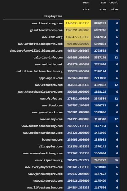
In the next section, we will check the response size for only top 10 domains.
Examining the Response Size and Ranking Relation for Top 10 Sources on the SERP
Top 10 domains’ response size can give a hint for the successful domain’s top and lowest size range. Below, you will see a data aggregation example for the top 10 domain’s response size.
crawl_serp_top10_df.pivot_table("size", "displayLink", aggfunc=["mean","sum","count"]).sort_values(("mean","size"), ascending=False).style.background_gradient(cmap="cividis")
#crawl_serp
#color is optional
We have used the “crawl_serp_top10_df” for the data aggregation and extracting the average and sum of the HTML sizes of the pages from top 10 sources. You can see the result below.
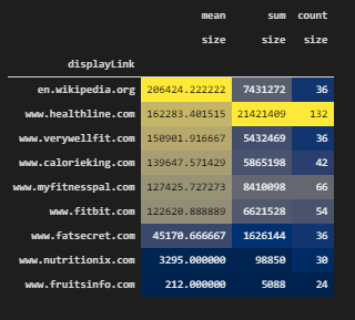
We see that the biggest response size is from Wikipedia, then, Healthline. It is because of the content length. And, total size is higher for Healthline because it has more pages for these queries. And, MyFitnessPal has lower page size.
Thus, an SEO can understand with the help of Search Engine Optimization Data Science, the necessary HTML Size range for a content strategy and SEO campaign. Having more information with less HTML size and faster response latency is the key to better SEO performance.
Visualization of HTML Size and SERP Situation for All Sources
We can visualize the HTML size for all of the domains while visualizating their average ranking on the SERP. Below, you will see an example.
fig = px.bar(crawl_serp_df, x='rank', y='size', hover_name="displayLink",color="displayLink", labels={"rank":"Ranking", "size":"Response Size"}, title="HTML Size and SERP Situation", hover_data=["link","searchTerms","title_x","resp_meta_download_latency"],width=1200,height=700)
fig.show()
We have used “px.bar()” method with the “crawl_serp_df” data frame. We have used “rank” data for the x-axis while using the “size” column for the y axis. We have grouped and visualized the domains based on colors, we have used queries, titles, response latency for the hover data. We have determined width as 1200, height as 700 and called our visualization.
Below, you will see the relevant output.
We see that every source has similar HTML size for every URL. Also, we see that some sources has different HTML sizes for the different queries or on different rankings. Based on this, a Search Engine Optimization Expert can use data visualization to understand the average response size on the SERP for every source, queries and ranking.
Visualization of HTML Size and SERP Situation for Top 10 Sources
Taking only the top domains’ HTML Size and visualizing it with data visualization can help an SEO to understand the industry normals. Below, you will see a relevan code block for HTML Size visualization.
fig = px.bar(crawl_serp_top10_df, x='rank', y='size', hover_name="displayLink",color="displayLink", labels={"rank":"Ranking", "size":"Response Size"}, title="HTML Size and SERP Situation", hover_data=["link","searchTerms","title_x","resp_meta_download_latency"],width=1200,height=700)
fig.show()
The explanation is below.
- We have created a variable, which is “fig”.
- We have used “px.bar()”.
- We have used “crawl_serp_top10_df” variable.
- We have used “rank”, “size” for the x and y-axis.
- We have used URLs, queries, titles, and response latency as the hover data.
- We have determined the width and height values with the height and width parameters of “px.bar()”.
- We have called the plot “fig.show()”.
Below, you can see HTML Size and SERP situation below.
We see that FatSecret and Healthline have more response sizes than others. Also, Wikipedia has more response size. We see that some of the domains have a better advantage in terms of content length, information amount, and HTML size along with rankings. In the next section, we will focus on the Off-Page SEO data and Data Science, Visualization.
To aggregate the link-related and Off-Page SEO data for top 10 domain, we will need to filter the every link related column.
for i in query_count_df.columns:
    if i.__contains__("link"):
        print(i)

OUTPUT>>>

Total Backlinks
Backlinks Text
Backlinks NoFollow
Backlinks Redirect
Backlinks Image
Backlinks Frame
Backlinks Form
Backlinks Governmental
Backlinks Educational
We have used a for loop and “__contains__” method for filtering columns according to whether they include a “link” phrase within them or not. We have extracted the related columns from Ahrefs Batch Analysis such as Total Backlinks or Backlink Image..
query_count_crawl_serp_df['Total Backlinks']

OUTPUT>>>

0        73
1       188
2       366
3       227
4        42
       ...
1027      0
1028      1
1029      0
1030      1
1031      0
Name: Total Backlinks, Length: 1032, dtype: int64
We have printed the Total Backlink Count for every landing page, in the next section, we will start to aggregate and visualization Off-page SEO data.
Referring Domain Count and Ranking Relation on the SERP for All Sources
Referring Domain Count or referrer count can be an important SEO performance factor for some domains. It shows the reference count on the web for a specific domain. Below, you will see an example.
fig = px.bar(query_count_crawl_serp_df, x='rank', y='Ref domains Dofollow', hover_name="displayLink",color="displayLink", labels={"rank":"Ranking", "Ref domains Dofollow":"Referring Domain Count"}, title="Referring Domain Count", hover_data=["link","searchTerms","title_x","resp_meta_download_latency", "Total Backlinks"],width=1200,height=700)
fig.show()
Explanation of this code block is below.
- We have created a variable which is “fig”.
- We have used “px.bar()” with “query_count_crawl_serp_df” data frame.
- We have used “rank” on the x-axis.
- We have used “Ref domains Dofollow” for the y-axis.
- We have used URLs, keywords, titles and response latency along with Total Backlinks for the hover data.
- We have determined the width as 1200, height as 700.
- We have called our SEO data visualization for referring domain count and ranking correlation.
You can see the result below.
We see that most of the domains don’t have enough referrer according to their main competitors. And, we see that Healthline has the most queries, most entities, and also referrers. We also see that Wikipedia has the most referring domains per landing page. Also, MyFitnessPal is doing well for its referring count, it might also be a reason for its rankings for these types of queries. Like in the response latency or response size section, having these types of Off-page SEO Data Visualization and Aggregation examples, help an SEO to calculate the off-page SEO necessities.
Total Backlink Count and Ranking Relation on the SERP For All Sources
Total Backlink Count and Ranking Relation is another SEO Data correlation example. Like in the referrer domain count, also total backlink count can be a good example to see the general situation of the SERP and its reasons.
fig = px.bar(query_count_crawl_serp_df, x='rank', y='Total Backlinks', hover_name="displayLink",color="displayLink", labels={"rank":"Ranking", "size":"Response Size"}, title="Total Backlinks and SERP Situation", hover_data=["link","searchTerms","title_x","resp_meta_download_latency"],width=1200,height=700)
fig.show()
The code explanation is below.
We have created a variable to assign the “px.bar()” command’s result.
- We have used “query_count_crawl_serp_df” data frame, “rank” column on x-axis, and “Total Backlinks” count on y-axis.
- We have used the domain name as a hover name.
- We have used queries, URLs, titles, response latency as the hover data.
- We have determined the height and width values and called the visualization example.
You can see the result below.
We see that Hawthorn.edu has the most backlink count among all the domains and also per URL. Also, Healthline has less backlink according to the some of its competitors, it means that every referrer has a reasonable count of backlink for Healthline, it is another signal for a natural backlink structure. MyFitnessPal and some other competitors except the Wikipedia, seems weaker in terms of backlink count. And some of the lesser known competitors such as “nutiriton-and-you.com” has more backlinks but less referring count, and again, it is not good.
Domain Rating and Ranking Relation on the SERP for All Sources
Domain rating is being calculated by Ahrefs according to the total referrer IP, backlink types and counts. It usually has a linear correlation between rankings. Below, you will see an example for Domain Rating and SEO Performance data visualization.
fig = px.scatter(query_count_crawl_serp_df, x='rank', y='Domain Rating', hover_name="displayLink",color="displayLink", labels={"rank":"Ranking"},opacity=0.50, title="Domain Rating and SERP Situation", hover_data=["link","searchTerms","title_x","resp_meta_download_latency"],width=1200,height=700, size_max=25, size="Domain Rating")
fig.show()
We have created a variable which is fig and assigned the “px.Scatter()” function’s and method’s result to it. We have used the “opacity” parameter with the 0.50 value and determined the x, y axes values with the “rank” and “Domain Rating” columns. We have used “25” as the maximum size of the bubbles that represent the Domain Rating (DR) value. You can see the result below.
We see that MyFitnessPal, Wikipedia, Healthline have the biggest domain rating and also their average ranking is higher than the competitors. We know that it is thanks to their content, branding, and historical data, but also this off-page SEO data shows that they also have an advantage that increases their SEO performance.
Total Backlink and Average Backlink Count Per URL and Source in a Data Frame
Total Backlink Count and Average Backlink Count per URL are two different SEO-related metrics. A site can have a higher backlink count but all of the backlinks can point to a specific URL. Thus, having a balanced backlink profile that points to all of the URLs is a better option. Below, you will see how to calculate the average backlink count per URL with the pivot table.
query_count_crawl_serp_df.pivot_table("Total Backlinks", "displayLink", aggfunc=["sum","mean"]).sort_values(("sum","Total Backlinks"), ascending=False).head(10).style.background_gradient(cmap="cividis")We have used the “pivot_table()” method and aggregated the Total Backlinks count, also took the total backlink count in a different column. We have styled our background with “style.background_gradient” and called the result as below.

The average backlink count per URL is better for Wikipedia. Also, Hawthorn.edu has a better average backlink count per URL but it is not perfect since it has fewer URLs. Healthline, WebMD also has more than 145 backlinks per URL. It is a nice level of Average Backlink Count per URL, because, Healthline and WebMD have more results on these queries according to the others.
Total Dofollow Domain Count and Dofollow Referring Domain Average Count Per Source in a Data Frame
To examine the Off-page SEO Data in a better way, we can use other related columns side-to-side within a dataframe as below.
query_count_crawl_serp_df.pivot_table("Ref domains Dofollow", "displayLink", aggfunc=["sum","mean"]).sort_values(("sum","Ref domains Dofollow"), ascending=False).head(10).style.background_gradient(cmap="cividis")We have taken the “Ref domains Dofollow” column, and used the “sum” and “mean” values for the “aggfunc” parameter. We have called the dofollow referrer domains as below.
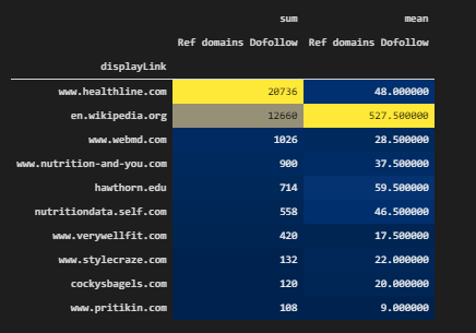
In the data aggregation example above, Healthline, WebMD, and Wikipedia have better dofollow referrer domain count per URL that they have. It is another signal from the Off-Page SEO data that shows the SEO necessities of these queries.
Taking Search Results According to Whether They Link a Domain or Not to See the Topical Authority and Domains’ Relevancy to Each Other
With Advertools’ “serp_goog()” function, we can retrieve URLs from SERP according to whether they link a specific site or not. Linking a site can be a relevance or clustering signal for the Search Engine. In the example below, we will use the first 6 queries from “culinary_fruits_queries” list and we will take the first 60 results from the SERP.
linksSiteHealthline = adv.serp_goog(culinary_fruits_queries[:6], key=api_key, cx=cse_id, linkSite="healthline.com", start=[1,11,21,31,41,51])
linksSiteHealthline.to_csv("linksSiteHealthline.csv")
linksSiteHealthline = pd.read_csv("linksSiteHealthline.csv")
linksSiteHealthline.drop(columns="Unnamed: 0", axis=1, inplace=True)
linksSiteHealthline[linksSiteHealthline['displayLink']!="www.healthline.com"]['link']

OUTPUT>>>

1                                                                 https://en.wikipedia.org/wiki/Healthline
5      https://m.facebook.com/story.php?story_fbid=1358785517502211&id=383360451711394&_ft_=mf_story_ke...
6                          https://m.facebook.com/story.php?story_fbid=1358783647502398&id=383360451711394
7                                                          https://www.linkedin.com/in/nancyschimelpfening
8                                                               https://www.linkedin.com/in/rachelsbarclay
                                                      ...
355                https://www.stevenson.edu/student-life/health-wellness/health-wellness-news/date/2020/4
356                                                              https://globalnews.ca/tag/healthline-811/
357                         https://sites.google.com/site/pascalscolesccp/behavioral-health-web-site-links
358                                         https://es-la.facebook.com/sleusf/community/?ref=page_internal
359    https://www.informationweek.com/healthcare/patient-tools/will-simpler-health-information-win-ove...
Name: link, Length: 336, dtype: object
We have created a variable, “linksSiteHealthline”.
- We have taken the first 60 results from the SERP.
- We have used the first 6 queries for our culinary fruit list.
- We have taken the CSV output of the results with “to_csv()”.
- We have read the CSV file with “pd.read_csv()”
- We have dropped the unnecessary columns.
- We have taken the URLs that link the “healthline.com” except the URLs from “healthline.com”.
You can see the results below.

To compare the linking sites for Healthline and MyFitnessPal, we will use the same queries as below.
linksSiteMyFitnessPal = adv.serp_goog(culinary_fruits_queries[:6], key=api_key, cx=cse_id, linkSite="myfitnesspal.com", start=[1,11,21,31,41,51])
linksSiteMyFitnessPal.to_csv("linksSiteMyFitnessPal.csv")
linksSiteMyFitnessPal = pd.read_csv("linksSiteMyFitnessPal.csv")
linksSiteMyFitnessPal.drop(columns="Unnamed: 0", axis=1, inplace=True)
We have created a new variable which is “linksSiteMyFitnessPal”. We have assigned the “adv.serp_goog()” function’s output, we have taken the CSV output, read it and dropped the unnecessary column.
linking_sites_from_serp_myfitnesspal = linksSiteMyFitnessPal[linksSiteMyFitnessPal['displayLink']!="www.myfitnesspal.com"]['displayLink'].value_counts().to_frame()
linking_sites_from_serp_healthline = linksSiteHealthline[linksSiteHealthline['displayLink']!="www.healthline.com"]['displayLink'].value_counts().to_frame()
We have created two other data frames with the help of data filtering, the “value_counts()” method of Pandas and the “to_frame()” method. These two data frames are necessary for the visualization of these domains.
Visual Comparison of Linking Sites for Healthline and MyFitnessPal on the SERP for the Target Queries
Every URL has a backlink profile even if they don’t have a backlink. And, these backlinks have their own queries and backlinks. Searching for a query and taking the URLs according to their specific outgoing link destinations is important, because it shows where these URLs give their authority and with which context. Visual comparison of linking sites for Healthline and MyFitnessPal can be found below.
fig = px.bar(linking_sites_from_serp_myfitnesspal,x=linking_sites_from_serp_myfitnesspal['displayLink'], y=linking_sites_from_serp_myfitnesspal.index, title="Linking sites of MyFitnessPal from SERP", labels={"index":"Domain Name", "displayLink":"Link Count"}, hover_data=["displayLink"], height=1000, width=1000, range_x=[1,15], range_y=[1,47], color="displayLink")
fig.show()
We have called the “px.bar()” method for the “linking_sites_from_serp_myfitnesspal” data frame. We have used the “linking_sites_from_serp_myfitnesspal” data frame’s “displayLink” column for the X-axis, and we have used the index values which are the sources and domains in the y axis. Thus we have acquired a horizontal bar chart as below.
We see that MyFitnessPal has links from “FitBit”, “theverge”, “blog.myfitnesspal”, “fitnoapp”, “downdetector” and more. These linking sites are not bad but most of the links are coming from support pages and some social media platforms. Below, we will see the same data for only Healthline.
fig = px.bar(linking_sites_from_serp_healthline,x=linking_sites_from_serp_healthline['displayLink'], y=linking_sites_from_serp_healthline.index, title="Linking sites of Healthline from SERP", labels={"index":"Domain Name", "displayLink":"Link Count"}, hover_data=["displayLink"], height=1000, width=1300, range_x=[1,15], range_y=[1,72], color="displayLink")
fig.show()
We have only changed the “linking_sites_from_serp_myfitnesspal” data frame with the “linking_sites_from_serp_healthline” data frame. You can see the result below.
We see that Healthline has links from “fitboard”, “globalnews”, “corkyy”, “mysaa”, “BusinessWire”, “worldhealth”, “stevenson.edu”, “nmu.edu” and more. For the same queries, Healthline has a better link profile and link sources.
You can examine the key results from our data below.
- There is a strong difference between Healthline and MyFitnessPal
- Healthline is a topical authority and trust signal for the same queries.
- Healthline’s competitors are even linking Healthline while competing with them.
- Also, Healthline is giving links to these sites if it is necessary.
- This can show the “honest-link network” on the SERP so that Search Engine can give more credit.
Aggregating the Link Count on the Pages and Ranking Relation on the SERP for All Sources
Until now, we have aggregated the data usually based on sources, but also we can aggregate the data without the source data. Sometimes, this can help to understand some industry normals and best SEO practices easier with the data science.
for i in crawl_serp_df.columns:
    if i.__contains__("link"):
        print(i)


OUTPUT>>>

link
parsely-link
links_url
links_text
links_fragment
links_nofollow
resp_headers_link
We have printed all of the link related columns again for using them in the data aggregation for SEO.
Aggregating the Link Count Based on Rank with “Between” Method and “Pivot Table”
We have used “between” and “pivot_table” methods from Pandas to perform simple data aggregation. Below, we will check the first three ranks and their average link count.
crawl_serp_df['link_count'] = crawl_serp_df["links_url"].str.split("@@").str.len()
crawl_serp_df[crawl_serp_df['rank'].between(1,3, inclusive=True)].pivot_table("link_count", "rank", aggfunc=["mean"])
We have created a new column as “link_count”. We have used the “str.split(“@@”) for splitting the URLs within the “links_url” column which include the links on the URLs. We have used the “between()” method with the “1,3” values and “inclusive=True” parameter. It means that we have filtered every row between 1-3 values including 1 and 3 for the “rank” value. We have used the pivot table for the “link_count” and “rank” columns with the “aggfunc=”mean”” parameter and value. You can see the result below.

We see that most of the web pages at the first rank have only 85 links while second rank pages have 59 link counts. And, web pages at the third rank have 92 links. We also can check the max, min values, and all of the rankings.
crawl_serp_df.pivot_table("link_count", "rank", aggfunc=["mean"])# .sort_values(("mean","link_count"), ascending=False).head(10)
#max() = 128
#min() = 50
We have performed the same process for the first 10 results. You can see the average link count per ranking below.
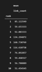
We see that there is no strong correlation between the rankings and the average link count on the pages. But we see that it is between 51 and 160. And most of the URLs on the first ten ranks have less than 100 links on them. So, this might be another necessity for a specific SEO campaign.
crawl_serp_df.pivot_table("link_count", "rank", aggfunc=["min"]).sort_values(("min","link_count"), ascending=True).head(10)We have taken the minimum link count per every ranking by changing the “aggfunc” parameter value as “min”. You can see the minimum link count per ranking as below.
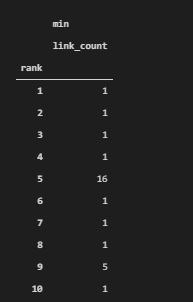
We see that some URLs have only 1 link on them. In such a situations, some exceptional examples should be excluded from the data frame so that the average values can be more realistic. Also, these URLs with only one link on them can be examined to see their situation and performance or their content to understand them better by an SEO Data Science expert.
crawl_serp_df.pivot_table("link_count", "rank", aggfunc=["max"]).sort_values(("max","link_count"), ascending=False).head(10)We have taken the maximum link count per every ranking by changing the “aggfunc” parameter value as “min”. You can see the maximum link count per ranking as below.
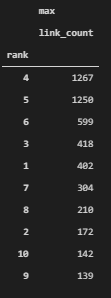
In the example above, we see that at some rankings, some specific exceptional URLs with high link count are affecting the average values. Thus, we couldn’t create a correlation between the link count and rankings. To create a better correlation between link count and average ranking, an SEO Data Scientist should clean the outliers, in other words, some extreme examples should be excluded from the data aggregation and classification process for understanding the SEO metrics in a better way.
Average Link Count per Web Page from all Sources on the SERP
Average Link Count can be aggregated based on sources so that an SEO can see the which domain uses how many links on which pages. It is important to find outliers in terms of link count such as domains with excessive amount of links or domains with a few links on the pages.
crawl_serp_df.pivot_table("link_count", "displayLink", aggfunc=["mean"]).sort_values(("mean","link_count"), ascending=False).head(50).style.background_gradient(cmap="cividis")We have used a pivot table to aggregate the average link count based on source names. You can see the result below.
We see that Wikipedia has an excessive amount of links on their pages, we have Womenshealthmag from the top 10 domains as a second example after Wikipedia. Also, WebMD has more than 200 URLs averagely on its web pages. But, other top 10 domains are not being seen on the data frame. It means that usually best sources have fewer links on their pages. And, we already covered these links and their anchor texts for the MyFitnessPal and Healthline while examining the On-Page SEO elements with data science.
Top 10 Domain’s Average Link Count Per Web Page on the SERP
In this section, we will filter all of the top 10 domains and check their average link count per URL on their sites. So that we can see the industry normals in a better way.
crawl_serp_top10_df['link_count'] = crawl_serp_top10_df["links_url"].str.split("@@").str.len()
crawl_serp_top10_df.pivot_table("link_count", "displayLink", aggfunc=["mean"]).sort_values(("mean","link_count"), ascending=False).head(50).style.background_gradient("cividis")
We have created a new column called “link_count” by counting the links on the pages via “links_url” column. We have used pivot table for the “link_count” column and domain names by aggregating the data. You can see the average link count per URL from the top 10 domains.
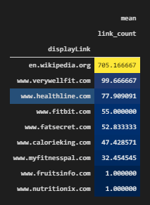
We see that most of the best-performing sites have links between 77 and 32. And, this can be used as a reference point for an SEO campaign, also some examples like “fruitsinfo” and “nutritionix” have only 1 link per URL which is excessively less than usual.
Average Link Count Based on Ranks on the SERP
Before continue further, extracting the average link count per ranking and sorting them according to the rank values is useful because in the next section we will check the which domain has how many links at which rank.
crawl_serp_top10_df.pivot_table("link_count", "rank", aggfunc=["mean"])You can see the average link count per ranking on the SERP with a proper order.
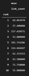
Best Top 10 Sources’ Average Link Count Per Web Page on Every Ranking in a Data Frame
crawl_serp_top10_df.pivot_table("link_count", "rank","displayLink", aggfunc=["mean"]).transpose().fillna("Not Ranked")
Visualization of Link Count and Ranking Relation for All Domains on the SERP
We can visualize the link count on the pages of the domains by aggregating the data as below.
fig = px.bar(crawl_serp_df, x="link_count", y="displayLink", hover_name="link", hover_data=["searchTerms", "title_x", "h1", "displayLink","rank"],color="rank", height=1200, width=1000, title="Internal Link Count and Ranking for All Domains", labels={"link_count":"Link Count","displayLink":"Domain Name"})
fig.update_yaxes(matches=None, categoryorder="total ascending")
fig.show()
#color "Ranking"
You can find the explanation below.
- We have called the “px.bar()” method. We have used “link_count” in the x-axis and we have used the “displayLink” values for the y-axis. We have used queries, titles, h1, domain name, and rank data for the hovering effect, in other words, when a user hovers over a bar, he will see the related data for these columns for that specific URL. We have determined the width and height values, title, and labels.
- We have used the “displayLink” for the “color” parameter so that we can group all of the data for different domains.
- We have changed the order of the bars with the “update_yaxes” method.
- We have called the bar chart.
You can see the result below.
We have visualized the per URL link count and total link count per domain. We see that Wikipedia, WebMD, fs.fed.us have excessive amount of links and also some other competitors such as “impexco.org” has fewer links. We also can see the URL, Query, Title, Rank and Link Count per Landing Page while hovering them. You can see an example below as image.

An SEO can learn the industry normals and different competitors’ strategies for internal linking here. Also, you can do the same for only queries instead of sources, it will also help to undestand Search Engines’ perspective while making decisions for ranking documents.
Visualization of the Total Link Count per URL and Source for the Top 10 Domains
We can filter the certain types of domains and visualize their ranking and total link and link count per URL at the same time as below.
fig = px.bar(crawl_serp_top10_df, x="displayLink", y="link_count", hover_name="link", hover_data=["searchTerms", "title_x", "h1", "displayLink","rank"],color="rank", height=600, width=1000, title="Internal Link Count and Ranking for Top 10 Domains", labels={"link_count":"Link Count","displayLink":"Domain Name"})
fig.update_xaxes(matches=None, categoryorder="total ascending")
fig.show()
We have used the “px.bar()” method for the “crawl_serp_top_df” data frame which includes the top 10 sources for the culinary fruit queries that we used. We have used sources on the x-axis and “link_count” on the y-axis. We have used URL at the hover name and query, title, h1, domain name, and rank data for the hovering effect. We have grouped the bar sections with different colors according to the rank situation. We have used 1000 as the “width” value and 600 as the “height” value. We have determined the title and used the “update_xaxes()” method for changing the order of the bars in the plot.
We have called the bar plot as below.
We see that “myfitnesspal”, “calorieking” and “fatsecret” have similar values in terms of internal link count. Also, we see that “HealthLine” has a more link count because it has more pages. The second domain with the most pages is “MyFitnessPal” but it doesn’t have so many link count because of the lackness of comprehensive content. While hovering gon the graphic objects, you might examine all of these data to understand the Data and SEO intersection with the help of science.
Introduction to the Topical Search Engine: Restricting Entities for Certain “Relevancy” and “Source Categorization” on the SERP
Topical Search Engine, Intelligent Search Engine, or Semantic Search Engine means the same thing. Topical Search Engine organizes the things according to their relevance for a specific topic, entity, context, and attribute. Every article can have multiple contexts, entities within them but one of them or at least some of them will be the main entity and context of the content. Topical Search Engine categorizes the landing pages on the SERP according to their topics. Below, you will see that we have categorized the SERP for three different entities for the phrase “apple”. Apple the company, Apple the fruit, and Apple the city are categorized for different SERPs. In some examples, Google also calls this Dynamic Content Organization, which means different topical SERP verticals for the same phrase.
apple = adv.serp_goog(q="Apple", cx=cse_id, key=api_key, start=[1,11], gl=["us"])
apple.to_csv("apple3.csv")
apple.to_csv("apple2.csv")
apple.to_csv("apple.csv")
Below, you will see the explanation of the code block.
- At the moment, we can’t do this via “Python”.
- I have restricted the “Entities in Results” as “Apple the Fruit”
- So that, I can compare the relevancy and topical categorization system of Search Engine
- The first Apple Query was for just Apple as a “phrase”
- The second Apple Query was for Apple the Fruit
- The third Apple Query was for the “New York” (New Apple)
- You can see How Search Engine Categorize the Web according to the Search Intent Calculation.
At the code block below, we have read all of the different SERP verticals and united them in the variable “united_apple_df”.
apple_1 = pd.read_csv("apple.csv")
apple_2 = pd.read_csv("apple2.csv")
apple_3 = pd.read_csv("apple3.csv")
united_apple_df = pd.concat([apple_1, apple_2,apple_3])
You can see the Exact Differences in the Results according to the Entity Types, every SERP instance has only one type of Landing Page for every URL. If it is about “city”, it includes all the results for only “The New York”, because another name of the New York is also “The Big Apple”. If it is a company, it only includes the company results, it shows the Apple, phone, and computer companies. If it is about the food, it shows the fruit and recipe results.
Topical search engine helps for the things below.
- This helps SEOs to understand the Search Engine’s Perception (Neural Matching)
- To use this feature better in scale, you should understand how Google uses NLP for NER, NEL, and Information Extraction
In the code block below, we have called the related data frame.
united_apple_df.drop(columns="Unnamed: 0", inplace=True)
united_apple_df
You can see the result below.
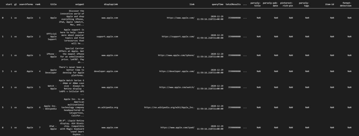
Above, you see the results for the company Apple, at the bottom section of the same data frame, there is only Apple the fruit and Apple the city.
Restricting Results for Only a Schema Type
Restricting search engine results according to their Schema Types is possible like restricting the results only for a specific entity. Below, you can see the methodology described for the restricting search engine results with Python for Data Science with SEO.
- At the moment, we can’t do this also with Python
- But, with CSE (Custom Search Engine) you can restrict results for only a certain type of Schema Mark Up or Structured Data Type
- Below, you will see the results for the “Apple” as a Recipe, “Apple” as a City, and “Apple” as an “Organization”
apple = adv.serp_goog(q="Apple", cx=cse_id, key=api_key, start=[1,11], gl=["us"]) # For the City
apple = adv.serp_goog(q="Apple", cx=cse_id, key=api_key, start=[1,11], gl=["us"]) # For the Recipe
apple = adv.serp_goog(q="Apple", cx=cse_id, key=api_key, start=[1,11], gl=["us"]) # For the Organization


apple.to_csv("apple-city.csv")
apple.to_csv("apple-recipe.csv")
apple.to_csv("apple-organization.csv")
We have changed the schema type configuration in the Programmable Search Engine. For the first example, we have chosen only the “City” related schema types, in the second example, we have chosen the recipe-related schema types, in the last one, we have chosen the organization-related structured data examples.
We have taken the search results to the different CSV files for every schema type which are recipe, city and organization.
united_apple_sd_df = pd.concat([apple_city, apple_recipe, apple_organization])We have united all of the different search results which include a different type of schema type.
united_apple_sd_df.drop(columns="Unnamed: 0", inplace=True)
united_apple_sd_df
While taking the CSV output with Pandas, you can use “index_col=False” parameter and value to save yourself from “drop(columns=”Unnamed: 0)” code line. After cleaning the data frame, we have called the result as below.
Restricting and grouping the search engine results page based on different schema types is important and helpful for SEOs to use data science, analyzing the patterns on the SERP and main relevance signals for different aspects and search intents during the searching journey of the search engine users.
Performing N-Gram Analysis for the Content and Phrase Patterns on the SERP based on Sources and Rankings
In the last section of this Data Science and SEO lecture, we will perform N-Gram Analysis with the SEO competitors contents. N-Gram analysis or Skip-gram analysis can be used by Search Engines to produce the “relevance labels” for the specific terms. N-Gram analysis can show a web page’s main focus and it can be used for phrase-indexing by the search engines. We will use “PorterStemmer()” and “CountVectorizer()” methods from Natural Language Toolkit (NLTK) from Python.
Methodology for N-gram Analysis for SEO as below.
- Taking stop words from “nltk.corpus.stopwords.words” as we did before.
- Using “PorterStemmer” for stemming the words
- Using “CountVectorizer” for “N-gram” analysis
stopwords = nltk.corpus.stopwords.words("english")
ps = nltk.PorterStemmer()
cv = CountVectorizer(ngram_range=(2,2))
We have created “ps” and “cv” variables to use “PorterSetemmber” and “CountVectorizer”. We have encapsulated the English stop words into the “stopwords” variable. In the next section, we will create a custom python function for N-Gram Analysis so that we can use it within a Data Frame.
def text_normalizer(txt):
    txt = "".join([c for c in txt if c not in string.punctuation])
    tokens = re.split("\W+", txt)
    txt = " ".join([ps.stem(word) for word in tokens if word not in stopwords])
    return txt
In the “text_normalizer” function, first we clean the punctuations and then stopwords, then we return a unified string with all words. You can see the key steps of the “text_normalizer” function below.
- Using “text_normalizer” for the “crawl_serp_df” data frame and the body text of the result URLs.
- Creating a New Column for the “Normalized Text”.
In the next code block section, we will use “text_normalizer” to create a new column which is “body_text_clean”.
crawl_serp_df['body_text_clean'] = crawl_serp_df['body_text'].apply(lambda x: text_normalizer(x))In the next section, we will filter the data frame for the query “calories in apple”, then we will chose the related content column which is “body_text_clean”. You will see the key parts of the next code block below.
- Performing the N-Gram Analysis on a Certain Query’s SERP and Body Text of the Result URLs on the SERP
- Using “fit_transform” with “CountVectorizer(ngram_range(2,2))”
crawl_serp_df[crawl_serp_df['searchTerms'] == "calories in apple"]['body_text_clean']
X = cv.fit_transform(crawl_serp_df[crawl_serp_df['searchTerms']== "calories in apple"]['body_text_clean'])
We have used “fit_transform” from “CountVectorizer”, we have used it for the “body_text_clean” column which includes the cleaned text. We have performed the “n-gram” analysis, now we will need to take into a proper data frame as below.
- Turning the N-Gram Analysis into a Data Frame for Further Data Manipulation and Data Visualization
- Using Filtered Data Frame’s URLs as Column Names for the New Data Frame
df = pd.DataFrame(X.toarray(), columns=cv.get_feature_names())
column_names = crawl_serp_df[crawl_serp_df['searchTerms']== "calories in apple"]['displayLink'].to_list()
df_transposed = df.transpose()
df_transposed.columns = column_names
We have used “X.toarray()” for taking all the values into a Numpy Array. We have used “get_feature_names” method for taking the feature names from our N-gram analysis. We have changed the column names with the “domain names” from “displayLink” column. We have used “transpose” method to turn the data frame into a more readable way.
Using Groupby for Aggregating the N-Grams based on Domain Names
In the next code block, we will use “groupby” for having a more readeble data frame. We will use “sort_values” based on the domain that we want to learn its N-grams from. In the example below, we used “womenshealthmag.com” for n-gram analysis.
df_transposed = df_transposed.groupby(df_transposed.columns, axis=1).sum().sort_values(by="www.womenshealthmag.com", ascending=False)
df_transposed
You can see the “n-gram analysis of the womenhealthmag.com”. The example below includes only “Biagrams” since we used “CountVectorizer(ngram_range=(2,2))” method, parameter and value together.

We see that “mani calori”, “how mani”, “get recip”, “recip per” are the most used biagrams from “Womenhealthmag.com”. These wrods are stemmed and lemmetized, thus all of the different phrase variations are unified under the origin of the word so that we can count the core phrases in a better way. You can see the Biagram Analysis dataframe info below.
df_transposed.info()

OUTPUT>>>
<class 'pandas.core.frame.DataFrame'>
Index: 4599 entries, mani calori to zone how
Data columns (total 7 columns):
 #   Column                   Non-Null Count  Dtype
---  ------                   --------------  -----
 0   apps.apple.com           4599 non-null   int64
 1   support.apple.com        4599 non-null   int64
 2   www.apple.com            4599 non-null   int64
 3   www.calorieking.com      4599 non-null   int64
 4   www.healthline.com       4599 non-null   int64
 5   www.nutritionix.com      4599 non-null   int64
 6   www.womenshealthmag.com  4599 non-null   int64
dtypes: int64(7)
memory usage: 287.4+ KB
We see that we have 4599 values per column. In the next section, we will count all of the “biagrams” for every domain.
Count of Biagrams for SEO Competitors with Data Science
In the example below, we have used “astype(str)” so that we can turn the data type from “int64” to “str”. Thus, we will be able to replace all of the “np.nan” values with the string “0”. This is necessary so that we can use the “count()” value for every column. We have used “to_frame” method to put everything into another data frame. Below, you will see the related code block.
df_transposed[:].astype(str).replace('0', np.nan).count().to_frame().rename_axis("Domain Names").rename(columns={0:"Count of Biagrams"}).sort_values(by="Count of Biagrams", ascending=False)You can see all of the related biagram counts fo rrelated SEO competitors for the culinary fruit queries which include the calorie and nutrition questions.
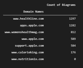
We see that Healthline has more biagram. “Womenshealthmag” and “CalorieKing”, “Nutritionix” follow “Healthline”. This information is consistent with the total keyword count of the domains. And, below you will see a Google patent about phrase-indexing and its methodology.

Phrase indexing is being used by Google as a information retrieval system. And the selected area in the Google Patent clearly states that differnet phrase variations of a phrase can help to give a document more value in terms of phraserank or phrase based relevance.
Visualization of Biagrams per Source
After getting the biagram count per source, an SEO with data science and data visualization skills can visualize the data for better SEO insights. Below, you will see three different visualization, one for all of the top 7 domains and their biagram count for the specific query that we have chosen, one is for the biagram count of WomensHealthMag and one is for Healthline’s biagram count.
df_transposed_visualization = df_transposed[:].astype(str).replace('0', np.nan).count().to_frame().rename_axis("Domain Names").rename(columns={0:"Count of Biagrams"}).sort_values(by="Count of Biagrams", ascending=False)We have assigned biagram count data frame into the “df_transposed_visualization” variable.
fig = px.bar(df_transposed_visualization,x=df_transposed_visualization.index, y="Count of Biagrams", color=df_transposed_visualization.index, title="Biagram Graph for Best Domains")
fig.show()
We have used “px.bar()” method with the “df_transposed_visualization” variable as below.
We see that “Healthline” has more biagram counts than others. In the future, you can compare the query count and biagram counts and create a correlation ratio between each other, the same thing can be done also for entity types and counts.
Visualization Biagram Count for Only One Source
df_transposed.sort_values("www.healthline.com", ascending=False, inplace=True)For visualization of the only one source’s biagram count, we should filter the values for only that source.
fig = px.bar(df_transposed.iloc[:40, :8],y=df_transposed.index[:40], x="www.healthline.com", labels={"y":"Biagram", "x":"Source: www.healthline.com"}, height=1200,title="Healthline Biagram Graph for 'Calories in Apple'")
fig.update_yaxes(matches=None, categoryorder="total ascending")
fig.show()
We have used “px.bar()” for only the Healthline, since Healthline is already one of the columns in the related data frame, we have used it in “x” parameter. We have used “update_yaxes” method for sorting the bars as ascending. You can see the result below.
We see that Healthline has lots of different types of biagrams but most of them are focusing on “health”, “calorie”, “vitamin”, “weight loss”, “food” and more. This is a healthy biagram profile for a source for a query.
df_transposed.sort_values("www.womenshealthmag.com", ascending=False, inplace=True)We have used “df_transposed” data frame to filter the only “womenshealthmag” biagrams by changing the data frame’s order.
fig = px.bar(df_transposed.iloc[:40, :8], y=df_transposed.index[:40], x="www.womenshealthmag.com", labels={"y":"Biagram", "www.womenshealthmag.com":"Source: Healthline.com"}, height=1200,title="Womenshealthmag Biagram Graph for 'Calories in Apple'")
fig.update_yaxes(matches=None, categoryorder="total ascending")
fig.show()
We have used the “px.bar()” method and put the “WomensHealthMag” into the “x” parameter as a value to show its biagrams within a horizontal bar plot with Plotly express. You can see the biagram analysis of a single domain below.
We see that “WomensHealthMag” has different types of biagrams than Healthline such as “colleen”, “fiber”, “marissa miller”, “sugar” and more. It is important because this shows the different angles of the two different sources for the same query and search intent. “Colleen” is actually the “collagen” at it doesn’t exist in the Healthline, also “free radic” doesn’t exist in Healthline’s content. So, in other words, Biagram Analysis and Entity Analysis, Text Analysis with data science are important for SEO.
Last Thoughts on Data Science, Visualization and SEO with Python
Data Science for SEO is one of the most important and fundamental disciplines. Data Science, Visualization, Analysis are the key methodologies for analyzing any algorithm including the decision and classification trees of Search Engines. Data Science means examining the data with scientific methods and principles. Data can prove the behavior pattern of an object, thing, or system. In the field of SEO, SEOs can mark up the Search Engines for semantic queries and sources, watch the decision-making process of search engines while following their updates. Data blending, data filtering, data analysis, data aggregation, and data manipulation are different columns of data science along with data visualization.
For Holistic SEO, Data Science is a must. Without data science, analyzing thousands of sites, queries, ranking changes, content strategies, back-end, and front-end changes won’t be possible. More data means more insight for SEO.
With time, our SEO Data Science and Visualization Tutorial and Guideline will be updated with the new information, methodologies and terminologies.
A Tribute to the Hamlet Batista for SEO, Data Science, Visualization and Python Intersection
Before finishing this Introduction to the SEO Tutorial for Data Science, I want to say a couple of words for Dear Hamlet Batista. In the Holistic SEO & Digital’s website’s PythonSEO section, we have a quote from Hamlet Batista which says “Do more with less”. Hamlet is the reason for me to start learning Python, and Elias Dabbas is the reason for me to start learning Data Science. These two people are educators for our industry, and when the first time Hamlet calls me “brilliant”, I felt that I can succeed more.

And, Hamlet didn’t want anything in return while promoting others’ work and encouraging them. Hamlet didn’t have any kind of interest while promoting others, he was giving the credit to the others without expecting anything. He was a genius that owns his own Search Engine Optimization patents.

When he invited me for a webinar and twittorial, he even didn’t know me, and in fact, I have started learning Python thanks to his “Automating Image Alt Tag Writing” article in Search Engine Journal. I have read most of his articles when he had written me.

And, when he was in the hospital, he said that he wanted Dear Elias Dabbas to be the host of our webinar, and I told him that when you are okay, we can perform the webinar altogether, Hamlet, me, and Elias.
Unfortunately, due to the American Health System and Governance and also some other millions of reasons, the SEO industry has lost one of the most important geniuses. I always thought that Hamlet will become the richest and most successful SEO on the planet. He was talking about automating everything with Artificial Intelligence for SEO. He told me that one day an SEO can have more than 1000 clients only by himself/herself. And, I always thought that he will show what the scientific and engineer approach towards to the SEO.
Today, I am happy that at least I can continue to contribute to this Legacy and his name. I am happy that at least, I will have performed the webinar with the Dear Elias Dabbas as Hamlet suggested. I will continue to contribute to Dear Hamlet Batista’s Legacy, Name and I will continue to follow his vision with great people such as Elias Dabbas, Greg Bernhardt, Charly Wargnier, Jean-Christophe Chouinard, Daniel Heredia Mejias, and more.
Happy to know you, Hamlet, see you on the other side.
- B2P Marketing: How it Works, Benefits, and Strategies - April 26, 2024
- SEO for Casino Websites: A SEO Case Study for the Bet and Gamble Industry - February 5, 2024
- Semantic HTML Elements and Tags - January 15, 2024


